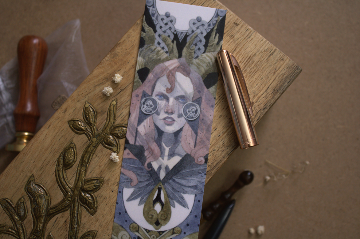
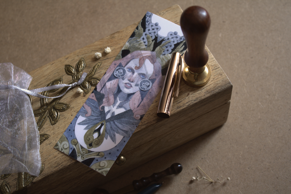
Looking through some of my older pieces, I’ve realized this painting among a few others, have not yet made it the blog. This was done in October of 2022, as part of an experiment to see how my paintings could translate into bookmarks and other smaller products.
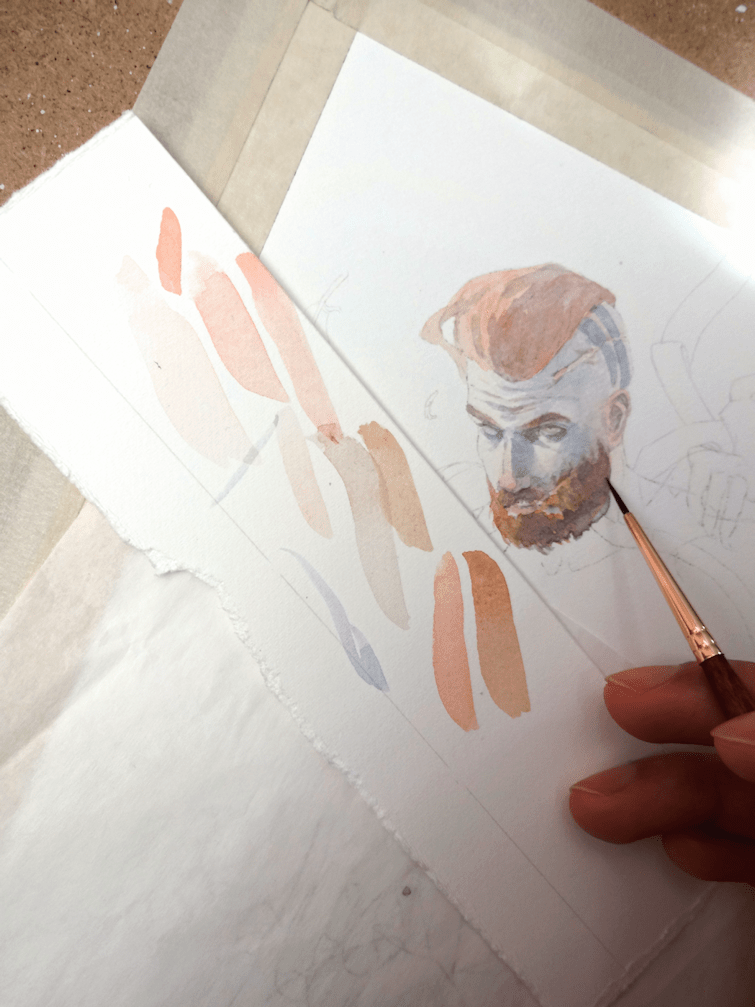
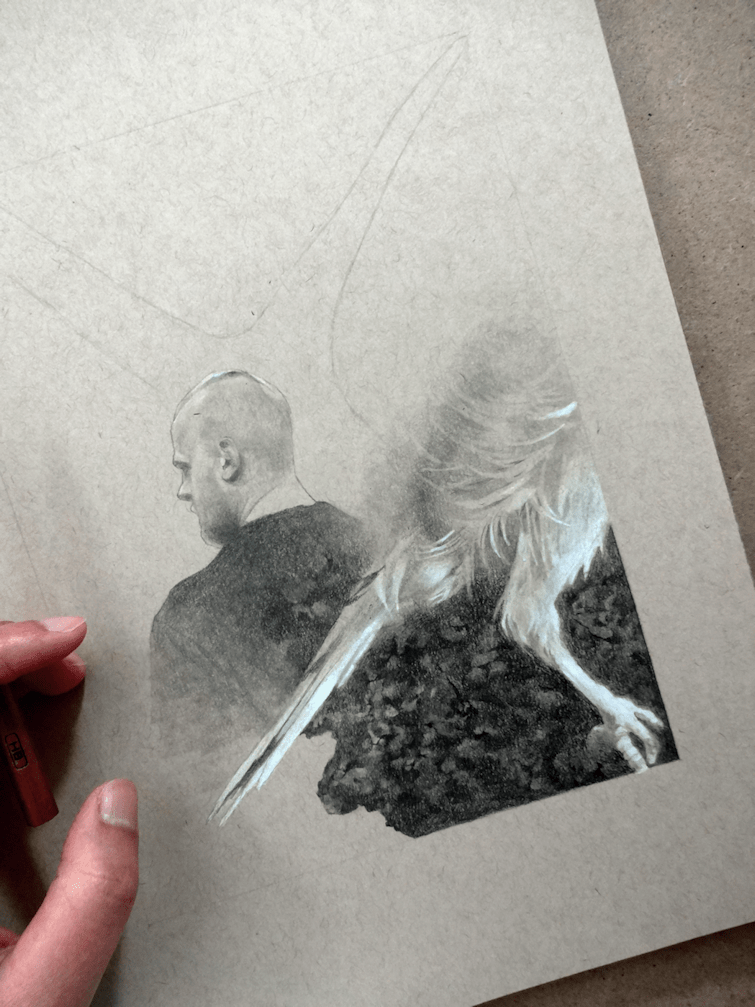
Laying down the first few watercolour washes over the pencil line-work.
I knew what I wanted for the concept of this painting, but was forced to work around the other design elements; such as the Celtic knots & negative spaces, which would work well for the composition of a bookmark design. The goal was to create a piece designed specifically for the dimensions and purpose of the product, rather than have one of my paintings slapped onto a bookmark template. I haven’t had many opportunities to work with graphic design, so I’ve been experimenting with creating pieces specifically for certain formats and hopefully other materials too.
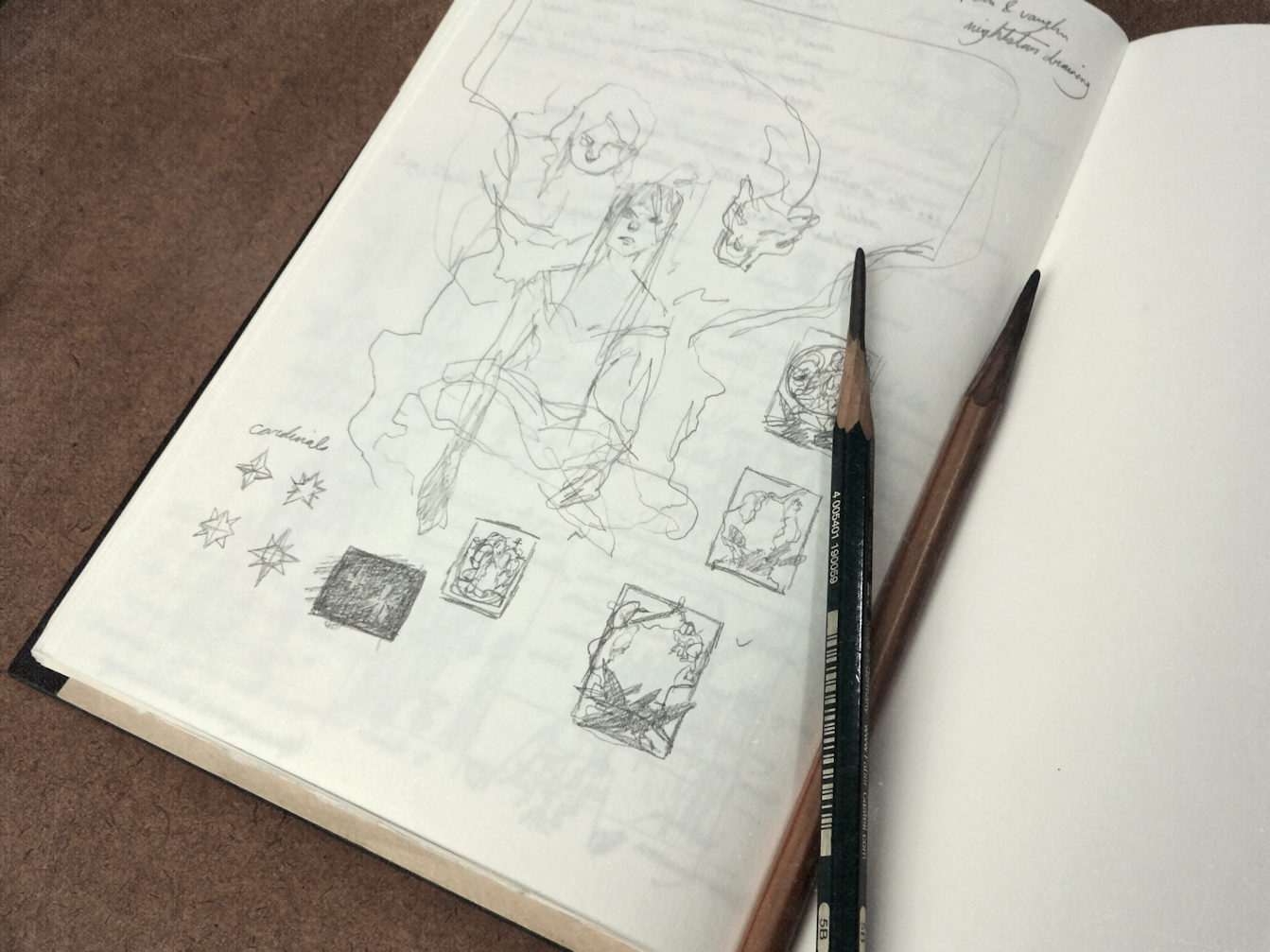
Starting with some brief thumbnails in the sketchbook. Going through Nalini Singh’s second installment in the Psy-Changeling series for some inspiration. Admittedly these tiny drawings look like a bunch of chicken-scratch, but the ideas are there I promise.
(below)
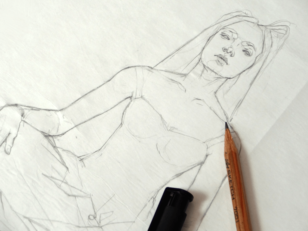
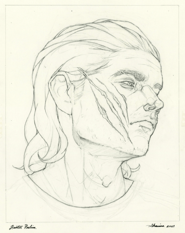
Starting the preliminary drawing on a sheet of vellum/drafting paper.
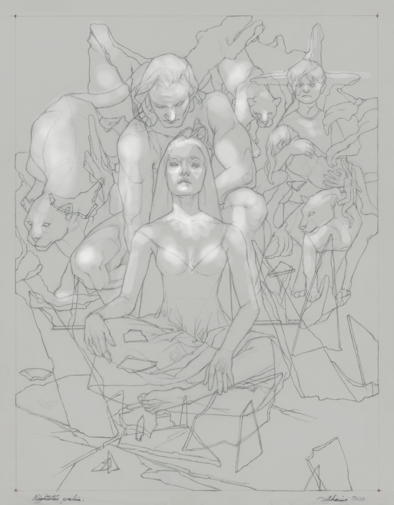
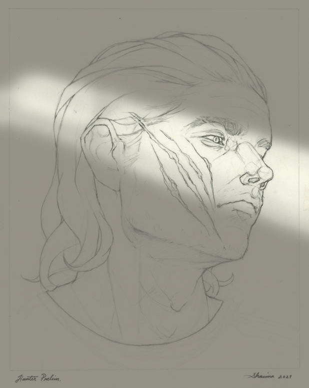
Taking the finished line drawing and creating a simple lighting/value study on Paintshop Pro.
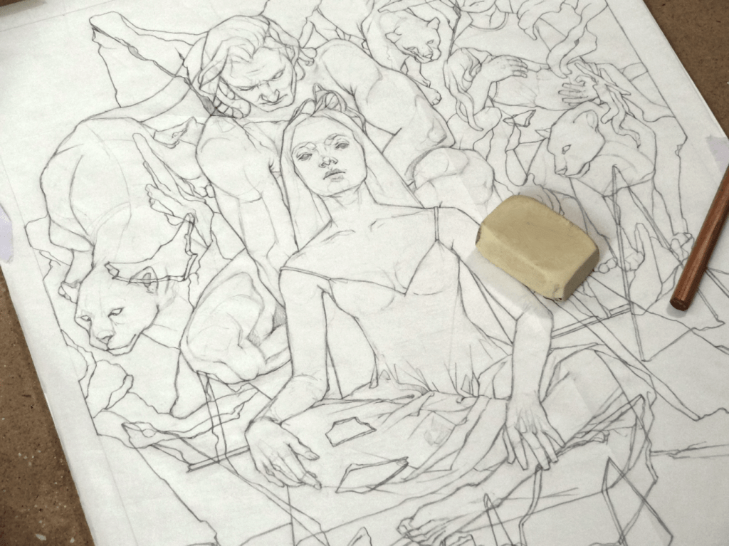
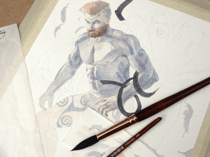
Drawing in Progress
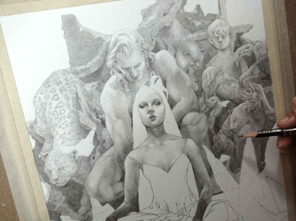
Line drawing transferred onto a sheet of Strathmore Bristol paper, followed by light applications of graphite; slowly building up to the darker values.
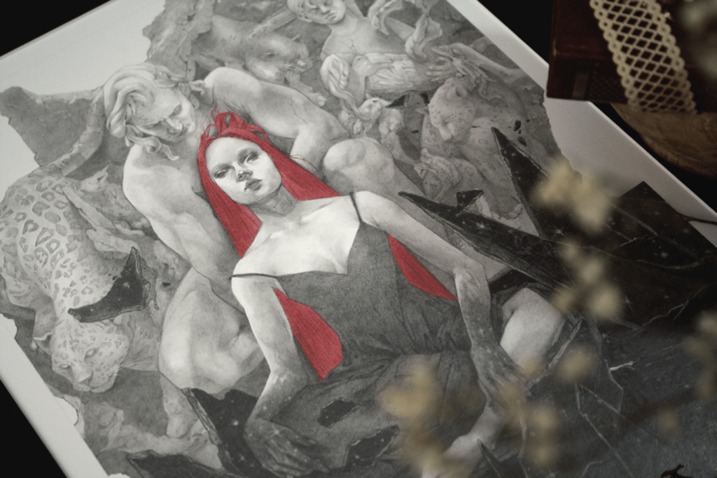
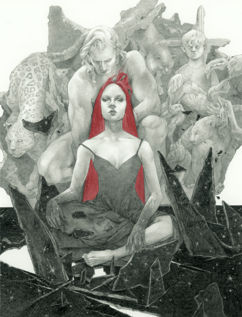
This Monday The Changeling Artists Collective on Facebook will be hosting the auction for original artwork, prints, and drawings from the Woven Path Tarot Project. My watercolour painting will be part of the auction, as well as many other wonderful pieces from this Tarot project. XII. Death is my contribution to the deck; the original painting (without digital edits) varies a slightly to what will be seen in the finished product. So if you’re looking to get your hands on the original piece, please head over the link below to participate in the bids or BIN (buy it now) option. *Please note that the BIN option is only available for a limited time before the auction begins.
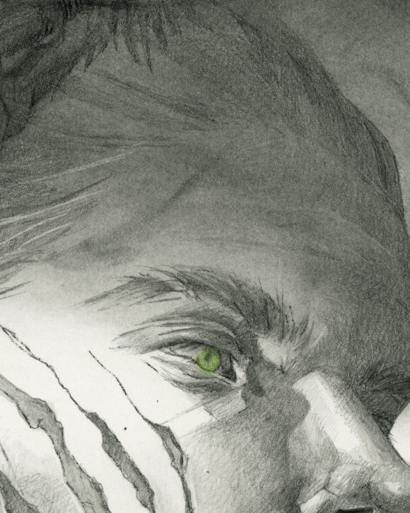
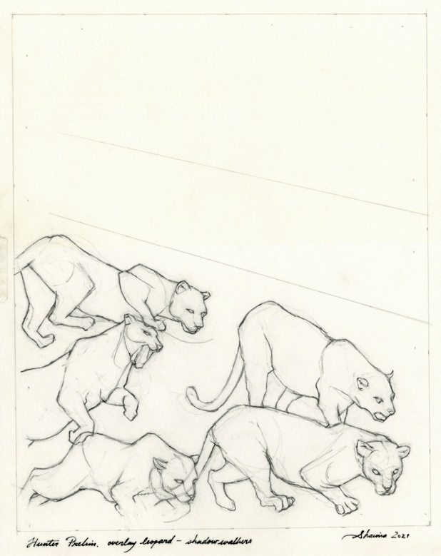
Hunter, graphite & colour-pencils on paper, 8×10″, 2021
BACK TO GRAPHITE
I’ve taken a little break from watercolours again. This one being a more fun personal project, taking a character from author Nalini Singh‘s work and imagining it into a more illustrative piece.
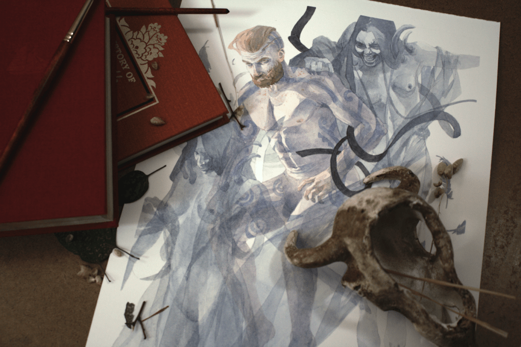
Starting off using the same technique from my last painting (Banshee’s Wail), and layering the preliminary drawings so they are ready for the transfer stage. This time around I wanted to play with more dramatic lighting, as I slowly get more comfortable with it. I decided to do some simple black and white lighting samples on Paintshop Pro. It’s not a really an in-depth study; more of an assurance, so that I don’t desecrate the drawing when I work graphite powder onto the paper. Speaking of paper, I’m using Strathmore’s Bristol 100lb. (270 g/m2) in Smooth Surface. I’ve used both the vellum and smooth surface sheets from Strathmore for many years now, and I usually shift between the two if I want more texture or not. I tend to shy away from more textured paper however, because I like to scan my pieces for digital use.
I use graphite powder for mainly large surfaces I want to cover. I don’t have any experience with any store-bought brands, so I tend to just use the saved ‘residue/remnants’ of when I sharpen my graphite (using the blade method). Using a tissue, I work it in to the paper ─ for this particular piece, adding in various forms with my Blending Stumps. I ended up feeling that the piece was a bit on the grey-scale of things; in which my usual work consists of some pure black elements for contrast, so I thought it might be fun to add some colour instead. Sticking to the paranormal and fantasy aspect of the author’s work, I chose to just focus on the eye with various shades of green colour pencils. Overall, a much needed casual and experimental project; although I never want to see leopards or spots again.
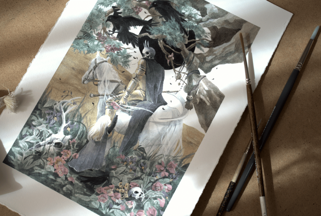
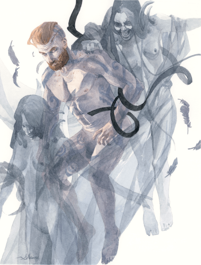
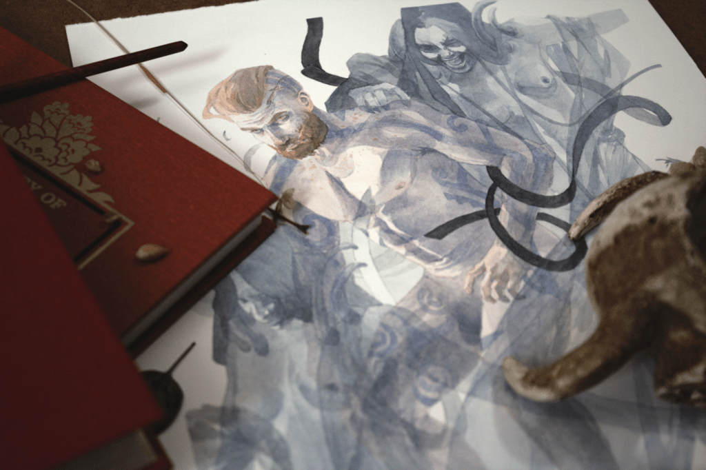
Hello everyone! I’ve finally had the chance to get this one scanned and uploaded. My latest painting Banshee’s Wail ─ taking on themes of Irish folklore. This year has been a roller-coaster in terms of development of artwork and style. Taking this piece for example. What started off as an idea I couldn’t wait to get on paper, transformed into a drawing I really liked, and by the end something I wanted to bury. In the end, I had to settle for being somewhat satisfied in depicting what I had imagined in my head. I’ve found the best remedy in these situations is to just move on and create more.
Banshee’s Wail, watercolours, 8.25×10.75″, 2021
NEW METHODS
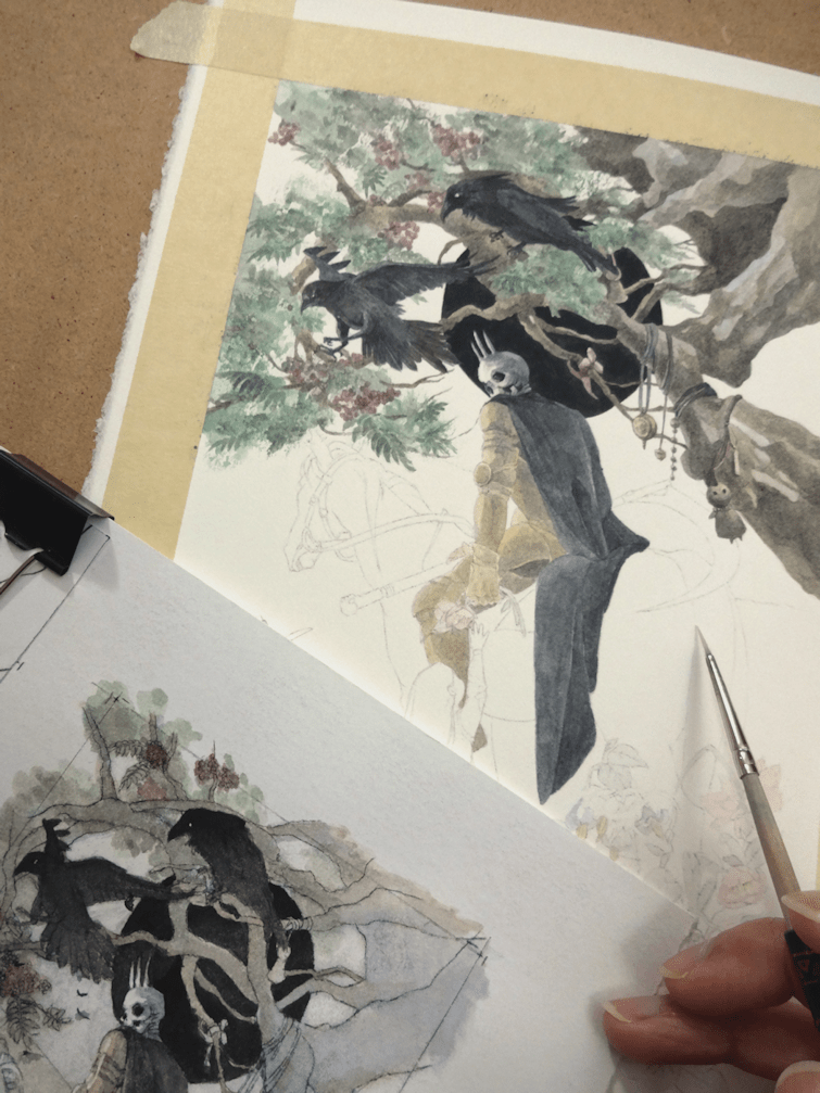
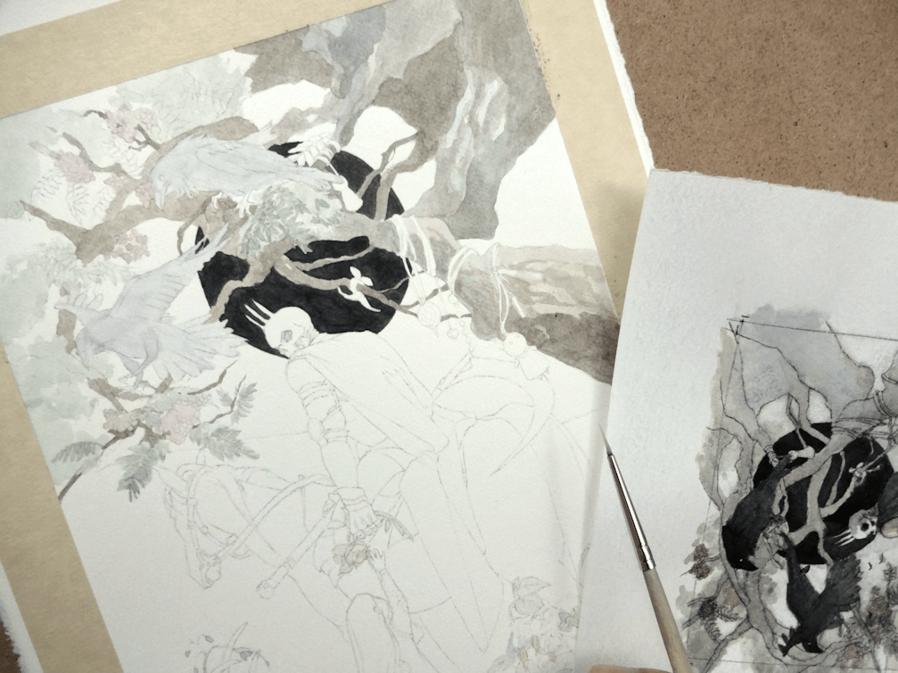
If there was one takeaway from this painting, it was the satisfaction of fine-tuning the preliminary stages of my creative process. I’ve been trying out a different way of developing the initial drawings for the transfer stage. With this method I’d be transferring each individual element/figure one at a time from tracing paper onto the final sheet. The idea is to eliminate the need to erase parts of a perfectly good drawing in the vicinity of another detail being added to the artwork. I’m not sure if this is going to be a permanent process, but it seems useful at the moment for pattern and graphic elements ─ or in the case of this painting, for sheer and translucent subjects. Someone on my Instagram referred to it as “analog Photoshop layers”, which hadn’t occurred to me till now; a fun way to look at it nonetheless.
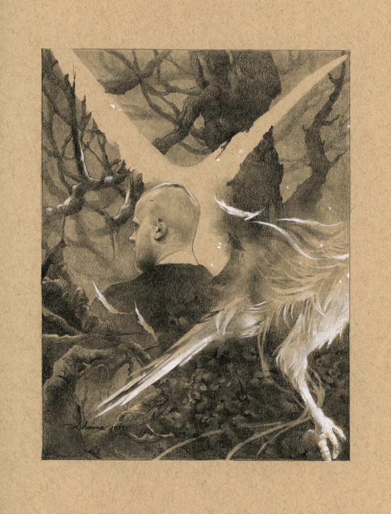
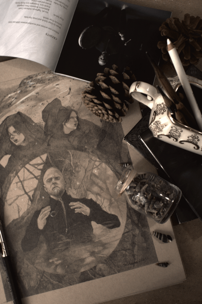
As I went to post my latest Wardruna inspired drawing, I realized I missed posting the last two pieces I had done. So here’s me backtracking to a couple of older sketchbook drawings. I’ve gone back to using my Strathmore Tan Drawing Sketchbook, and I would say after using it for this long it’s the only sketchbook I’ve gone back to over and over again (sadly some of my regular sketchbooks are collecting dust). Many artists, myself included, love the amount of depth you can easily create on toned paper. You already have a working middle ground, so pushing the shadows and highlights comes easier and results in better depth in the overall drawing.
WARDRUNA ‘Lyfjaberg’, graphite and white colour-pencil on paper.
The Appeal of Pagan Folk
I’m using the term ‘pagan folk’, but sometimes placing specific genres on a musician or band can be a bit vague. ‘Faroese singer-songwriter’ comes up for a singer like Eivør Pálsdóttir or ‘alternative Nordic pop’ for Aurora or Kalandra. The band Heilung describes their own music as “amplified history”. Where as a band like Faun from Germany, identifiable with their medieval themes, gets labelled pagan folk as well. All to say, lots of genres being thrown out there to the point that I don’t know how to package any of these musicians into one specific label.
The desire to be closer to nature, live more rural, and escape from the general madness of our concrete jungles is no longer reserved to a small population. It’s also something being translated more and more into different art forms including music. Inspiration can be found in many forms different from your practice; photography, film, etc, but mine has overwhelming been through music and literature. I can easily get lost in the rhythms and voice of a singer like Einar and feel transported.
“I think many people who don’t go to church or other religious ceremonies, I think they miss that solemn, holy place. … One of the goals with Wardruna concert is to actually create that space. To create that serious space, moment, where you can just get lost into the music. … It’s about communication, back and forth. About acknowledging things that are bigger than yourself. Remembering nature, that we are part of it, etc.”
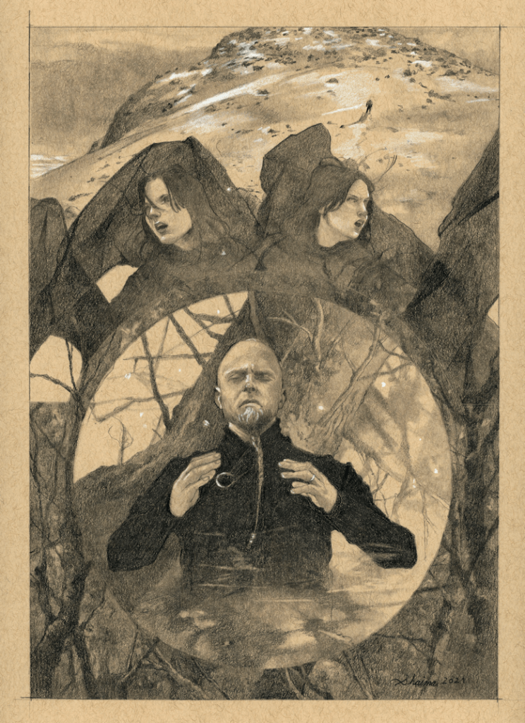
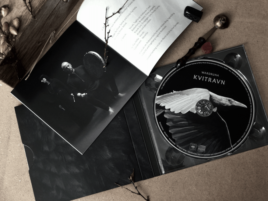
WARDRUNA ‘Kvitravn’, graphite & white colour pencil on paper.
The drawings for Kvitravn; the one above and the one with the white raven featuring Lindy-Fay Hella, are both inspired by Wardruna‘s latest album and the visuals from their respective music videos which you can find on Youtube.
I’ve made the switch to hot-press paper. Having conversations with other artists and looking at their process, it was time to switch over and give this paper a try. I think I’ll always prefer cold-press; the texture and depth of colours you can achieve is much more satisfactory, but alas the scanning results in my opinion are rarely so for displaying work online (especially for more illustrative pieces).
Stock piling and clutter in both art and life is not something I’m keen on. Something I’ve had to reconsider during this pandemic. Luckily I had enough supplies until shops opened up again, but what I didn’t have on hand was hot-press paper. A month back, the only shop that had any in stock here in Toronto was Deserres. 4-5 ‘misroutes’ with Canpar, emails & phone-calls back and forth with both companies, and I finally had my paper arrive in a bent cardboard box. …I don’t know if I was more surprised at having received my shipment at all, or that the paper had somehow survived with minimal damage. Yay to Canadian postal service.
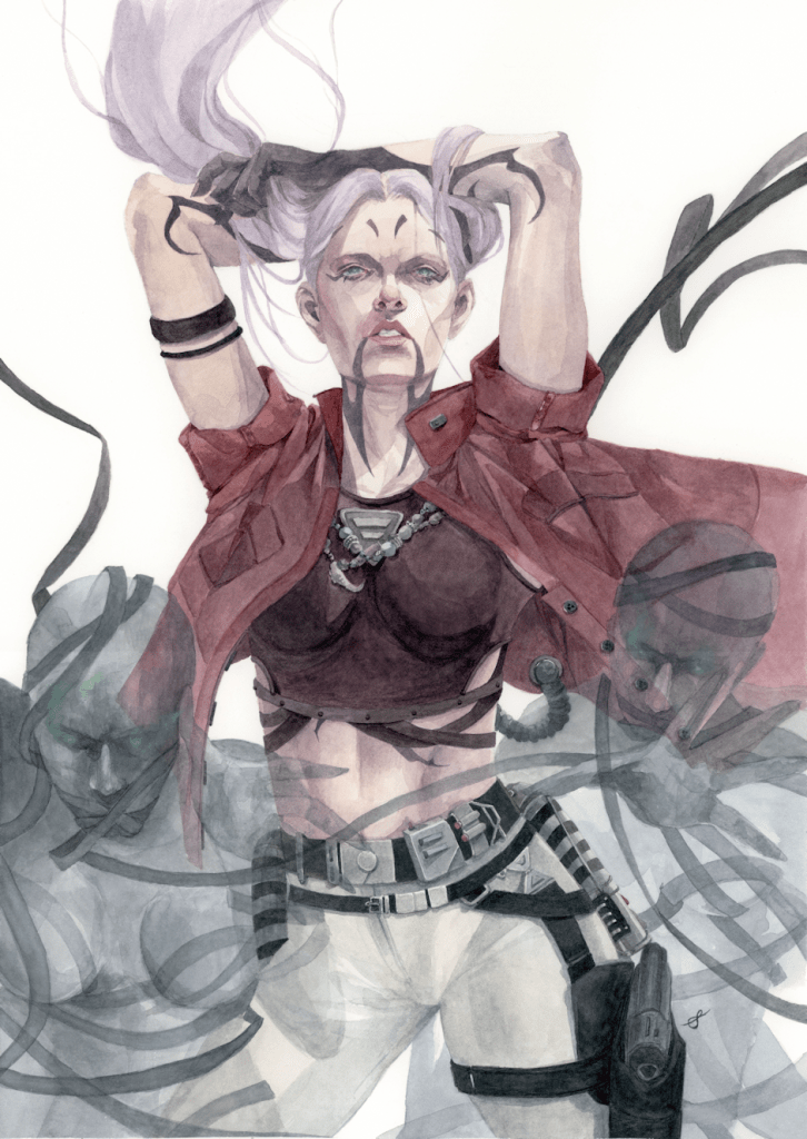
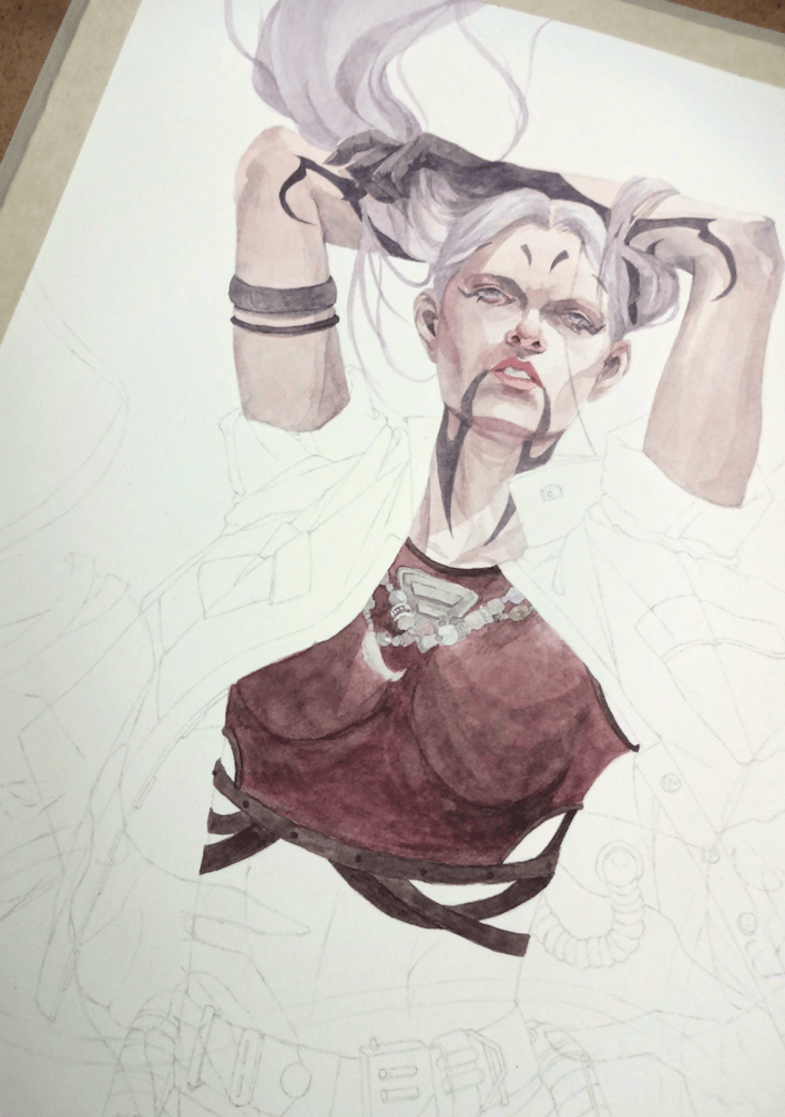
Ventress, watercolours & acrylics on 11×15″ paper, 2020
I chose to test out Fabriano’s Artistico Hot-Press Watercolour Paper, and after success with this one I’m eager to try out Arches‘ (pricier) paper as well. I had little to no warp; although I’m suspicious of my 3M masking tape playing a part as well. I don’t put down a lot of heavy wet washes either, so I can’t say what the result would be for those of you who like to do so.
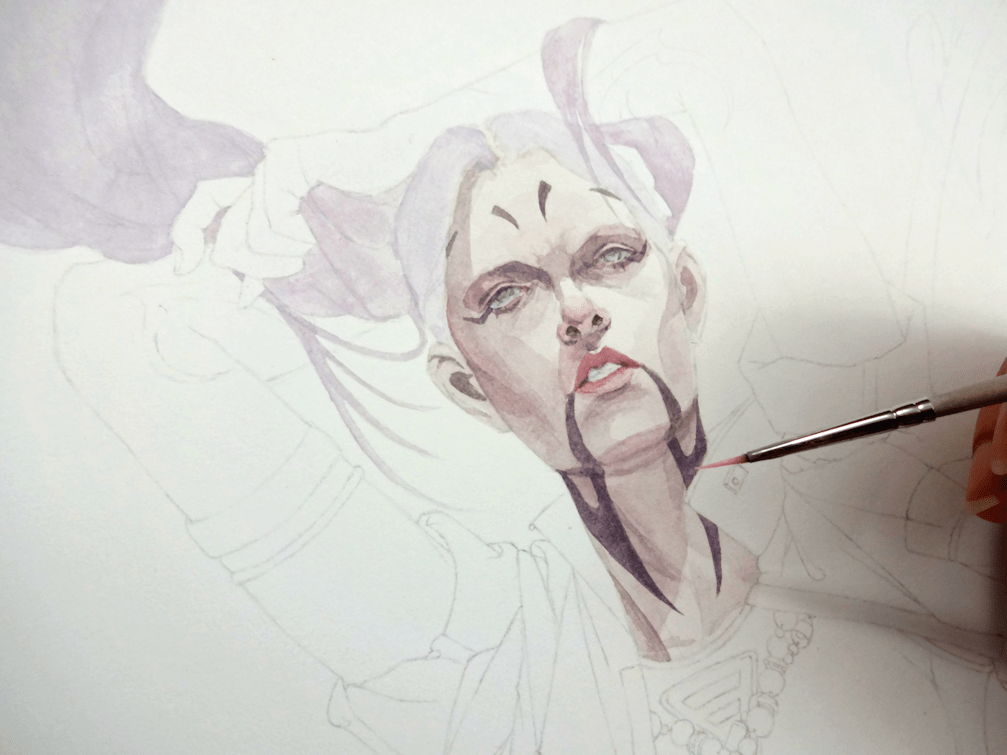
Achieving some ‘glowy’ eyes with acrylic paints.
I wanted to soften Asajj’s look by giving her hair again (drawing on the flashbacks of her lavender hair as a child), as well as changing her usual Sith attire to more of a civilian one. Taking liberties from the original design, I played around with additional Sith corruption marks and tried to include references to her Dathomirian heritage ─ beaded necklaces and elements of witchcraft & necromancy. This was a fun little side project to work on, although personally it’s always nerve-raking to mess around with original visions of any series.
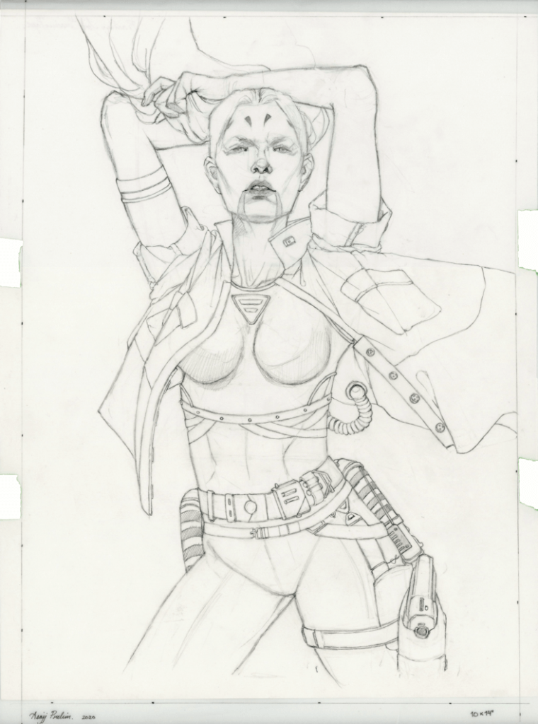
Process.
3rd time’s a charm; various attempts of re-imagining Ventress.