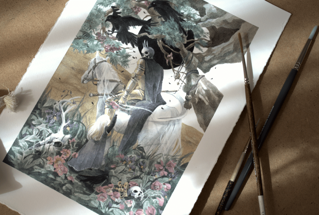
This Monday The Changeling Artists Collective on Facebook will be hosting the auction for original artwork, prints, and drawings from the Woven Path Tarot Project. My watercolour painting will be part of the auction, as well as many other wonderful pieces from this Tarot project. XII. Death is my contribution to the deck; the original painting (without digital edits) varies a slightly to what will be seen in the finished product. So if you’re looking to get your hands on the original piece, please head over the link below to participate in the bids or BIN (buy it now) option. *Please note that the BIN option is only available for a limited time before the auction begins.
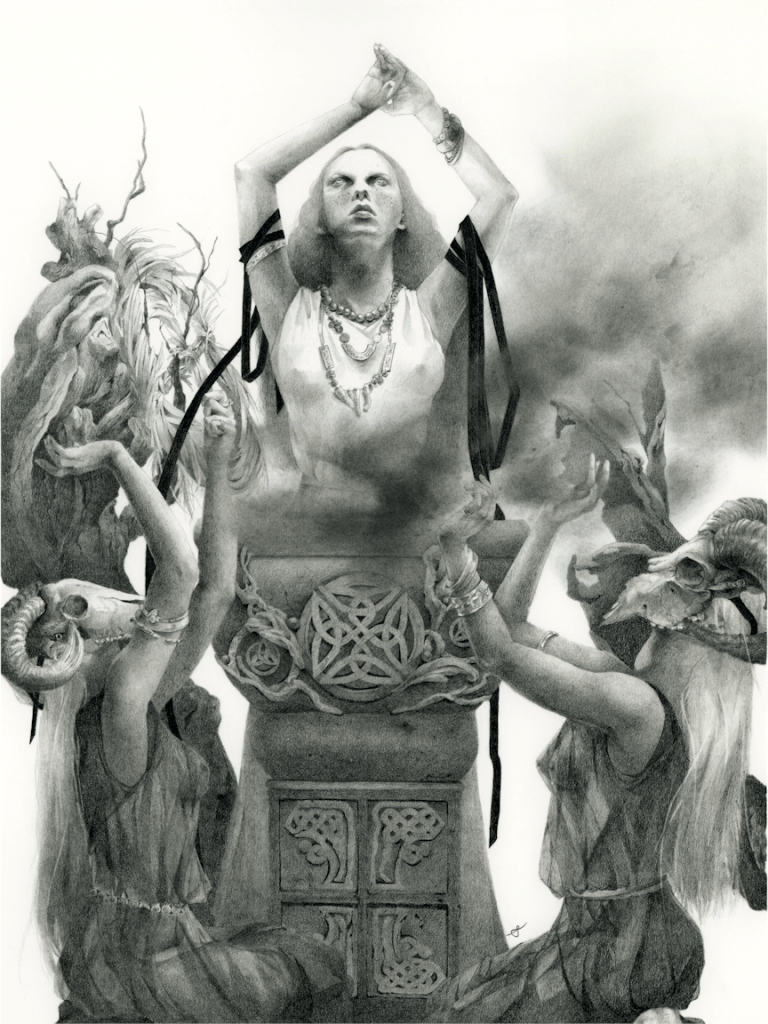
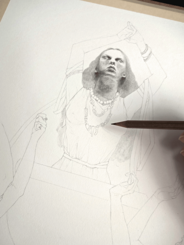
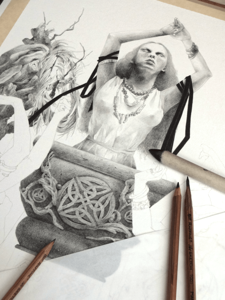
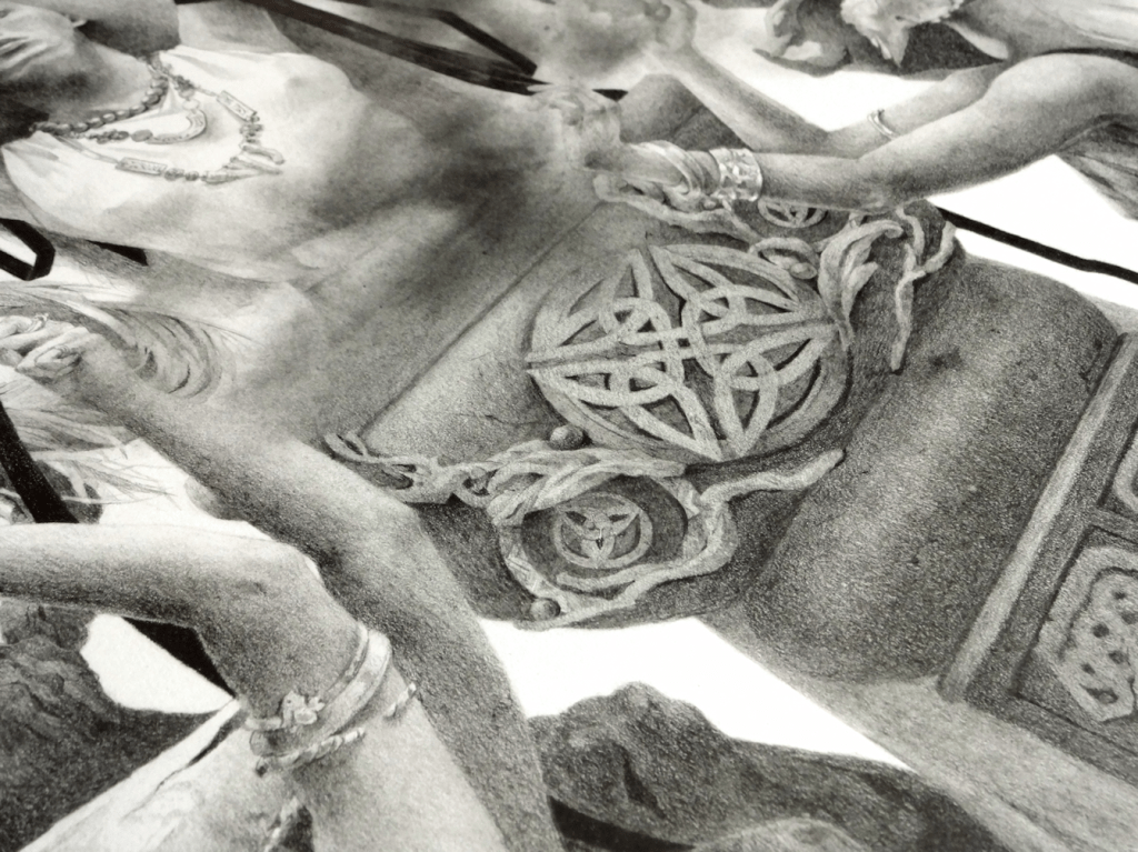
The Ritual, graphite, 12×16″ (on 14×17″ paper), 2021 Strathmore 100lb. 270 g/m2
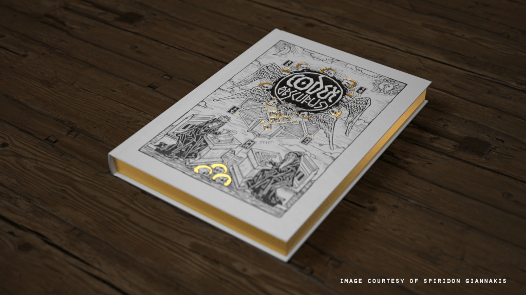
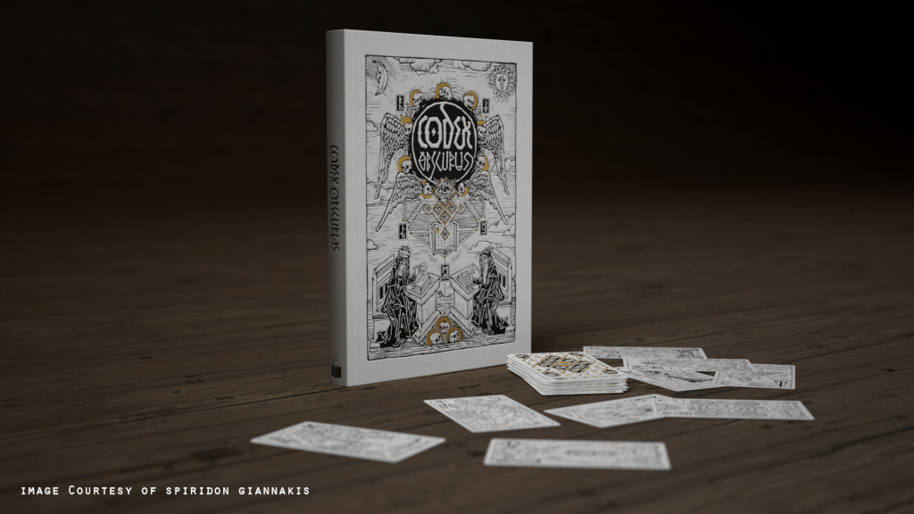
I shared a little peek into this piece sometime earlier this year, but with the project now on full swing on Kickstarter I can announce that this drawing will be part of the CODEX Obscurus Artbook. This is a project by Spiridon Giannakis with cover and Tarot deck design by Viktor Pushkarev, and is a collaboration with an incredibly talented lineup of 145 artists and their unique take on witches & warlocks, witchcraft, the occult and various folklore. As a bonus, I along with several others will be putting forth our original artwork (The Ritual in my case) for purchase in this campaign. If you are interested acquiring an artwork please head over to the Kickstarter page for all the info.
The campaign runs until the end of the month & there are just a few more stretch goals to go! If you would like to back this project please head over to pledge.
Limited Edition Prints & Campaign Bundles
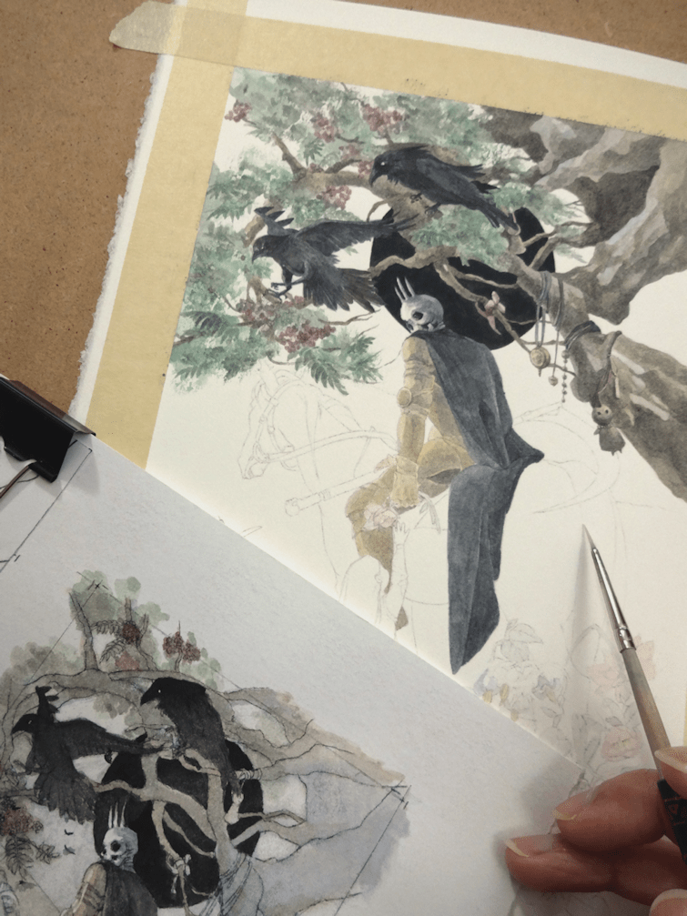
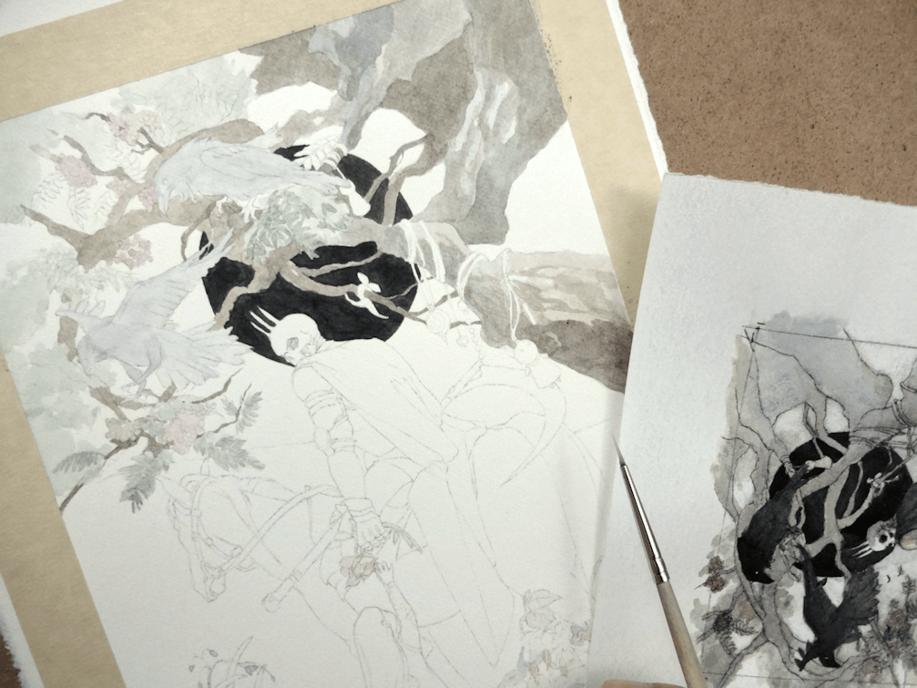
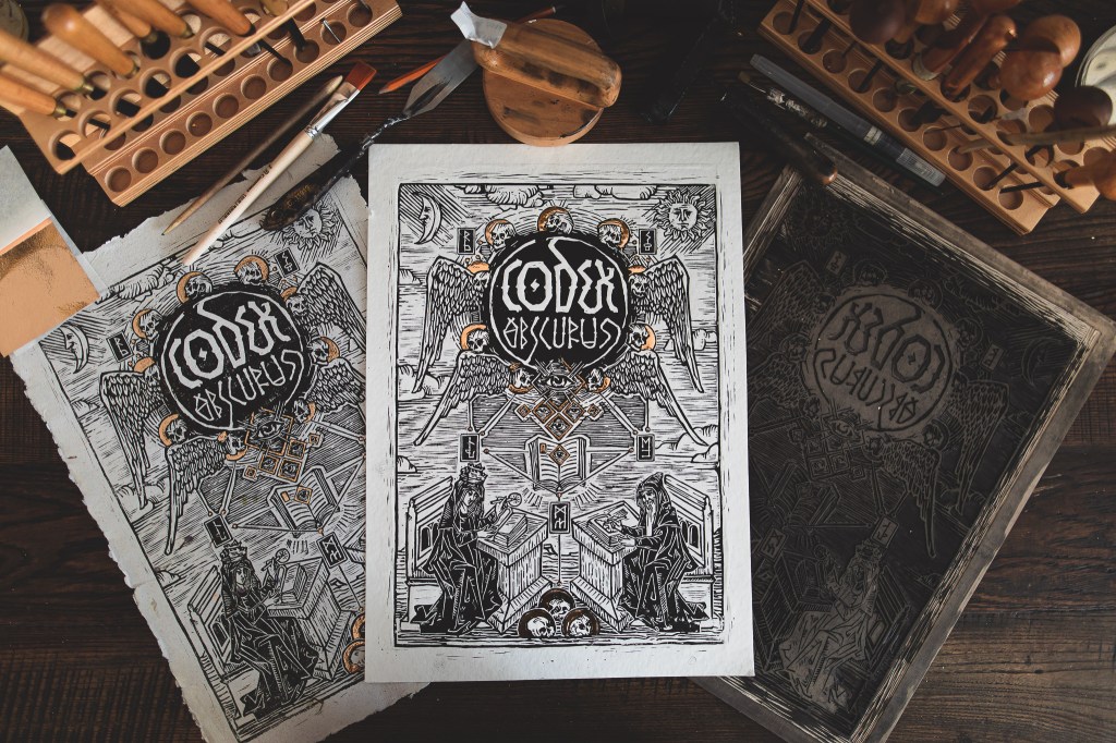
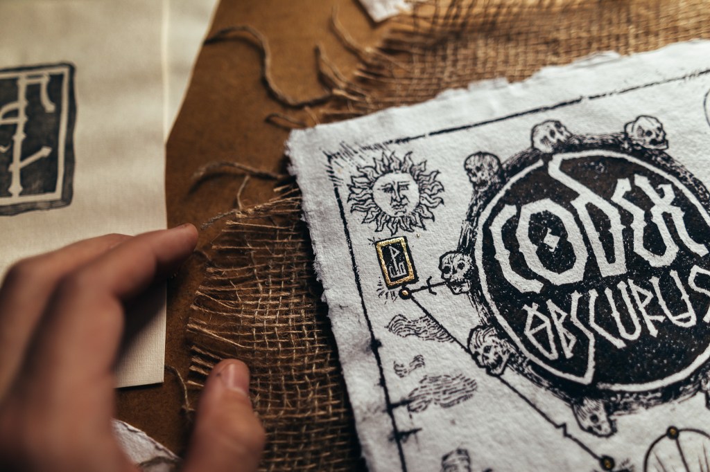
There will also be a limited edition run of these amazing hand-made prints by Viktor. Here’s just a little peek at his process, but you can find more behind-the-scenes on the Codex Kickstarter page as well as on Viktor’s Instagram. Depending on the pledge, there will also be different extras from other artists in this campaign from high quality Prints, Postcards, Posters & Bookmarks; with the potential of even more bonuses with the unlocking of stretch goals.
Images Courtesy of Spiridon Giannakis & Viktor Pushkarev | CODEX Obscurus
The Ritual: a look into the process
For this project I decided to go with a full graphite piece. I wanted a break from painting with watercolour last year and although I hadn’t touched graphite in while, I felt confident again after laying down the foundation and just having at it. It also helped that I was excited to create something that was very much in line, thematically, to my own work.
I knew I’d be working with a lot of blending and powdered graphite ‘washes’, so I started by taping off the borders for a clean look for the finished product. Once the prelim sketch had been transferred onto the paper, I worked in layers from 2B pencils all the way to 6B & 7B for the darkest as I could go. To achieve the softer appearance I like to create in contrast to the more defined Celtic designs and such, I went to my trusty blending stumps as well as the usual no nonsense tissue paper. This project was also an attempt to improve on metallic elements (or in this case jewellery); working in grayscale and then using an eraser to create effects for a more realistic rendering.
I hope you enjoyed a look into this project and hope you will support our work through this artbook. Take care everyone!
Going into this year I really wanted to improve the way I drew faces and proportions. Most important of all I wanted to be able to see said improvements when not working with any references. I was noticing the loss of creativity that I had an abundance of, when I used to create art in the early days of middle & high school. Back then I was doing more of a manga/anime style work, however I had much more creative ideas come through in terms of design.
A really good article that caught my eye earlier this year was The Danger of Reference by Jesper Ejsing via. Muddy Colors (A website you should be following if you’re interested in acquiring a wealth of knowledge from artists in the industry). It was something that I had gotten too comfortable with, and something I hadn’t even noticed or thought about until I read Jesper’s article. I had indeed created a safety blanket for myself over these last couple years, relying heavily on references for all my work in every stage. Although there isn’t anything inherently wrong with this process (most artists require references at many stages of their work), there is a danger of killing creativity if you don’t step outside the technical once in a while. This reliance on references came from an insecurity of my own skills as an artist, and of course comparison to the masters in the fantasy art and illustration industry.
So at the end of September, as sort of a spur of the moment thing, I decided to do a painting in which I would draw a face without the help of any reference material. …Confession, I did give up on the hands 😅; something I have yet to master in terms of structure/shape. I am pleased I was able to come up with a face, composition and design at least. Small steps.
Margarette, watercolours & acrylics on paper, 8×10.5″, 2020
WIP.
This painting along with many other originals are available for purchase directly through the Shop section in this website. If you are looking for prints, please visit my Inprnt store.
As a promise to myself to improve my figure drawing, (the male form in particular), I was surprisingly satisfied by the end of this piece. My current displeasure with my work was that there was something off about how my figures in my watercolour paintings were looking. There was a flatness that I didn’t really like, and really wanted to improve on. Therefore I went back to the basics with graphite. Obviously a much more forgiving medium, it gave me the chance to really analyze what I was missing in how I presented the male/female form in my work; taking a slower pace, and building up each layer with shadows, highlights & textures. I think the next step will be to play around with much more dramatic lighting to add more dimension to faces and figures.
It was also really fun to play around with some of the graphite shavings/residue I had saved from sharpening my pencils. So do save them if you sharpen your tools with a blade! 🙂 Although scanners don’t do a very good job at picking up the subtleties in traditional work, I hope you can at least see the attempt to create more solid black planes. I’ve wanted to incorporate this technique for a while now, without using black paper or ink washes. Although easily created (as seen in the halo), there will inevitably be a visible texture no matter how dark the graphite. So this technique was quite interesting to try out, as well as figuring out whether I like graphite better on white or tan-toned paper. The verdict’s still out on than one.