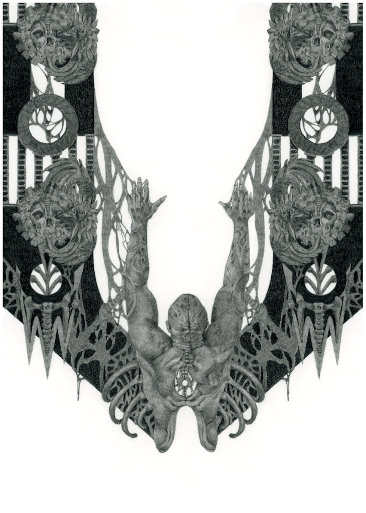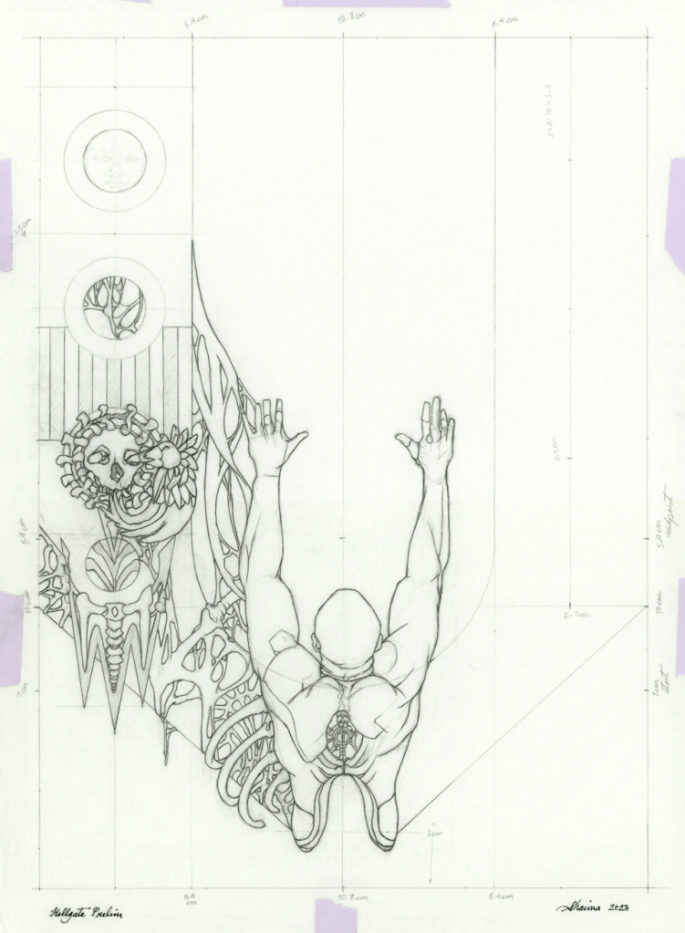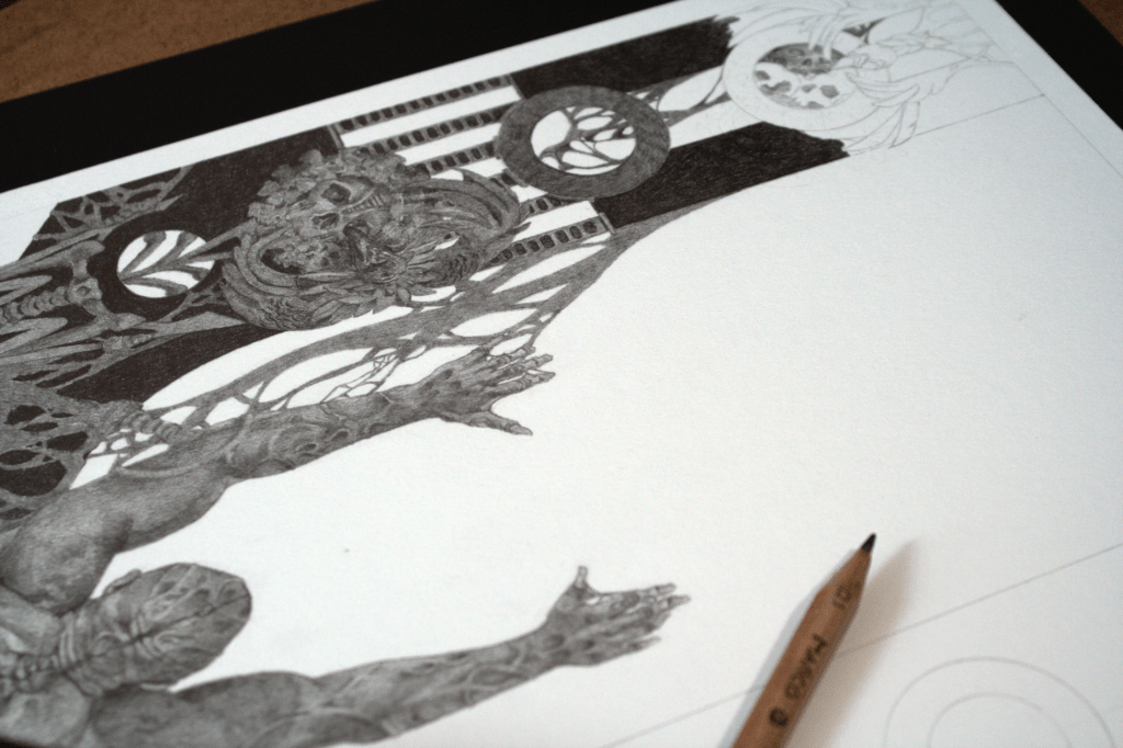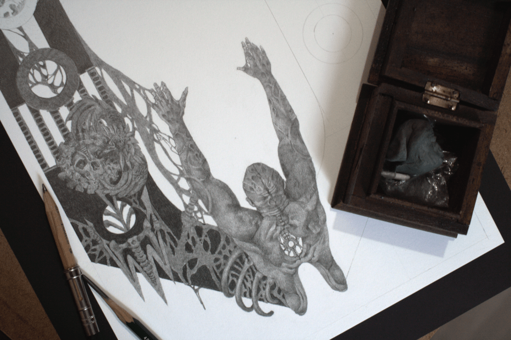
Glittery & Gold | CODEX Obscurus

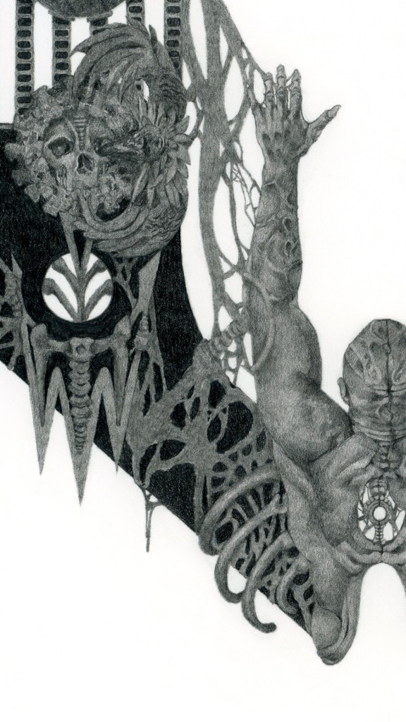
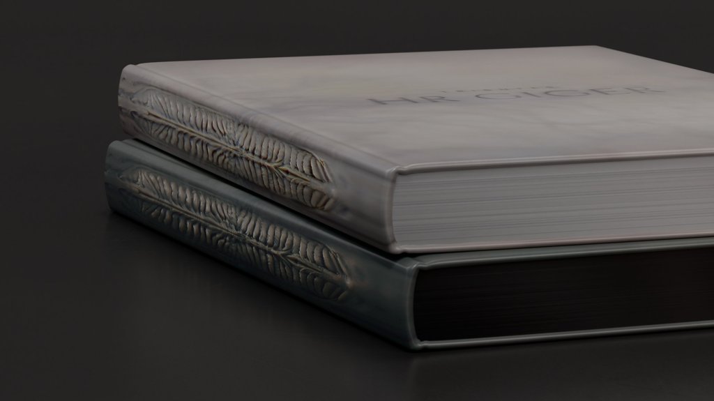
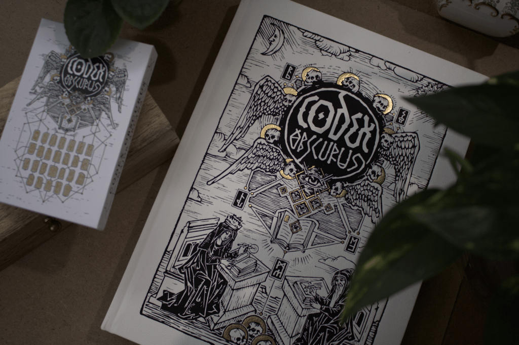
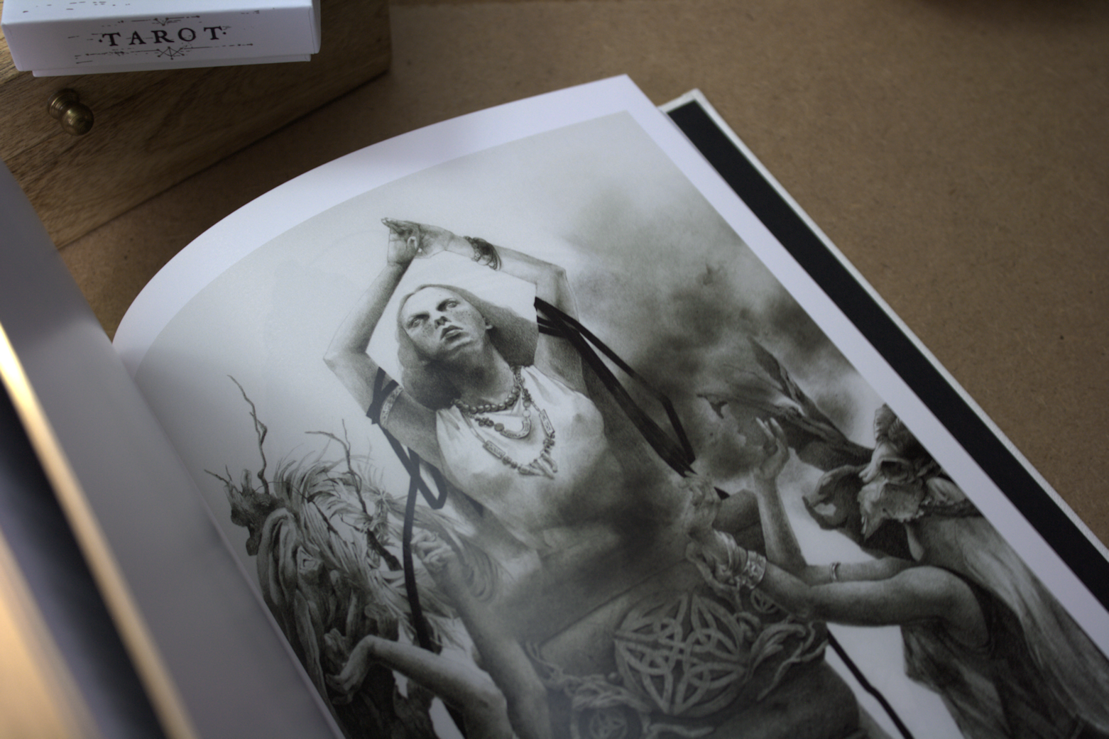
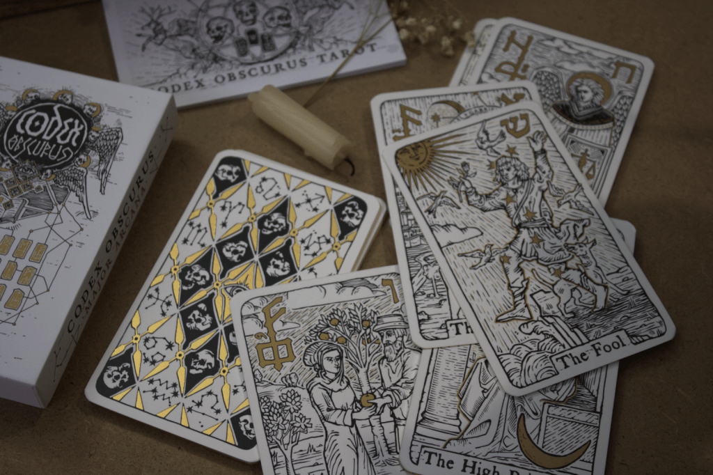
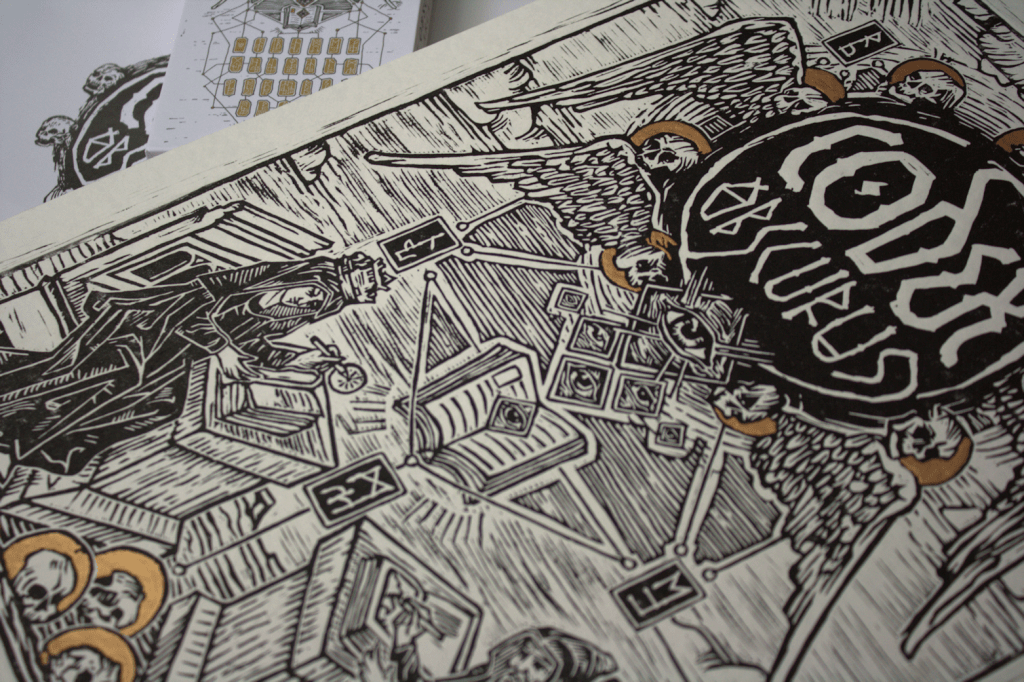
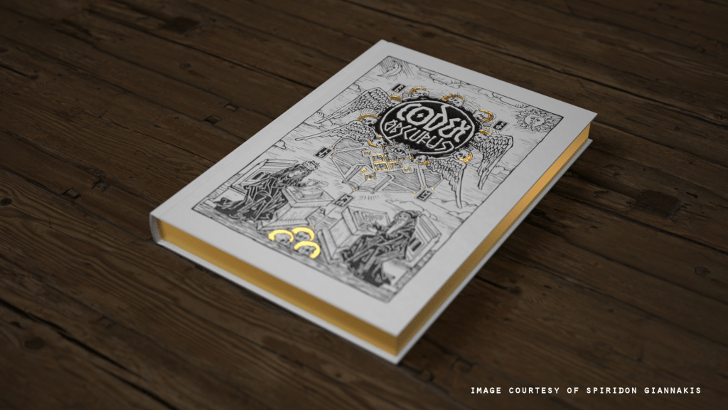
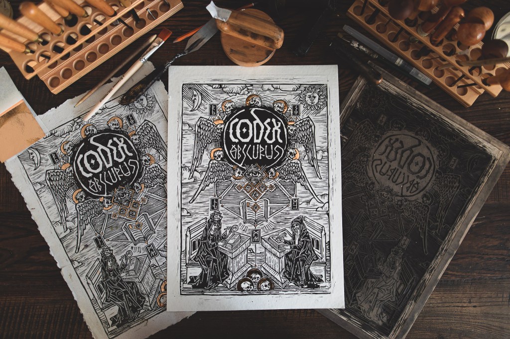
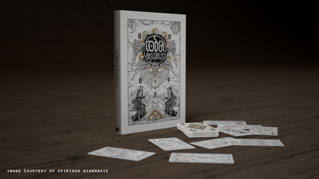
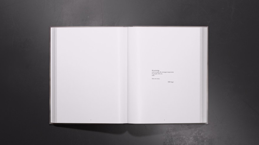
I had the immense pleasure of opening my copy of CODEX: Obscurus this week. This was an artist collaboration of ‘witchy’ and occult themed artwork produced by SPIRIDON; whom I must thank again for including me among such talents. The book itself is quite hefty, and I’m especially loving the texture on the cover and back  ̶  not to mention it’s glittery and gold, who can resist that? Each artist has a page dedicated to their work, so you get the enjoyment of seeing the work in proper scale (no small/quarter images). On top of that you have the talents of Viktor Pushkarev with all his lettering, graphic, and calligraphy work. I’m now on the hunt for a proper frame for his lino-cut print. If you’d like to see some more of his intricate-designs, his contribution to Alex Konstad’s Artbook, Obliskura is a good place to start  ̶  link here (you’re welcome…it’s mind-blowing).

If you missed out on the original Kickstarter campaign, I believe there are a few copies of just the artbook itself out there for purchase from Liber Distri.

If you’d like to see more about my piece for this artbook, The Ritual, I did a blog post (here) last year which went through some of the process. The original artwork is available for purchase; if you’re interested please check out the Shop section. Thank you everyone for your support in this campaign, it wouldn’t have been possible without you!
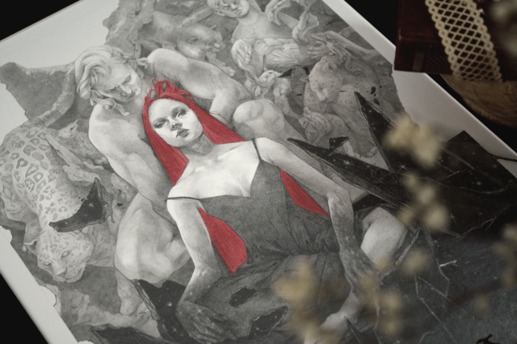
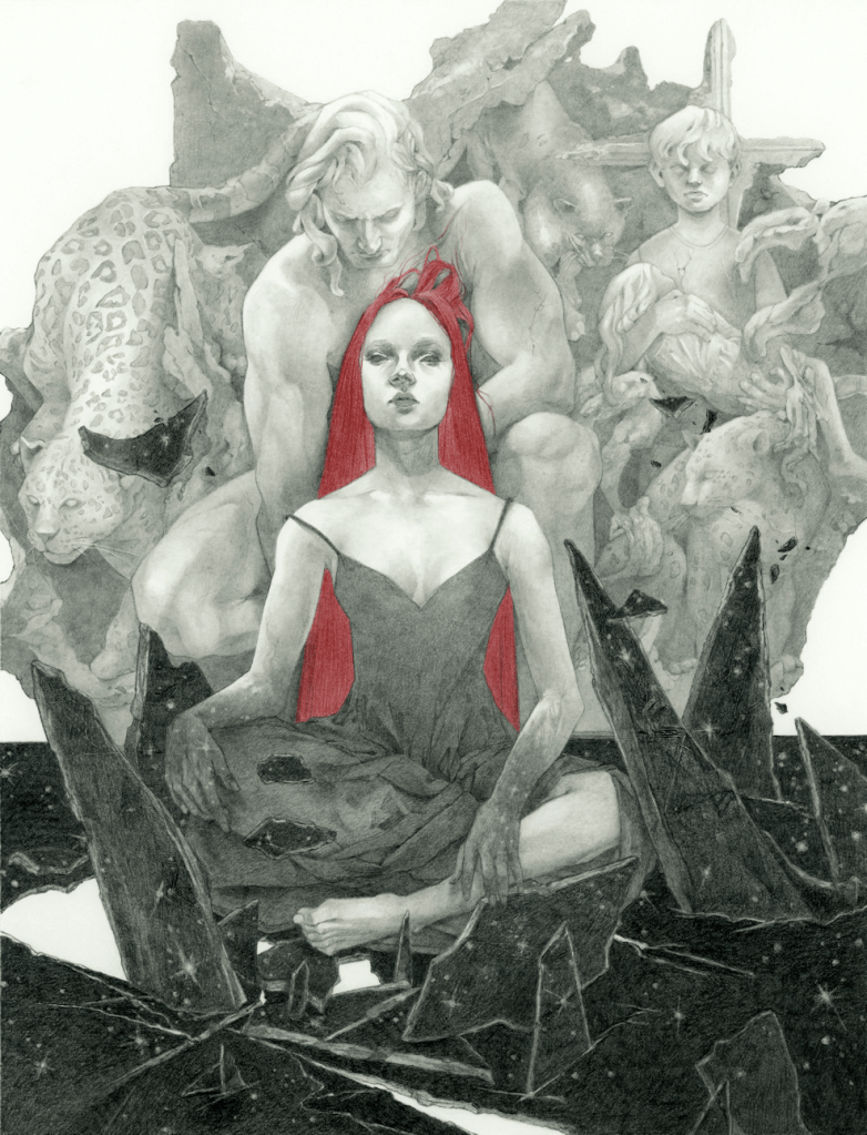
NightStar | Graphite Drawing

NightStar, graphite & colour pencil, 10×13″ (11×14″ paper), 2022.

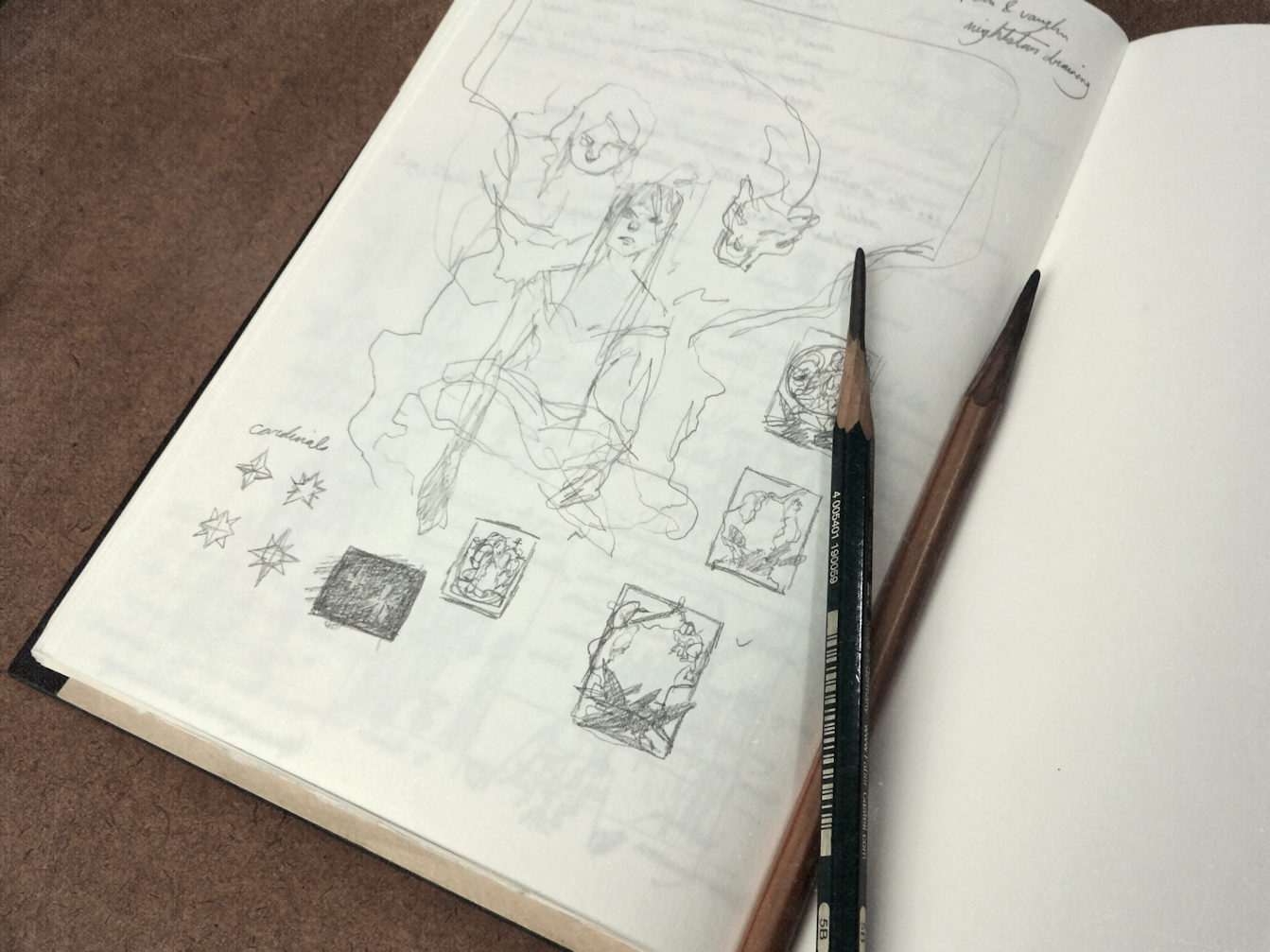
PRELIM

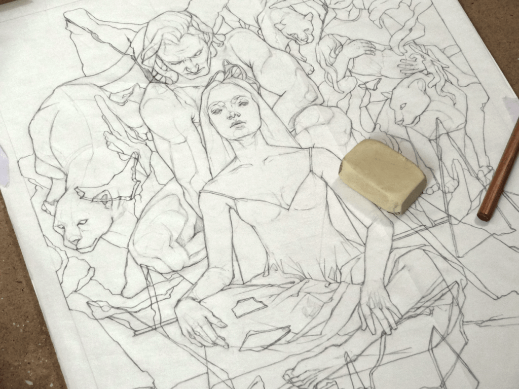
Starting with some brief thumbnails in the sketchbook. Going through Nalini Singh’s second installment in the Psy-Changeling series for some inspiration. Admittedly these tiny drawings look like a bunch of chicken-scratch, but it has been enough to save ideas nonetheless.

(below)

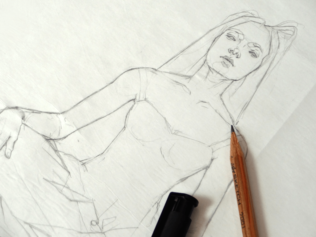
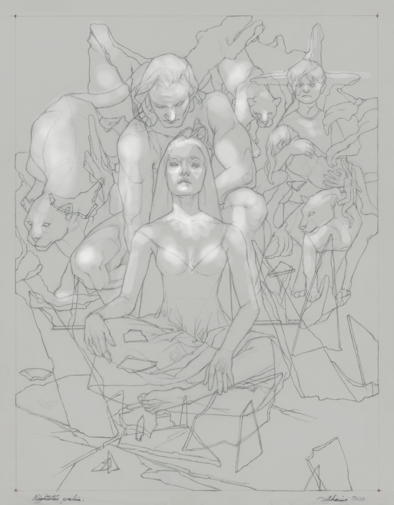
Starting the preliminary drawing on a sheet of vellum/drafting paper.


Taking the finished line drawing and creating a simple lighting/value study on Paintshop Pro; using various references as a guide.

Drawing in Progress

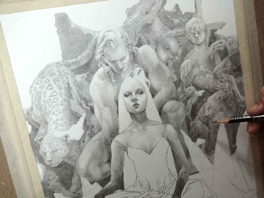
Line drawing transferred onto a sheet of Strathmore Bristol paper, followed by light applications of graphite; slowly building up to the darker values.


Reacher | June 2022 Updates

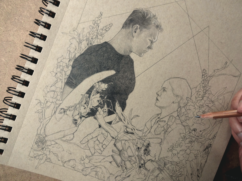
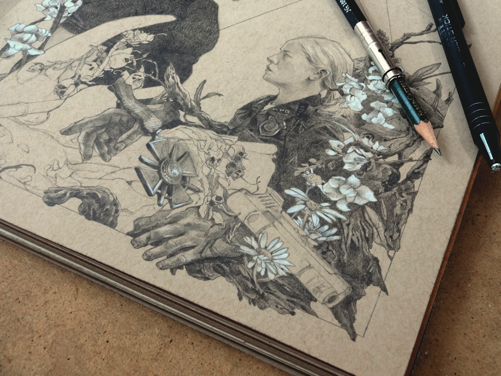
For this drawing I wanted to incorporate little things here and there from the show. I’ll avoid listing them all out, so as to not put out spoilers for those who have yet to watch the series or read the books. On a side note, drawing skulls, bones and such things haven’t ever bothered me; I’ve got so say I’ve never been more troubled by nature than while studying Snapdragon seed pods.

Killing Floor, graphite & white colour-pencil on paper.

I went on a bit of a binge-watch in February when I heard good things about Amazon’s Reacher series; starring Alan Ritchson, Willa Fitzgerald & Malcolm Goodwin. I was pleasantly surprised at how much I enjoyed it, dare I say it’s been the best show (live-action) I’ve watched in the last couple years (Arcane obviously did me in with its Art Nouveau & Steampunk visuals). The first 2 episodes of the show sold it for me with some seriously awesome fight choreography, and kudos to Alan all while filming through the magnitude of his injuries; I admittedly squeamed quite a bit this season with every ankle that Reacher broke. Bonus points as well for the mini Smallville reunion; I know both Alan and Kristin have been in other projects, but 2000s nostalgia just won’t let me forget.

I believe the second season will be skipping forward to book 11 Bad Luck and Trouble, so this gives me more of a push to get started on reading the rest of Lee Child’s Jack Reacher series. Thriller and crime novels haven’t really been on my list of things to read, as I tend to gravitate more towards Fantasy, Sci-Fi or Regency/Victorian titles. Shows like this and Jack Ryan however make me want to pick up some books in this genre. If you have any recommendations please feel free to leave them below.


UPDATES

EMBERS & STONES

I’ve been creating some new designs for the shop with a new toy in the form of a chasing hammer. If you’re new here, thank you for visiting, I also create jewellery and other crafty trinkets which can be found on my Etsy Shop Embers and Stones. I’m enjoying new ways to incorporate wire-work designs. The chasing hammer will definitely require some more experience, not to mention I’m now regretting not investing in a higher quality German brand I decided not to get at the time.

I’m slowly adding pieces to the shop as I get time to make them, and am grateful for everyone who has been purchasing items in the meantime. This time around I decided to go for some Norse and Greek Mythology themed Brass pieces. I’ve been giving my fingers a little bit of a break, but I have to admit I’ve been itching to attempt more complicated weaving techniques. Getting hold of supplies during this time has also been a nightmare.

SHOP | ORIGINAL ARTWORK

I’ve decided to close a few of my stores as they weren’t quite working for me. If you are interested, I now put up new originals that are available for purchase on Big Cartel and other studio clearances (as well as prints) on Etsy | Art of Shaima. A few original paintings and drawings have already found new homes, which I’m so ecstatic about. I think all artists say this, but nothing compares to packing up an order to send to a patron. Thank you very much for your continued support!

The Woven Path | November Auction

Auction Begins Monday

This Monday The Changeling Artists Collective on Facebook will be hosting the auction for original artwork, prints, and drawings from the Woven Path Tarot Project. My watercolour painting will be part of the auction, as well as many other wonderful pieces from this Tarot project. XII. Death is my contribution to the deck; the original painting (without digital edits) varies a slightly to what will be seen in the finished product. So if you’re looking to get your hands on the original piece, please head over the link below to participate in the bids or BIN (buy it now) option. *Please note that the BIN option is only available for a limited time before the auction begins.


The Faery Ring

changeling artists collective

Nov. 22, 12:00 EST – Nov. 26, 12:00 EST

Auction here on Facebook | Info. & Bids

CODEX Obscurus | 2021

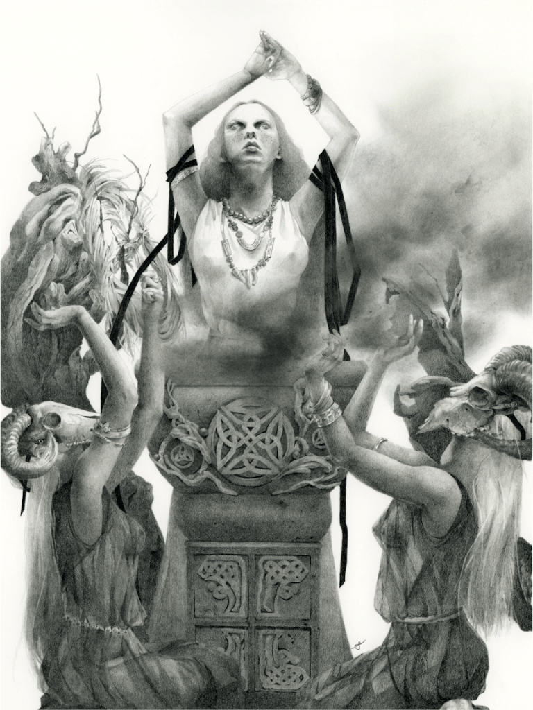
The Ritual, graphite, 12×16″ (on 14×17″ paper), 2021
Strathmore 100lb. 270 g/m2

I shared a little peek into this piece sometime earlier this year, but with the project now on full swing on Kickstarter I can announce that this drawing will be part of the CODEX Obscurus Artbook. This is a project by Spiridon Giannakis with cover and Tarot deck design by Viktor Pushkarev, and is a collaboration with an incredibly talented lineup of 145 artists and their unique take on witches & warlocks, witchcraft, the occult and various folklore. As a bonus, I along with several others will be putting forth our original artwork (The Ritual in my case) for purchase in this campaign. If you are interested acquiring an artwork please head over to the Kickstarter page for all the info.

Now Live on Kickstarter

kickstarter.com/projects/spiridon/codexobscurus

The campaign runs until the end of the month & there are just a few more stretch goals to go! If you would like to back this project please head over to pledge.

Limited Edition Prints & Campaign Bundles

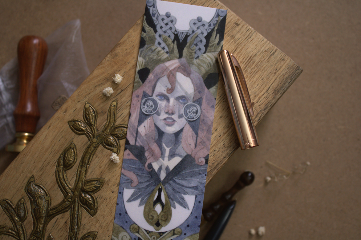
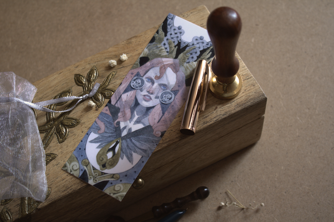
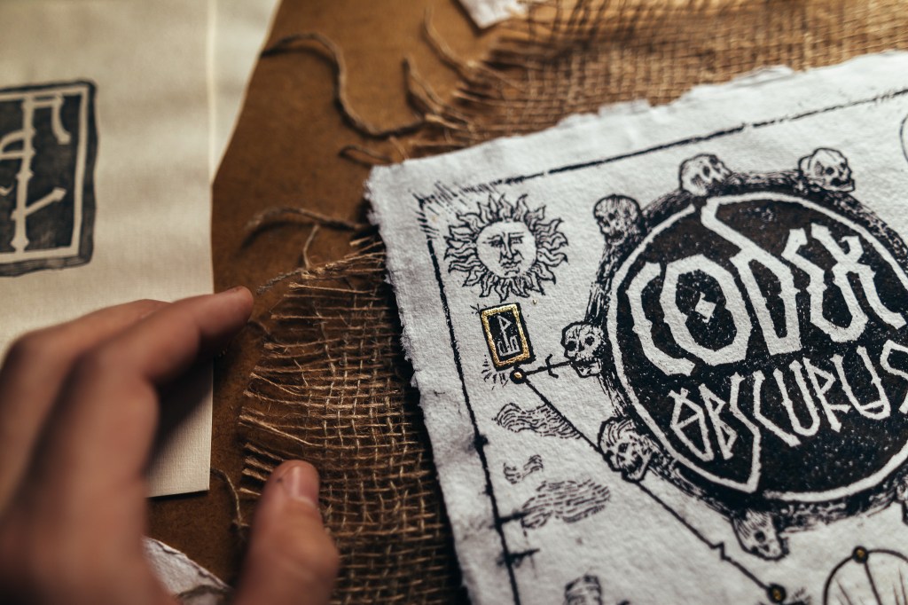
There will also be a limited edition run of these amazing hand-made prints by Viktor. Here’s just a little peek at his process, but you can find more behind-the-scenes on the Codex Kickstarter page as well as on Viktor’s Instagram. Depending on the pledge, there will also be different extras from other artists in this campaign from high quality Prints, Postcards, Posters & Bookmarks; with the potential of even more bonuses with the unlocking of stretch goals.

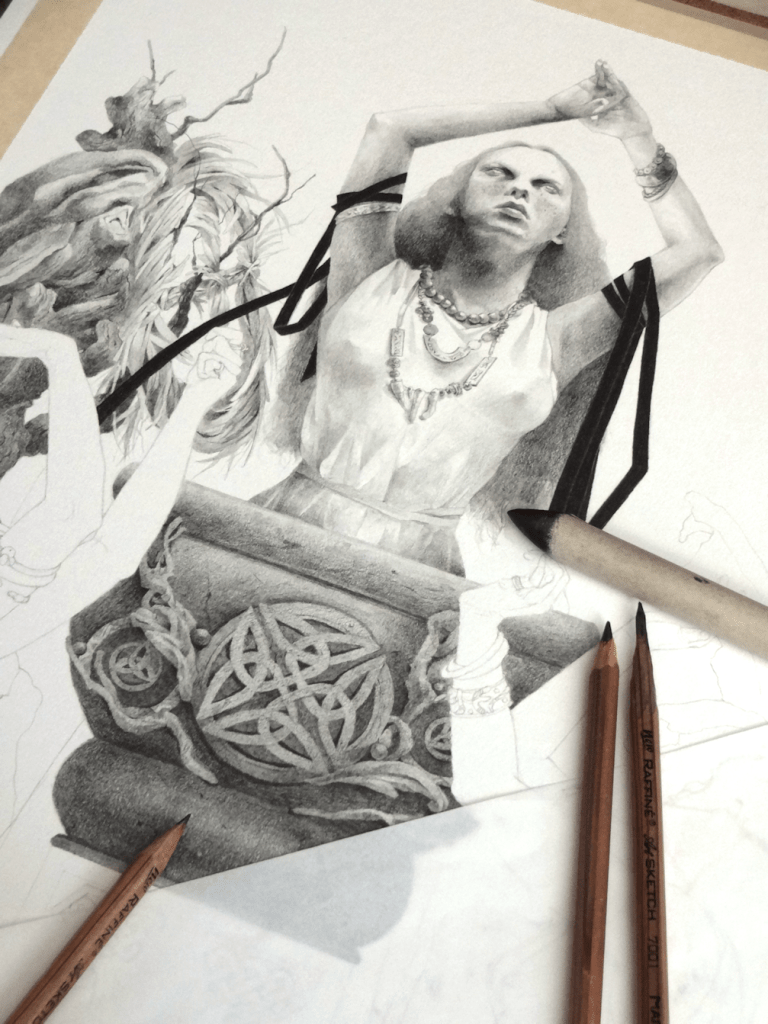
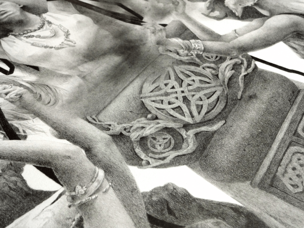
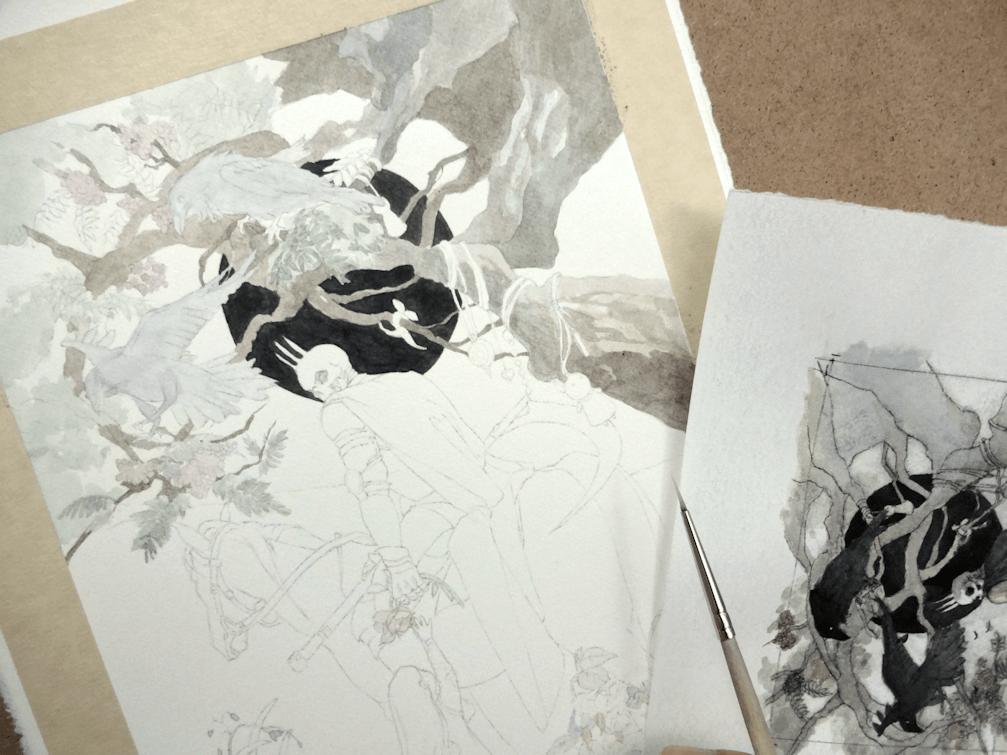
The Ritual: a look into the process

For this project I decided to go with a full graphite piece. I wanted a break from painting with watercolour last year and although I hadn’t touched graphite in while, I felt confident again after laying down the foundation and just having at it. It also helped that I was excited to create something that was very much in line, thematically, to my own work.

I knew I’d be working with a lot of blending and powdered graphite ‘washes’, so I started by taping off the borders for a clean look for the finished product. Once the prelim sketch had been transferred onto the paper, I worked in layers from 2B pencils all the way to 6B & 7B for the darkest as I could go. To achieve the softer appearance I like to create in contrast to the more defined Celtic designs and such, I went to my trusty blending stumps as well as the usual no nonsense tissue paper. This project was also an attempt to improve on metallic elements (or in this case jewellery); working in grayscale and then using an eraser to create effects for a more realistic rendering.

I hope you enjoyed a look into this project and hope you will support our work through this artbook. Take care everyone!


Hunter | Graphite Drawing

Hunter, graphite & colour-pencils on paper, 8×10″, 2021

BACK TO GRAPHITE

I’ve been enjoying all the Inktober pieces from artists on social media, as usual I haven’t been able to get into it myself. I’m fully determined to keep saying ‘next year’ however, until I get something in for the darn monthly challenge! Meanwhile, I’ve taken a little break from watercolours again, as we near the end of the month. This one being a more fun and free project, taking a character from author Nalini Singh‘s work and imagining it into a more illustrative piece.

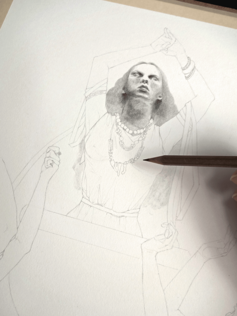
Starting off using the same technique from my last painting (Banshee’s Wail), and layering the preliminary drawings so they are ready for the transfer stage. This time around I wanted to play with more dramatic lighting, as I’m slowly starting to get more comfortable with it for future projects. I decided to do some simple black and white lighting samples on Paintshop Pro. It’s not a really an depth study, more of an assurance really so that I’m not going to desecrate the drawing when I work in graphite powder onto the paper. Speaking of paper, I’m using Strathmore’s Bristol 100lb. (270 g/m2) in Smooth Surface. I’ve used both the vellum and smooth surface sheets from Strathmore for many years now, and I usually shift between the two if I want more texture or not; I tend to shy away from more textured paper however because I like to scan my pieces for digital use.

I tend to use graphite powder for mainly large surfaces I want to cover, and I believe you can purchase it as well. I don’t have any experience with it so I tend to just use the saved ‘residue/remnants’ of when I sharpen my graphite (using the blade method to sharpen of course). Using a tissue I then work it in, and for this particular piece adding in various forms with my Blending Stumps. I ended up feeling that the piece was a bit on the grey-scale of things and flatter than my usual work; in which I usually have some pure black elements for contrast, so I thought it might be fun to add some colour instead. Sticking to the paranormal and fantasy aspect of the author’s work, I chose to just focus on the eyes (…or rather eye) with various shades of green colour pencils. Overall, a much needed casual and experimental project; although I never want to see leopards or spots again.

Hope you all have a fun Halloween!

A CLOSER LOOK


(This post contains affiliate links. I can receive a small amount of commission should you choose to purchase from a link provided. It helps me keep this blog going and supporting my work here on this site. I will only recommend items I’ve used and already purchased with my own money, or know enough about to recommend as an alternative.)

Banshee’s Wail | Watercolour Painting

A CONFOUNDING PIECE

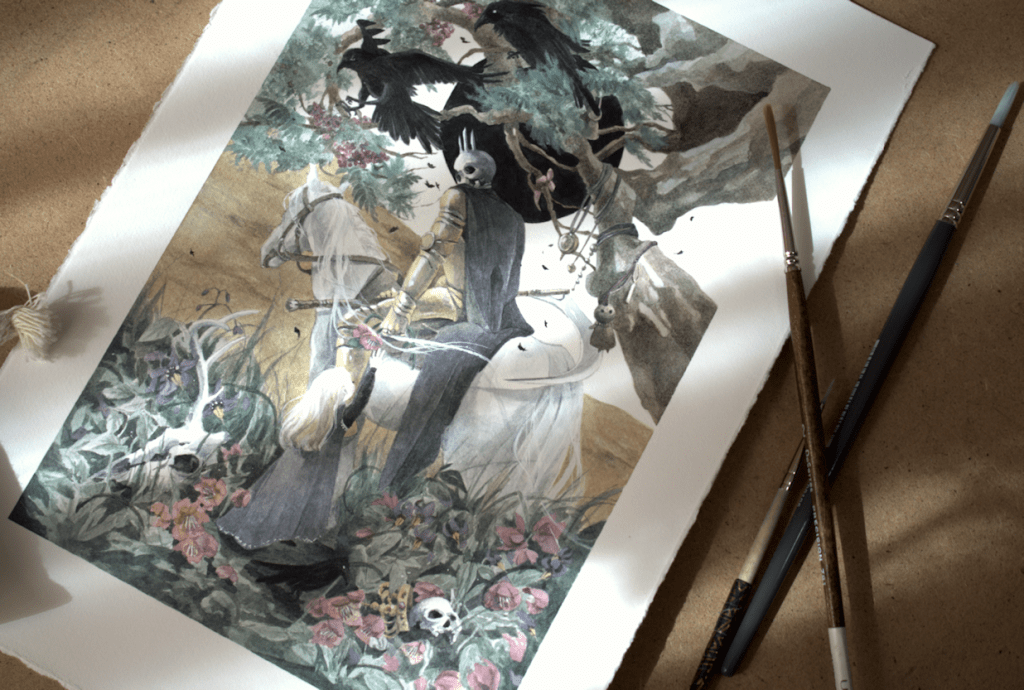
Hello everyone. I’ve finally had the chance to get this one scanned and uploaded. My latest painting Banshee’s Wail, taking on themes of Irish folklore. This year has been a roller-coaster ride of emotions in terms of development of artwork and style. Taking this piece for example. What started off as an idea I couldn’t wait to get on paper, transformed into a drawing I really liked, and then the initial excitement petered off. Any other artists out there who can’t stay on an artwork for too long? In the end I was satisfied having accomplished somewhat of what I had imagined in my head. I’ve found the best remedy in these situations is to just move on and create more. So off to a new drawing I’ve been working on…and of which I’m enjoying far more than the process of this painting. I think after a little self analyzing it’s come down to missing incorporating some design elements I used to love doing. Let me know what you guys think and feel free to share your own experiences; I love chatting with you all. As always thanks for stopping by the blog, and hope you are all well!

Banshee’s Wail, watercolours, 8.25×10.75″, 2021

Original now available artofshaima.bigcartel.com

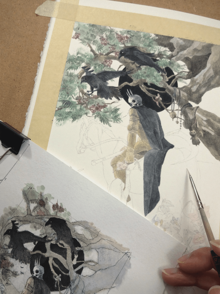
NEW METHODS

If there was one takeaway from this painting, it was through the preliminary stages of the piece. I’ve been trying out a different way of developing the initial drawings for the transfer stage. I usually just go the regular route and add in elements, erase, add some more. With this method I’d be transferring each individual element/figure one at a time from tracing paper onto the final sheet. The idea is to eliminate the need to erase parts of a perfectly good drawing in the vicinity of another piece being added to the artwork. Personally what tends to happen when trying to overlay other figures and objects, is the sheer number of unavoidable adjustments; trying to get the face, anatomy, flora, etc. just right. I’m not sure I’ll use this technique for all future work, but it seems useful at the moment for pattern and graphic elements, or in the case of this painting for sheer and translucent subjects. A lovely follower on Instagram referred to it as “analog Photoshop layers” which hadn’t occurred to me till now; a fun way to look at it nonetheless.