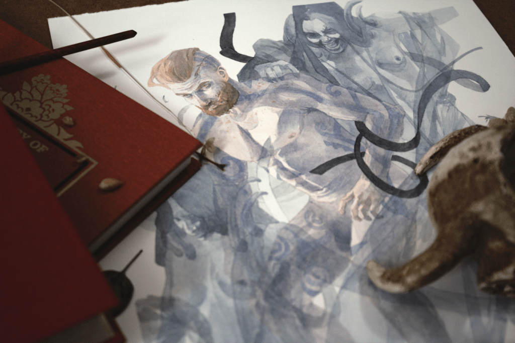
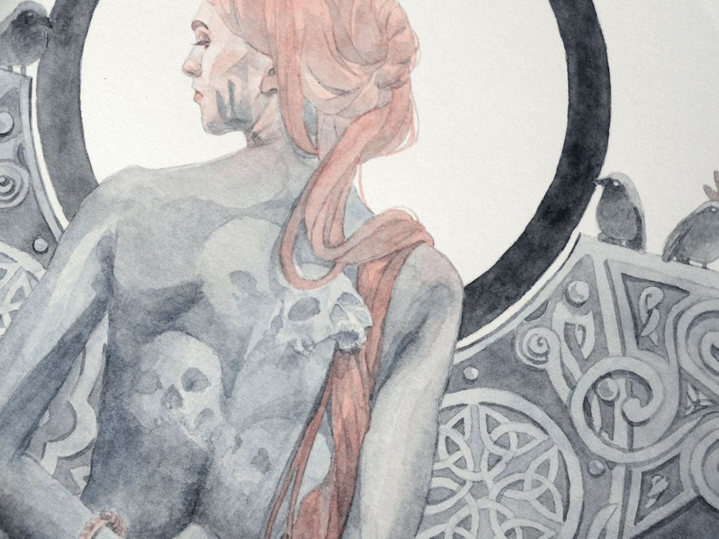
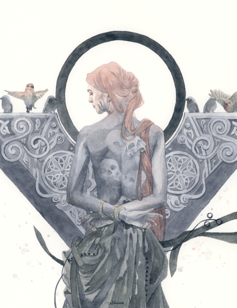
Banshee’s Wail | Watercolour Painting

A CONFOUNDING PIECE

Hello everyone. I’ve finally had the chance to get this one scanned and uploaded. My latest painting Banshee’s Wail, taking on themes of Irish folklore. This year has been a roller-coaster ride of emotions in terms of development of artwork and style. Taking this piece for example. What started off as an idea I couldn’t wait to get on paper, transformed into a drawing I really liked, and then the initial excitement petered off. Any other artists out there who can’t stay on an artwork for too long? In the end I was satisfied having accomplished somewhat of what I had imagined in my head. I’ve found the best remedy in these situations is to just move on and create more. So off to a new drawing I’ve been working on…and of which I’m enjoying far more than the process of this painting. I think after a little self analyzing it’s come down to missing incorporating some design elements I used to love doing. Let me know what you guys think and feel free to share your own experiences; I love chatting with you all. As always thanks for stopping by the blog, and hope you are all well!

Banshee’s Wail, watercolours, 8.25×10.75″, 2021

Original now available artofshaima.bigcartel.com

NEW METHODS

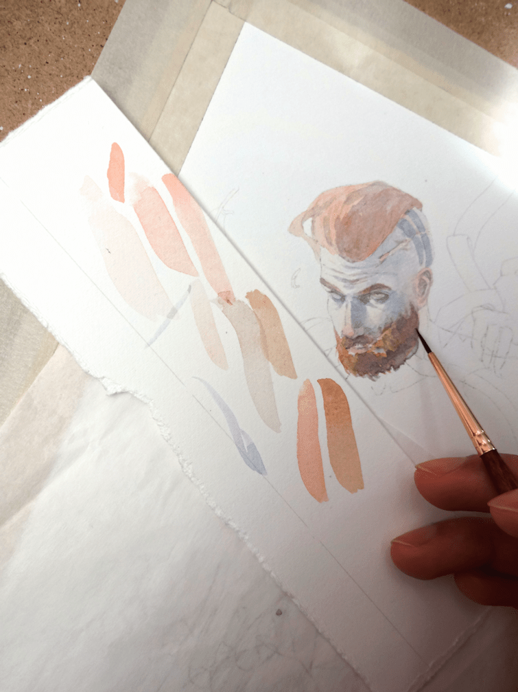
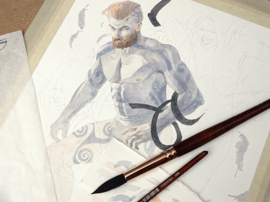
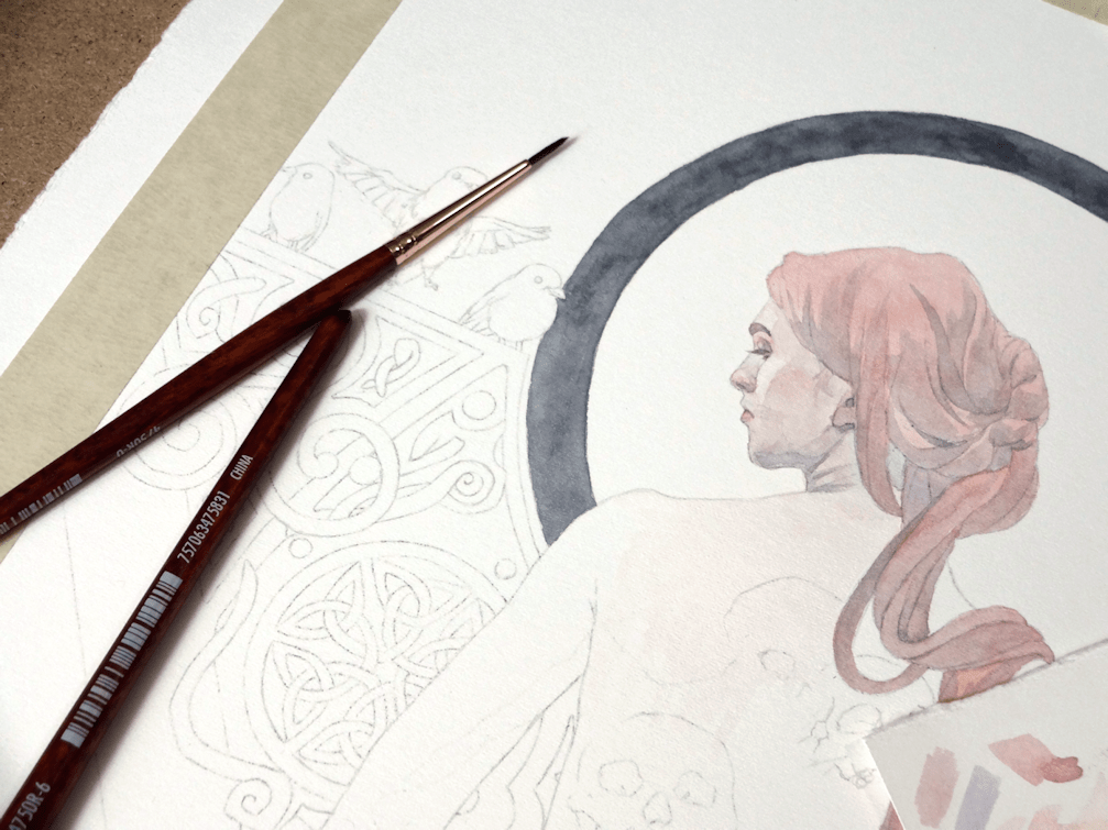
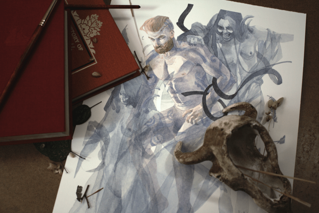
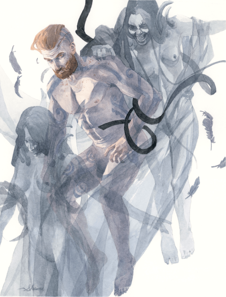
If there was one takeaway from this painting, it was through the preliminary stages of the piece. I’ve been trying out a different way of developing the initial drawings for the transfer stage. I usually just go the regular route and add in elements, erase, add some more. With this method I’d be transferring each individual element/figure one at a time from tracing paper onto the final sheet. The idea is to eliminate the need to erase parts of a perfectly good drawing in the vicinity of another piece being added to the artwork. Personally what tends to happen when trying to overlay other figures and objects, is the sheer number of unavoidable adjustments; trying to get the face, anatomy, flora, etc. just right. I’m not sure I’ll use this technique for all future work, but it seems useful at the moment for pattern and graphic elements, or in the case of this painting for sheer and translucent subjects. A lovely follower on Instagram referred to it as “analog Photoshop layers” which hadn’t occurred to me till now; a fun way to look at it nonetheless.

Soul Collector | Watercolour Painting

Testing New Brushes

I’ve been meaning to get some new watercolour brushes, as the ones I’ve been using (although having served well for years) are fraying and/or have rogue hairs going in one direction. Debating on whether or not to invest in squirrel-hair brushes, I decided it wouldn’t really serve me any purpose as I like painting in a particular way; and perhaps even more impractical for those who use hot-press paper. There are definitely a wide range of brushes out there and admittedly quite overwhelming, but after watching some reviews by other artists on Youtube I settled for trying out the Princeton Neptune range. I went for the Round Synthetic Squirrel in 0, 6, & 12 (as they are the sizes I use the most) of the 4750 Series. I’ll provide links below of where I got mine, even though this is not sponsored, and I’ll be sure to provide updates on how they fare with more use. I’m loving them so far, as the handles in particular feel more comfortable than my standard ones from the art stores here like Deserres or Curry’s. If any of you have used brushes from this brand please share your experiences in the comments, or even what your favourite brushes are; I’m sure we could all glean something useful from it. In the meantime I’ll be continuing using these new brushes as I’ve done for this latest piece, and will be retiring my older brushes for inks and acrylic washes.

Princeton Artist Brush | Neptune Series 4750 | Round Synthetic Squirrel, Size 0

Princeton Artist Brush | Neptune Series 4750 | Round Synthetic Squirrel, Size 6

Princeton Artist Brush | Neptune Series 4750 | Round Synthetic Squirrel, Size 12

The Prelim.

As usual I started out with my drawing on tracing paper, eventually transferring the finished product with a graphite backing and tracing all the lines and details. I was sharing this thought on Instagram as well but, does anyone else hate ‘transfer’ days as much as I do?! Recently I’ve been laying some scrap paper as masking (as you see on the right side), just so I have less graphite residue to erase off of my watercolour paper when I’m done transferring.


The finished drawing ready for transfer.

There’s no better feeling than finally getting to put pigment to paper.

You always feel ambitious with the thought of filling a piece with knotwork, until the realization sets in of having to trace said knotwork for a second time accurately. I cheated a bit with this piece as you’ll notice with my preliminary drawing as I drew in only one side; the other side was cheekily transferred by doing a mirror/flip transfer of the paper. I also decided to incorporate some cute little Robins as well; going on themes of death and souls for this painting. You might be wondering what on earth I’m talking about, and rightfully so. I often tend to come by weird articles and stories (go figure), and a few that have interested me are of Robins visiting people in grieve and mourning. One in particular was that of a woman grieving the death of her child at his grave and a robin flying and landing on her. I hadn’t known of the bird’s connection in folklore and symbolism surrounding death. Truly fascinating.

Soul Collector, watercolours, 8.5×11″, 2021