Margarette| Watercolour Painting


Drawing Without Reference

Going into this year I really wanted to improve the way I drew faces and proportions. Most important of all I wanted to be able to see said improvements when not working with any references. I was noticing the loss of creativity that I had an abundance of, when I used to create art in the early days of middle & high school. Back then I was doing more of a manga/anime style work, however I had much more creative ideas come through in terms of design.

A really good article that caught my eye earlier this year was The Danger of Reference by Jesper Ejsing via. Muddy Colors (A website you should be following if you’re interested in acquiring a wealth of knowledge from artists in the industry). It was something that I had gotten too comfortable with, and something I hadn’t even noticed or thought about until I read Jesper’s article. I had indeed created a safety blanket for myself over these last couple years, relying heavily on references for all my work in every stage. Although there isn’t anything inherently wrong with this process (most artists require references at many stages of their work), there is a danger of killing creativity if you don’t step outside the technical once in a while. This reliance on references came from an insecurity of my own skills as an artist, and of course comparison to the masters in the fantasy art and illustration industry.

So at the end of September, as sort of a spur of the moment thing, I decided to do a painting in which I would draw a face without the help of any reference material. …Confession, I did give up on the hands 😅; something I have yet to master in terms of structure/shape. I am pleased I was able to come up with a face, composition and design at least. Small steps.

Margarette, watercolours & acrylics on paper, 8×10.5″, 2020

WIP.

This painting along with many other originals are available for purchase directly through the Shop section in this website. If you are looking for prints, please visit my Inprnt store.

Update & August Sketches

August has just flown by for me. It started out rather slow, and then ideas kept piling up and now I’m feeling a little overwhelmed. 😯 While I get into finishing up some newer pieces, I thought I’d share some sketchbook drawings from this month. I’ve been trying out the Strathmore Drawing Sketchbook, and it’s quite fantastic I have to say.

Head studies using Victorian & Edwardian photo references.
graphite & acrylic ink

New Project, Kickstarter Collab.

I’m excited to also share that I’ll be joining a roster of very talented artists in illustrating part of a Tarot Deck from Changeling Artist Collective. Guesses as to which card I’ll be illustrating? 🤭 The project will be coming to Kickstarter in 2021, so make sure you follow CAC on Instagram as well to keep up to date. Here’s a little sneak peek at what I’m working on.

July Painting – VENTRESS

The Switch

I’ve made the switch to hot-press paper. Having conversations with other artists and looking at their process, it was time to switch over and give this paper a try. I think I’ll always prefer cold-press; the texture and depth of colours you can achieve is much more satisfactory, but alas the scanning results in my opinion are rarely so for displaying work online (especially for more illustrative pieces).

Stock piling and clutter in both art and life is not something I’m keen on. Something I’ve had to reconsider during this pandemic. Luckily I had enough supplies until shops opened up again, but what I didn’t have on hand was hot-press paper. A month back, the only shop that had any in stock here in Toronto was Deserres. 4-5 ‘misroutes’ with Canpar, emails & phone-calls back and forth with both companies, and I finally had my paper arrive in a bent cardboard box. …I don’t know if I was more surprised at having received my shipment at all, or that the paper had somehow survived with minimal damage. Yay to Canadian postal service. 👍😑

Ventress, watercolours & acrylics on 11×15″ paper, 2020

New Vision for Ventress

I chose to test out Fabriano’s Artistico Hot-Press Watercolour Paper. I would suggest everyone do a little test run before starting a new piece, but seeing as I didn’t follow my own advice it seems a tad bit hypocritical to say so. 😅 After success with this paper and seeing that it wasn’t a waste of money, I’m eager to try out Arches‘ (pricier) paper as well. I had little to no warp with this one, although I’m suspicious of my 3m masking tape playing a part as well. I don’t put down a lot of heavy wet washes either, so I can’t say what the result would be for those of you who like to do so. Again, do your tests!

I suppose it’s no surprise I’m doing another Star Wars related piece. With the last season of The Clone Wars finished and looking forward to both Season 2 of The Mandalorian and The Bad Batch, my head is constantly buzzing with ideas for artwork. I’m keeping my fingers crossed for Dave Filoni to continue the stories of SW Rebels characters, and that of Ventress in future animated projects. I had hoped to see more of her life after serving the Sith and her new missions as a bounty hunter; even more interactions with Boba’s team perhaps.

Achieving some ‘glowy’ eyes with acrylic paints.

Keeping the bounty hunter theme in mind, I wanted to soften Asajj’s look by giving her hair again (drawing on the flashbacks of her lavender hair as a child), as well as changing her usual Sith attire to more of a civilian one. Taking liberties of course from the original art & design, I played around with additional Sith corruption marks and tried to include references to her Dathomirian heritage with things like beaded necklaces, and of course some elements of witchcraft & necromancy. This was a fun little side project to work on, although personally it’s always nerve-raking to mess around with original visions of any series.

Process.

3rd time’s a charm; various attempts of re-imagining Ventress.
The final drawing on tracing paper before adding some tidbits of embellishments.

Through the Void – Graphite Drawing

Graphite WIP for Through the Void

As a promise to myself to improve my figure drawing, (the male form in particular), I was surprisingly satisfied by the end of this piece. My current displeasure with my work was that there was something off about how my figures in my watercolour paintings were looking. There was a flatness that I didn’t really like, and really wanted to improve on. Therefore I went back to the basics with graphite. Obviously a much more forgiving medium, it gave me the chance to really analyze what I was missing in how I presented the male/female form in my work; taking a slower pace, and building up each layer with shadows, highlights & textures. I think the next step will be to play around with much more dramatic lighting to add more dimension to faces and figures.

It was also really fun to play around with some of the graphite shavings/residue I had saved from sharpening my pencils. So do save them if you sharpen your tools with a blade! 🙂 Although scanners don’t do a very good job at picking up the subtleties in traditional work, I hope you can at least see the attempt to create more solid black planes. I’ve wanted to incorporate this technique for a while now, without using black paper or ink washes. Although easily created (as seen in the halo), there will inevitably be a visible texture no matter how dark the graphite. So this technique was quite interesting to try out, as well as figuring out whether I like graphite better on white or tan-toned paper. The verdict’s still out on than one.

Through the Void, graphite on 11×14″ paper, 2020

June – New Additions to the Shop

It’s been fun to do a few smaller works these past few weeks. I’ve added 2 new drawings to the shop section, so if you’re interested please do check them out under ‘Minis and Postcards’. As always thank you for your support, and feel free to contact me for any further info on originals. 🙂

Study 01, markers & microns on paper, 6×7″, 2020

Emissary – Watercolour Painting

Latest painting for June, Emissary. Although I’ve found a style that has comfortably worked for me over the years, I’ve really had this urge to push myself further. I’m sure other artists have had such instances; not necessarily criticism or even a need to changes one’s style, but a nagging unsatisfactory feeling. The frustrating part is that you have it planned in your head, but the execution isn’t necessarily as forthcoming on paper. If you follow me on Instagram, you’ll have seen that I’ve fallen back to the sketchbook many times. I’ve felt my figures were in dire need of improvement. Although I’m not a realism painter by any means, I’ve felt the lack of substance in the forms I’ve drawn/painted lately. Here’s hoping to improvements in the next pieces. 🍹

Emissary, watercolours on paper, 12×18″, 2020

A Slow May – WIP & New Minis

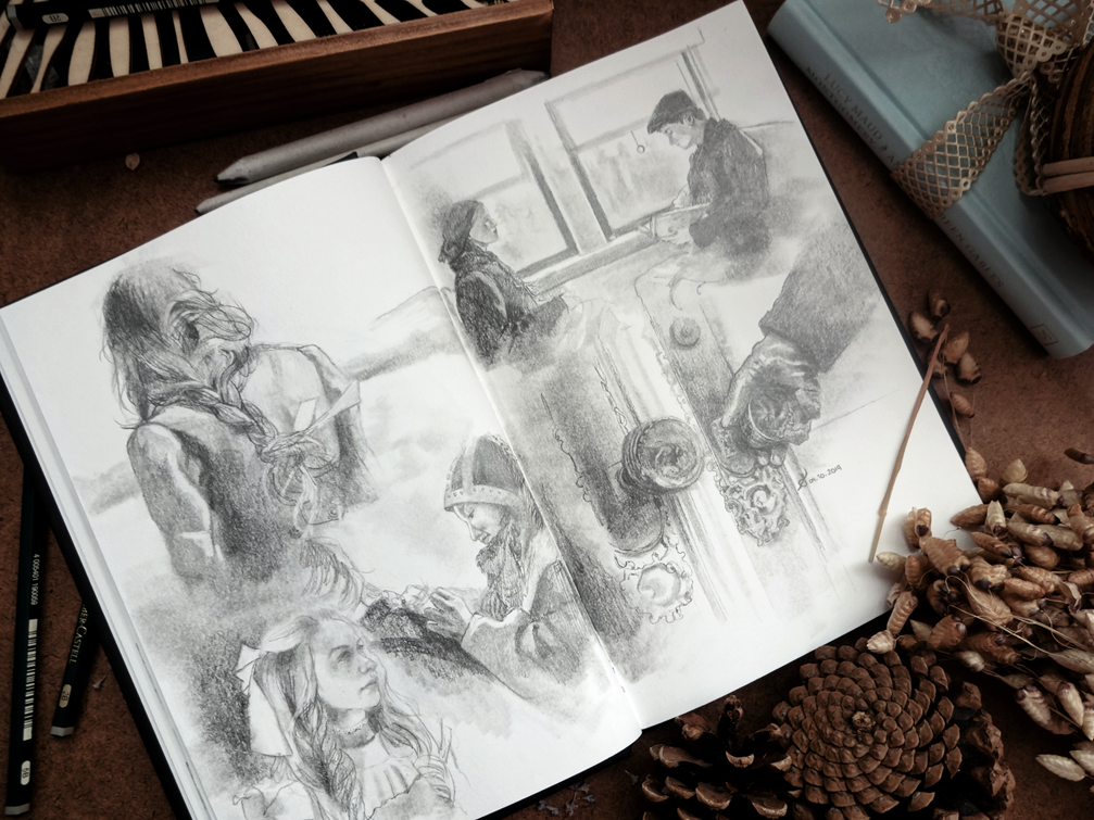
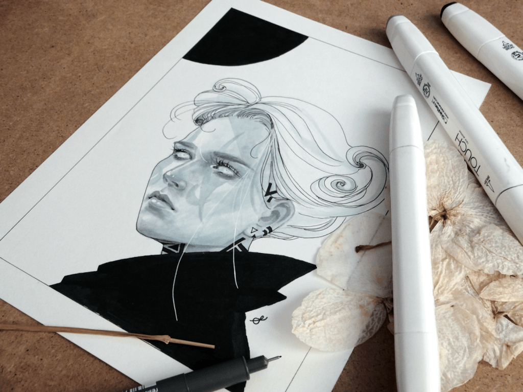
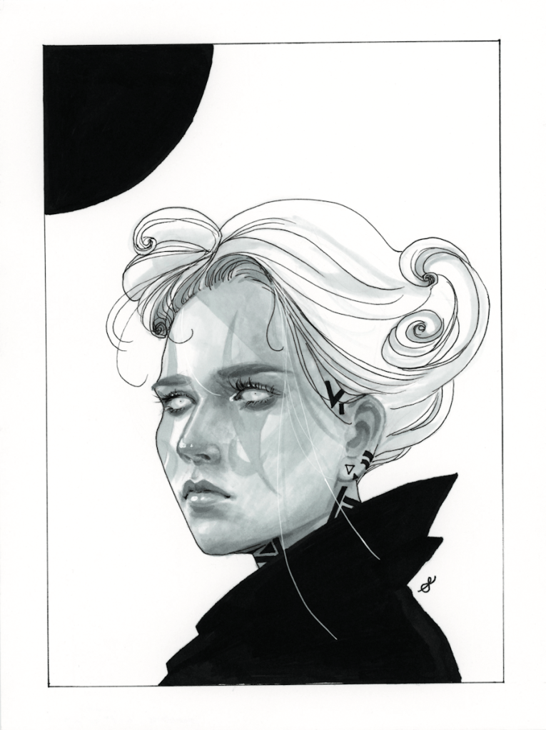
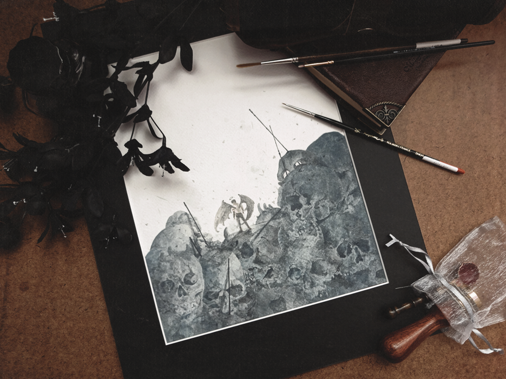
Although my head’s buzzing with ideas at the moment, this month has been rather slower than I would have liked. I had been struggling with the usual artist block, which returning meant too many ideas all at once. 😫

In hopes of improving whilst simultaneously creating new artwork, I’ve decided to do a bunch of these mini drawings. Keep an eye out in the shop if you’re looking to purchase any of these upcoming small originals. 🙂

Sight, markers/microns on paper, 6×8″, 2020

watercolour painting, wip.

A little peak at a new watercolour painting I’ve been working on.