Work in Progress | Watercolours

New painting in the works. Watercolour on paper.

Margarette| Watercolour Painting


Drawing Without Reference

Going into this year I really wanted to improve the way I drew faces and proportions. Most important of all I wanted to be able to see said improvements when not working with any references. I was noticing the loss of creativity that I had an abundance of, when I used to create art in the early days of middle & high school. Back then I was doing more of a manga/anime style work, however I had much more creative ideas come through in terms of design.

A really good article that caught my eye earlier this year was The Danger of Reference by Jesper Ejsing via. Muddy Colors (A website you should be following if you’re interested in acquiring a wealth of knowledge from artists in the industry). It was something that I had gotten too comfortable with, and something I hadn’t even noticed or thought about until I read Jesper’s article. I had indeed created a safety blanket for myself over these last couple years, relying heavily on references for all my work in every stage. Although there isn’t anything inherently wrong with this process (most artists require references at many stages of their work), there is a danger of killing creativity if you don’t step outside the technical once in a while. This reliance on references came from an insecurity of my own skills as an artist, and of course comparison to the masters in the fantasy art and illustration industry.

So at the end of September, as sort of a spur of the moment thing, I decided to do a painting in which I would draw a face without the help of any reference material. …Confession, I did give up on the hands πŸ˜…; something I have yet to master in terms of structure/shape. I am pleased I was able to come up with a face, composition and design at least. Small steps.

Margarette, watercolours & acrylics on paper, 8×10.5″, 2020

WIP.

This painting along with many other originals are available for purchase directly through the Shop section in this website. If you are looking for prints, please visit my Inprnt store.

July Painting – VENTRESS

The Switch

I’ve made the switch to hot-press paper. Having conversations with other artists and looking at their process, it was time to switch over and give this paper a try. I think I’ll always prefer cold-press; the texture and depth of colours you can achieve is much more satisfactory, but alas the scanning results in my opinion are rarely so for displaying work online (especially for more illustrative pieces).

Stock piling and clutter in both art and life is not something I’m keen on. Something I’ve had to reconsider during this pandemic. Luckily I had enough supplies until shops opened up again, but what I didn’t have on hand was hot-press paper. A month back, the only shop that had any in stock here in Toronto was Deserres. 4-5 ‘misroutes’ with Canpar, emails & phone-calls back and forth with both companies, and I finally had my paper arrive in a bent cardboard box. …I don’t know if I was more surprised at having received my shipment at all, or that the paper had somehow survived with minimal damage. Yay to Canadian postal service. πŸ‘πŸ˜‘

Ventress, watercolours & acrylics on 11×15″ paper, 2020

New Vision for Ventress

I chose to test out Fabriano’s Artistico Hot-Press Watercolour Paper. I would suggest everyone do a little test run before starting a new piece, but seeing as I didn’t follow my own advice it seems a tad bit hypocritical to say so. πŸ˜… After success with this paper and seeing that it wasn’t a waste of money, I’m eager to try out Arches‘ (pricier) paper as well. I had little to no warp with this one, although I’m suspicious of my 3m masking tape playing a part as well. I don’t put down a lot of heavy wet washes either, so I can’t say what the result would be for those of you who like to do so. Again, do your tests!

I suppose it’s no surprise I’m doing another Star Wars related piece. With the last season of The Clone Wars finished and looking forward to both Season 2 of The Mandalorian and The Bad Batch, my head is constantly buzzing with ideas for artwork. I’m keeping my fingers crossed for Dave Filoni to continue the stories of SW Rebels characters, and that of Ventress in future animated projects. I had hoped to see more of her life after serving the Sith and her new missions as a bounty hunter; even more interactions with Boba’s team perhaps.

Achieving some ‘glowy’ eyes with acrylic paints.

Keeping the bounty hunter theme in mind, 
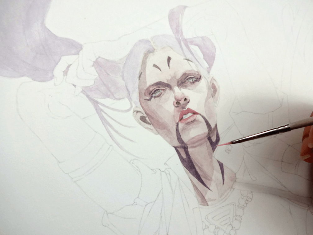
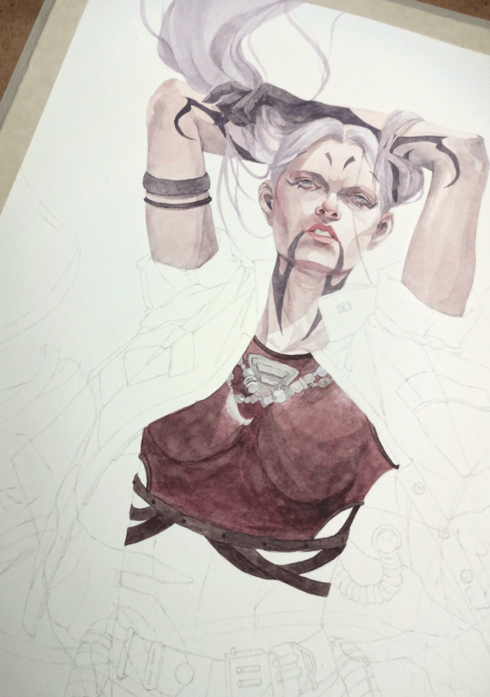
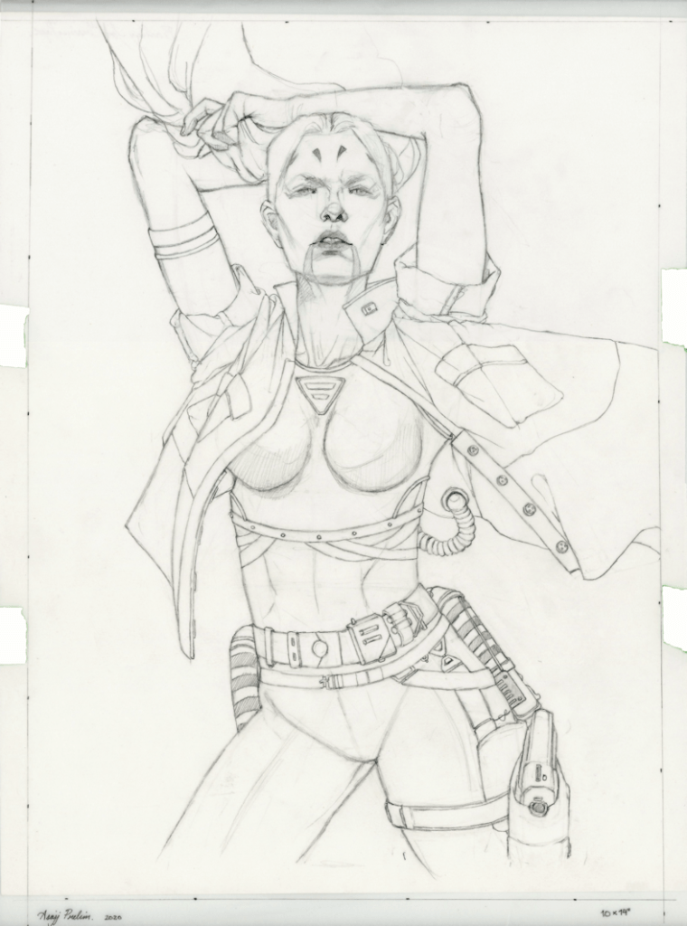
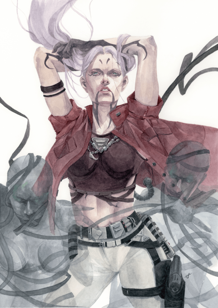
I wanted to soften Asajj’s look by giving her hair again (drawing on the flashbacks of her lavender hair as a child), as well as changing her usual Sith attire to more of a civilian one. Taking liberties of course from the original art & design, I played around with additional Sith corruption marks and tried to include references to her Dathomirian heritage with things like beaded necklaces, and of course some elements of witchcraft & necromancy. This was a fun little side project to work on, although personally it’s always nerve-raking to mess around with original visions of any series.

Process.

3rd time’s a charm; various attempts of re-imagining Ventress.
The final drawing on tracing paper before adding some tidbits of embellishments.

Emissary – Watercolour Painting

Latest painting for June, Emissary. Although I’ve found a style that has comfortably worked for me over the years, I’ve really had this urge to push myself further. I’m sure other artists have had such instances; not necessarily criticism or even a need to changes one’s style, but a nagging unsatisfactory feeling. The frustrating part is that you have it planned in your head, but the execution isn’t necessarily as forthcoming on paper. If you follow me on Instagram, you’ll have seen that I’ve fallen back to the sketchbook many times. I’ve felt my figures were in dire need of improvement. Although I’m not a realism painter by any means, I’ve felt the lack of substance in the forms I’ve drawn/painted lately. Here’s hoping to improvements in the next pieces. 🍹

Emissary, watercolours on paper, 12×18″, 2020

Giant Slayer – Watercolour Painting


28.12.2019_1_Shaima

Something that was meant to be a fairly quick painting/study, but inevitably capturing my interest and thus more of my time. I did enjoy it…although I might take a break from looking at this many skull references for a bit. πŸ˜… This will be the last post for this year; so I’ll be wishing you all the best for 2020, and I can’t thank you all enough for supporting my work. πŸ™‚

Giant Slayer_2019_Shaima
Giant Slayer, watercolours on paper, 8×10″, 2019

[Now available at the shop & print store.]

Process/WIP.

This slideshow requires JavaScript.

In Fate’s Hand – Painting & Charity Auction

07.08.2019_4_Shaima

This painting has been a bit puzzling for me. Although I’m not unsatisfied with the results, the composition and I suppose just the piece in general was a bit out of the usual for me. I admire artists whose pieces involve lots heavy background work; sceneries, forests, water, etc; but somehow I had moved away from it entirely since university days.

If you follow my work, you may have noticed that nowadays I prefer to work with a mostly a minimal backdrop (white usually). It’s just something I have come to like in my art. There are elements of this piece that I plan on using in the future, although I might not necessarily go this route again in terms of trying to create a full on classical painting. I still find painting nature, trees and such quite interesting; in terms of texture, foliage, etc, but I prefer to incorporate them in the composition without going too heavy on the background. What do you think? Do you think this type of piece wanders too far from my usual style? πŸ˜„

In Fate's Hand_2019_Shaima
In Fate’s Hands, watercolours on paper, 11×14″, 2019

Although I mentioned I prefer not to go the route of a full classical painting, most of my favourite artists would fall under that genre. πŸ˜… For this painting for example, I was inspired by the work of the French painter Bouguereau. I love how he paints children in particular, because for myself it’s an absolute nightmare. If you follow me on any of social media you’ll have seen me trying to figure out the alien proportions when it comes to kids. 😁

07.08.2019_1_Shaima

***

AUCTION SUPPORTING CANADIAN FIREFIGHTERS.

*UPDATE.

Auctioning on Ebay didn’t go as planned as I had to create a whole new account for the one painting and I feel it may have impacted how many people actually got to view it. So instead the painting is now available for purchase at the shop. The charity support will stay the same; I’ll still be donating 50% of the sale to the CFFF (just not using Ebay).

~

This auction will be contributing to a Canadian charity that supports the brave men and women and their families, who don’t get nearly as much recognition as they deserve. 50% of the sale from this painting will be going to the Canadian Fallen Firefighters Foundation. Please feel free to share with anyone else you think might be interested. Thankyou.

More info on this charity at http://www.cfff.ca/


This slideshow requires JavaScript.