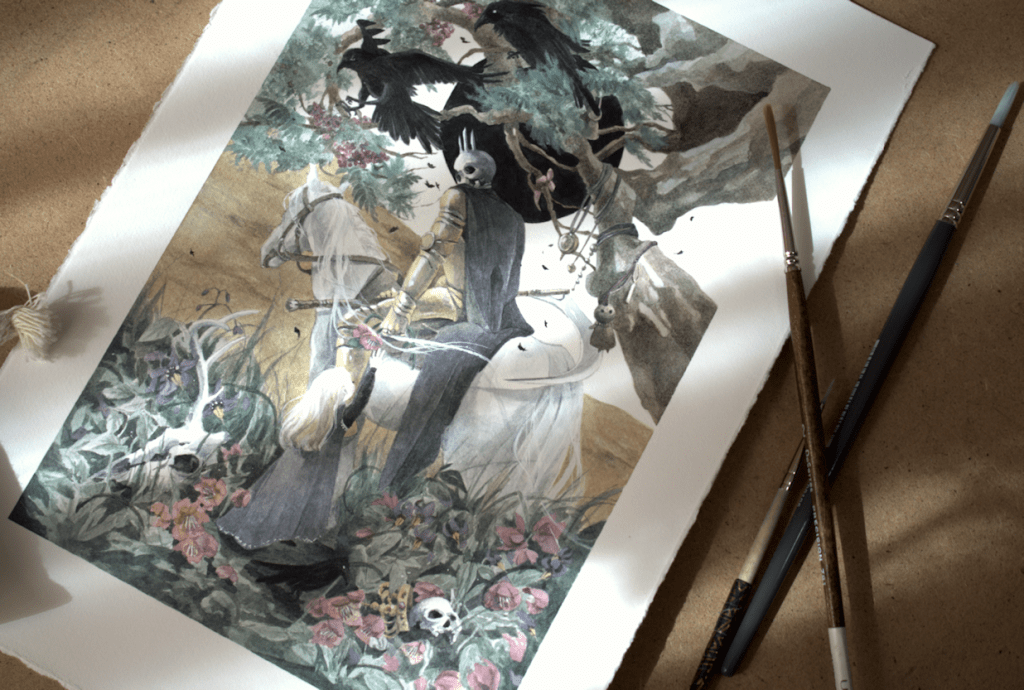
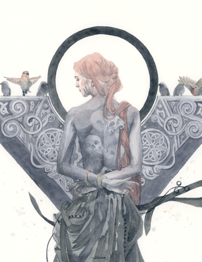
This Monday The Changeling Artists Collective on Facebook will be hosting the auction for original artwork, prints, and drawings from the Woven Path Tarot Project. My watercolour painting will be part of the auction, as well as many other wonderful pieces from this Tarot project. XII. Death is my contribution to the deck; the original painting (without digital edits) varies a slightly to what will be seen in the finished product. So if you’re looking to get your hands on the original piece, please head over the link below to participate in the bids or BIN (buy it now) option. *Please note that the BIN option is only available for a limited time before the auction begins.
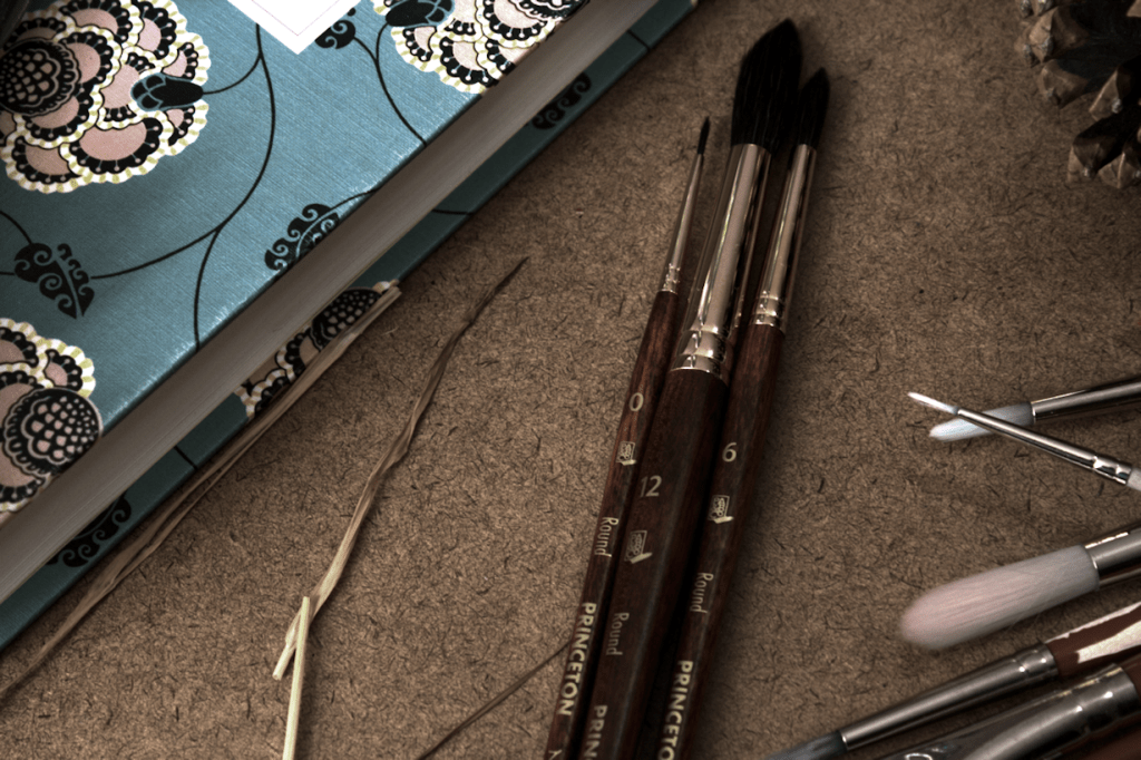
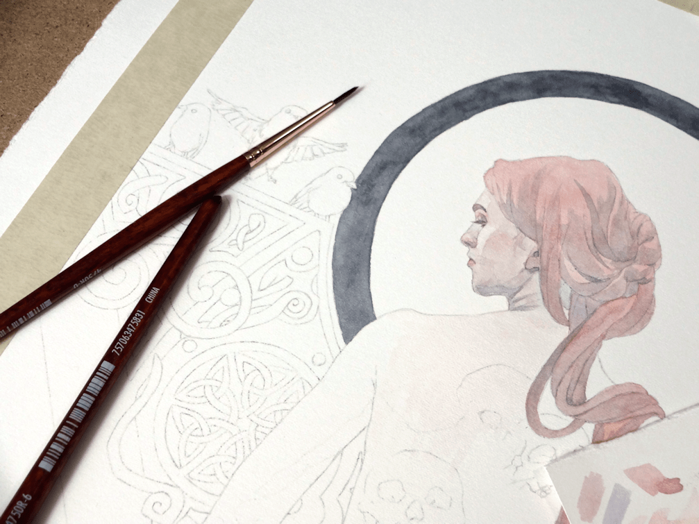
I’ve been meaning to get some new watercolour brushes, as the ones I’ve been using (although having served well for years) are fraying and/or have rogue hairs going in one direction. There are definitely a wide range of brushes out there (which was a tad overwhelming), but after watching some reviews by other artists on Youtube I settled for trying out the Princeton Neptune range. I went for the Round Synthetic Squirrel in 0, 6, & 12 (as they are the sizes I use the most) of the 4750 Series. I’m loving them so far, as the handles in particular feel more comfortable than my standard ones from Deserres or Curry’s.
Preliminary Drawings
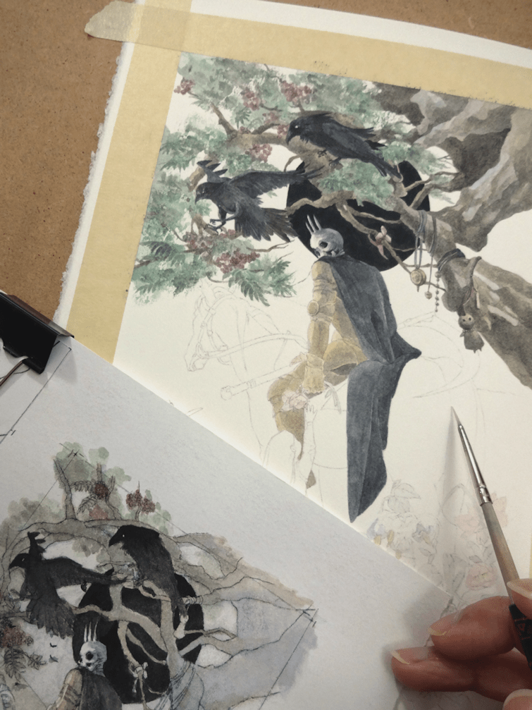
I started out with my drawing on tracing paper, eventually transferring the finished product with a graphite backing and tracing all the lines and details. I was sharing this thought on Instagram as well but, does anyone else hate ‘transfer’ days as much as I do?! Recently I’ve been laying some scrap paper as masking (as you see on the right side), just so I have less graphite residue to erase off of my watercolour paper when I’m done transferring.
The finished drawing ready for transfer.
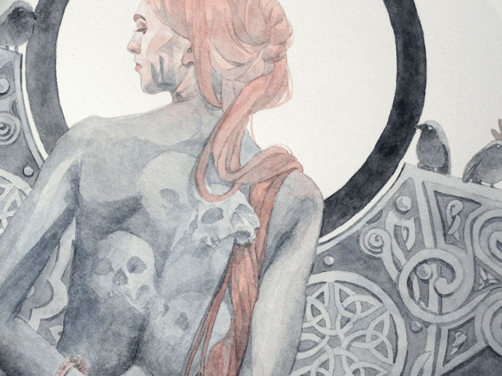
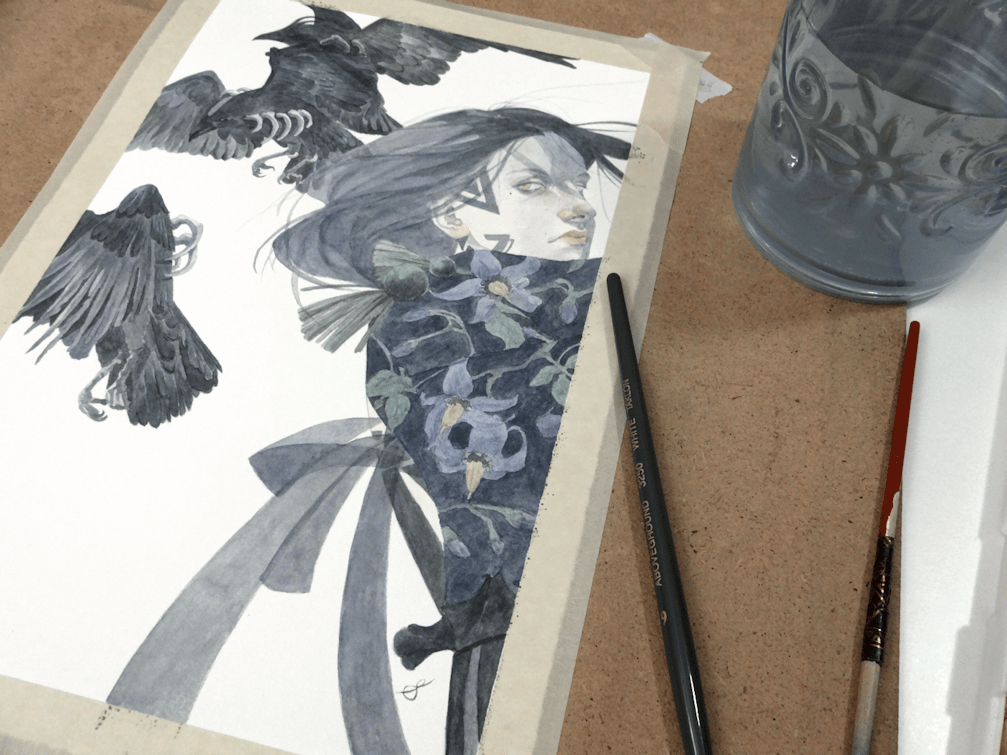
There’s no better feeling than finally getting to put pigment to paper.
You always feel ambitious with the thought of filling a piece with knotwork, until the realization sets in of having to trace said knotwork for a second time accurately. I cheated a bit with this piece as you’ll notice with my preliminary drawing as I drew in only one side; the other side was cheekily transferred by doing a mirror/flip transfer of the paper. I also decided to incorporate some cute little Robins as well; going on themes of death and souls (Robins said to visit people in grief and mourning) for this painting.
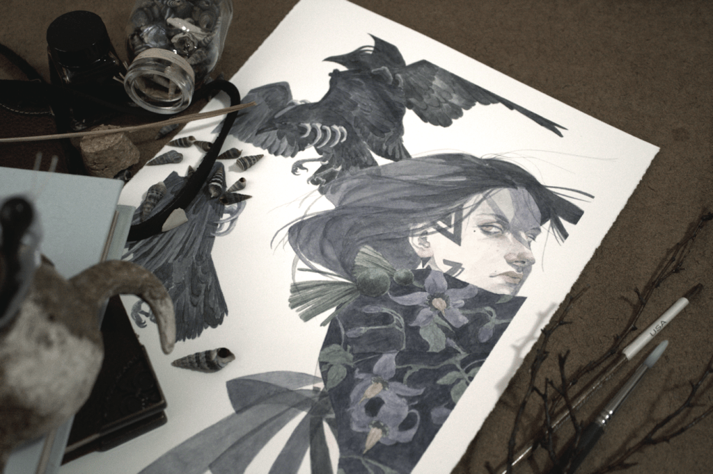
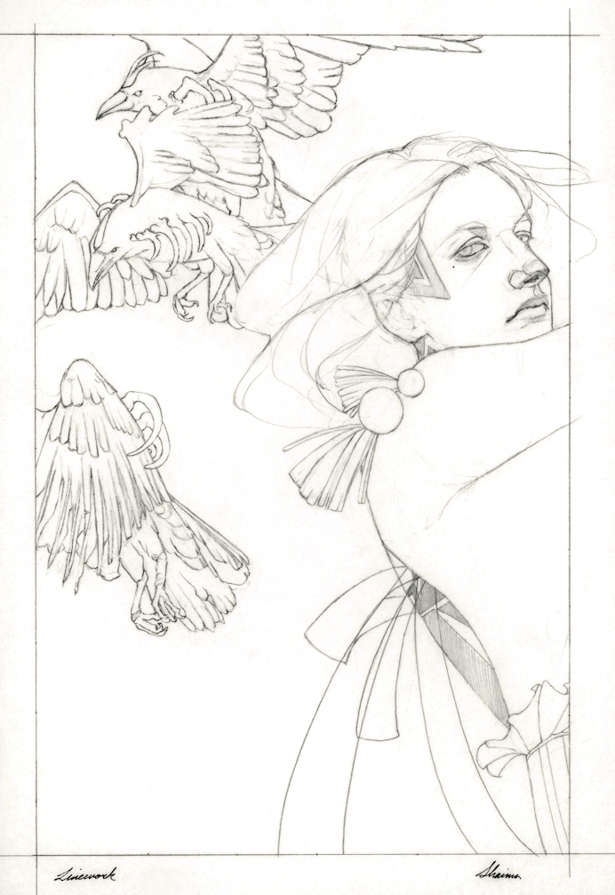
As usual I started with a drawing on tracing paper, although you’ll notice I didn’t add the flowers. Sometimes with more simpler design details, I’ll go in directly to the watercolour paper. The drawing isn’t really meant to be ‘finished’, just the line-work (the simpler the better) so I can do a graphite-transfer onto the paper. I’ve also stopped printing my line-art/drawing, as I used to for transferring drawings. Personally, I haven’t been finding the need to waste more paper; a sharp pencil over the tracing paper drawing works fine. I’ll usually scan the drawing before I get started on tracing with graphite, so as to preserve all the lines I originally had for reference.
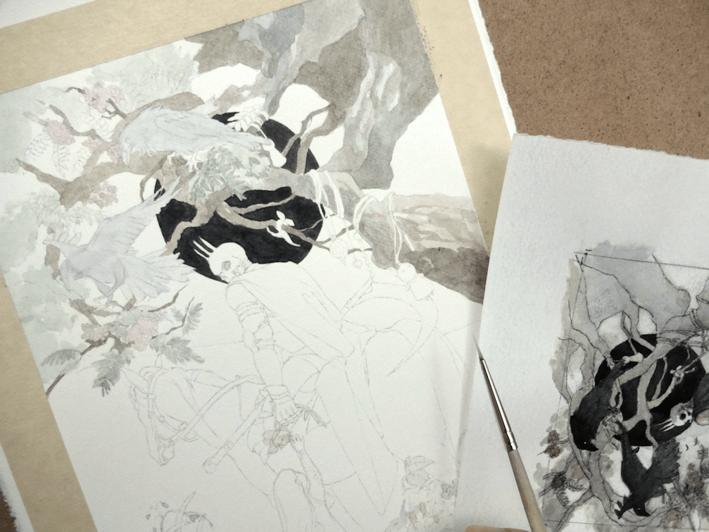
It’s often too hard for me to capture the transferred drawing on my watercolour paper. I’ve usually erased quite a bit of the graphite so it’s barely visible when I lay down paint.