CODEX Obscurus | 2021

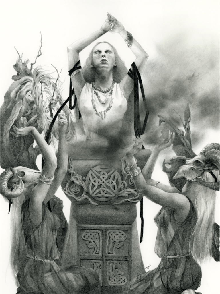
The Ritual, graphite, 12×16″ (on 14×17″ paper), 2021
Strathmore 100lb. 270 g/m2

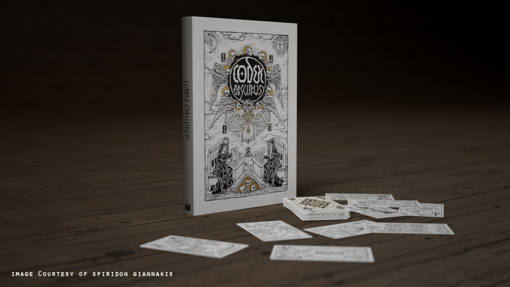
I shared a little peek into this piece sometime earlier this year, but with the project now on full swing on Kickstarter I can announce that this drawing will be part of the CODEX Obscurus Artbook. This is a project by Spiridon Giannakis with cover and Tarot deck design by Viktor Pushkarev, and is a collaboration with an incredibly talented lineup of 145 artists and their unique take on witches & warlocks, witchcraft, the occult and various folklore. As a bonus, I along with several others will be putting forth our original artwork (The Ritual in my case) for purchase in this campaign. If you are interested acquiring an artwork please head over to the Kickstarter page for all the info.
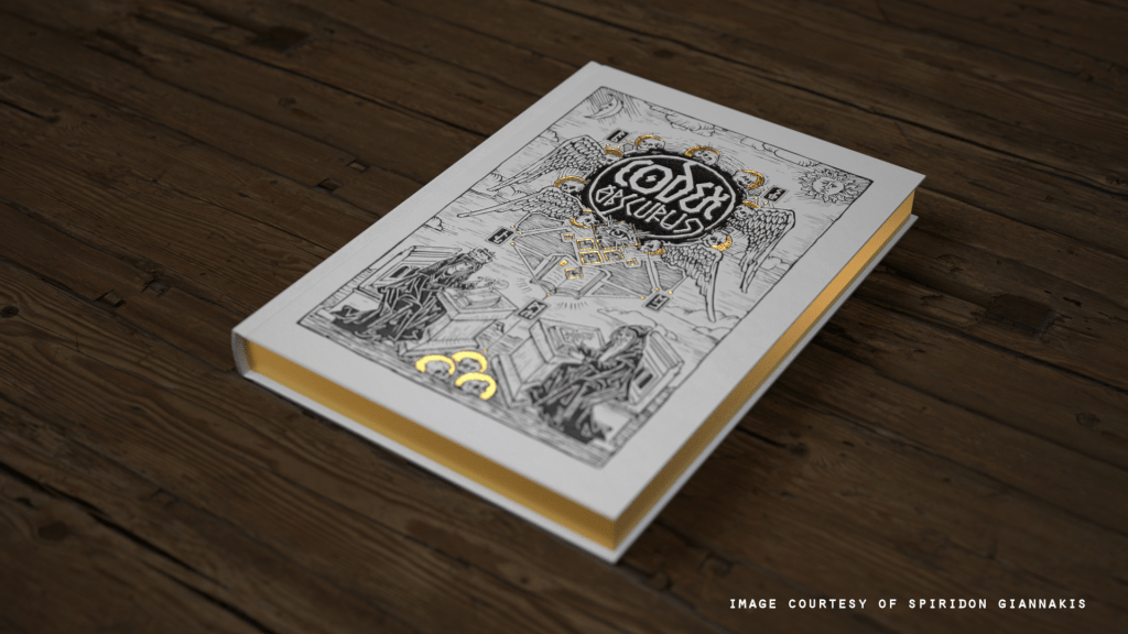
Now Live on Kickstarter

kickstarter.com/projects/spiridon/codexobscurus

The campaign runs until the end of the month & there are just a few more stretch goals to go! If you would like to back this project please head over to pledge.

Limited Edition Prints & Campaign Bundles

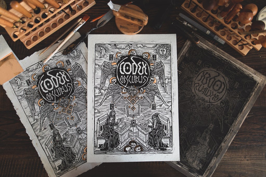
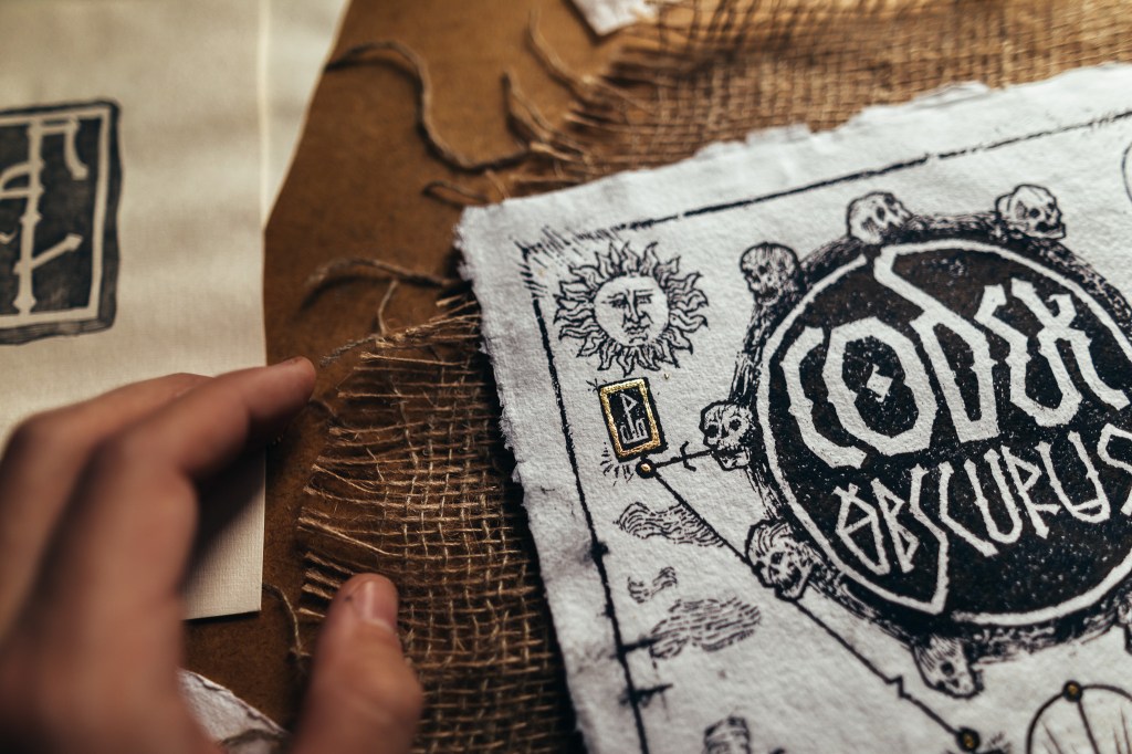
There will also be a limited edition run of these amazing hand-made prints by Viktor. Here’s just a little peek at his process, but you can find more behind-the-scenes on the Codex Kickstarter page as well as on Viktor’s Instagram. Depending on the pledge, there will also be different extras from other artists in this campaign from high quality Prints, Postcards, Posters & Bookmarks; with the potential of even more bonuses with the unlocking of stretch goals.

The Ritual: a look into the process

For this project I decided to go with a full graphite piece. I wanted a break from painting with watercolour last year and although I hadn’t touched graphite in while, I felt confident again after laying down the foundation and just having at it. It also helped that I was excited to create something that was very much in line, thematically, to my own work.
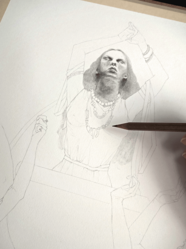
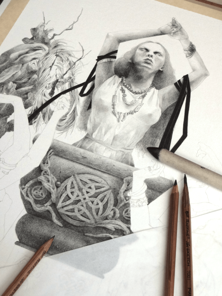
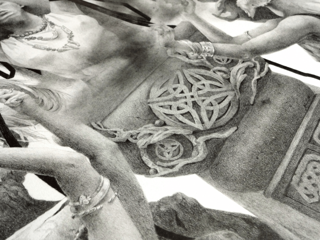
I knew I’d be working with a lot of blending and powdered graphite ‘washes’, so I started by taping off the borders for a clean look for the finished product. Once the prelim sketch had been transferred onto the paper, I worked in layers from 2B pencils all the way to 6B & 7B for the darkest as I could go. To achieve the softer appearance I like to create in contrast to the more defined Celtic designs and such, I went to my trusty blending stumps as well as the usual no nonsense tissue paper. This project was also an attempt to improve on metallic elements (or in this case jewellery); working in grayscale and then using an eraser to create effects for a more realistic rendering.

I hope you enjoyed a look into this project and hope you will support our work through this artbook. Take care everyone!

Sisters Cassandra – Watercolour Painting

Sisters Cassandra, watercolours & mixed-media, 11×14″, 2020

It should be noted that procrastinating on art supply restock is never a good thing; which I’m learning all too well at the moment. I’ve shared a few snaps on the process of creating this piece below (at least most of which I remembered to do as I was painting).


prelim to painting.

The current situation with the virus and limiting shopping/delivery on art supplies of course doesn’t mean an end to creating work. It is indeed a very first world problem, but an annoyance nonetheless.

I’ve been trying to return to the habit of using preliminary drawings more, and then using a method of transferring onto watercolour paper. As I’ve been trying to improve my figure drawings, I’ve noticed that my watercolour paper does tend to get a fair bit of damage from erasing and redrawing. The fact that this can happen isn’t new too me, but in all honesty we all get lazy at times.

Happy with my drawing, I scanned the work and got ready to print. If you’re interested in the method I use, you can also check out Cynthia Sheppard’s video here, where she shows how you can go from your drawing to painting. I then realized I had run out of printer ink, as well as any graphite transfer paper…Time for the old school method. I’m talking about what we did as kids, taking graphite and going over the back of a sheet of paper covering it entirely, and then placing your drawing over it and tracing over that. Its the same concept as the ones you can buy at art supply stores. I’m a bit conservative with wasting graphite however, so I usually tend to fill my ‘transfer paper’ only on the areas I know will have outlines. Often times there’s no need to have whole sheet covered, you’ll probably end up with graphite residue on a perfectly clean watercolour paper.

I tend to use tracing paper as it’s the thinnest, but you could use whatever paper you prefer.

Once the drawing’s been transferred there’s only one thing left to do, paint! 🙂 I didn’t have the same issues I did with my Sparks of Rebellion piece; again because I removed a lot of the surface on the watercolour paper during preliminary drawings on that one. This piece was mainly in watercolours but to get a more smoother gradient on the background I opted for some Faber Castell Polychromos, and acrylic paint highlights.

This painting is also available for purchase as prints and the original. You can find all the info by heading over to Shop.

Guarding the Red

It was wonderful to see the extent of medals captured by our Canadian athletes at the Pyeongchang Olympics; it may not have been a gold this time around, but I think I can say that we’re very proud of both our men’s & women’s hockey teams. Considering how great she played despite her injury, it was even more incredible to see the games Shannon Szabados played. Good job girls! 🙂

Guarding the Red_ShaimaIslam
Guarding the Red, microns & markers on paper, 11×14″, 2018

Looking at the pieces I’ve done so far, it seems I’ve done quite a few goalie art haven’t I? Actually almost all. 😀 Time to switch it up I think!

hockeyart_ShaimaIslam