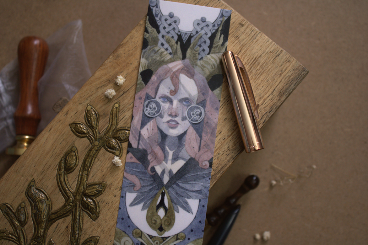
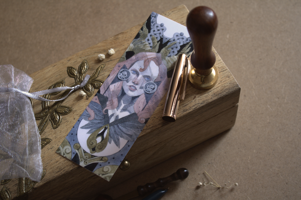
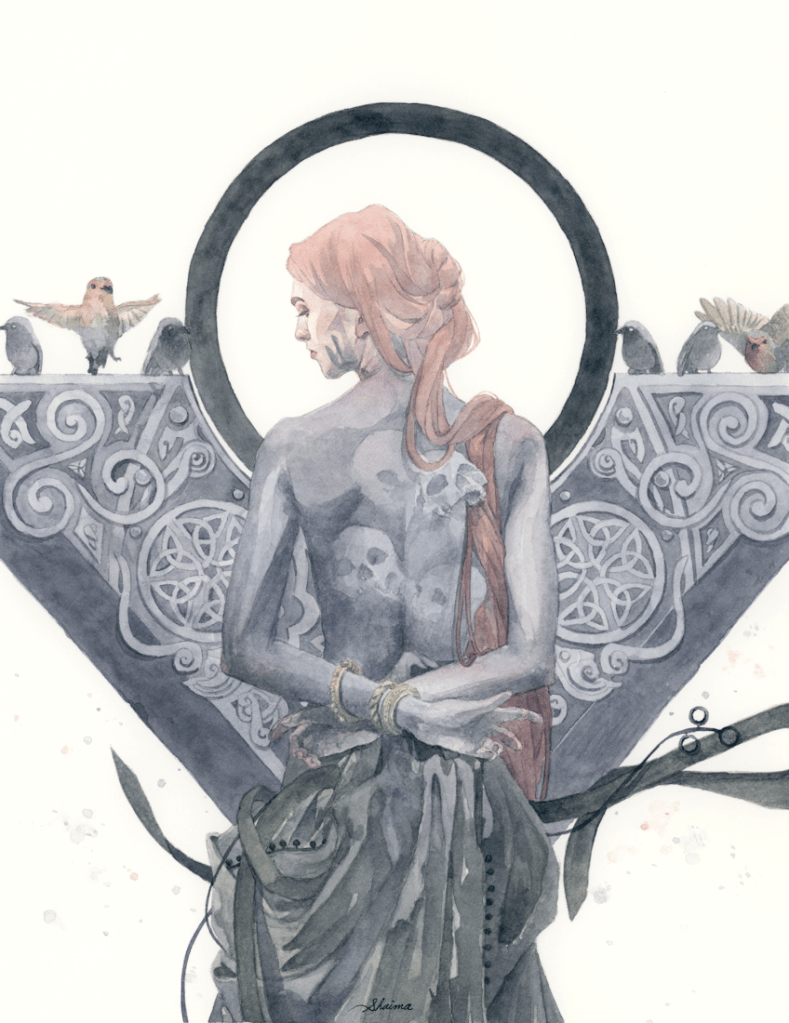
Looking through some of my older pieces, I’ve realized this painting among a few others, have not yet made it the blog. This was done in October of 2022, as part of an experiment to see how my paintings could translate into bookmarks and other smaller products.
Laying down the first few watercolour washes over the pencil line-work.
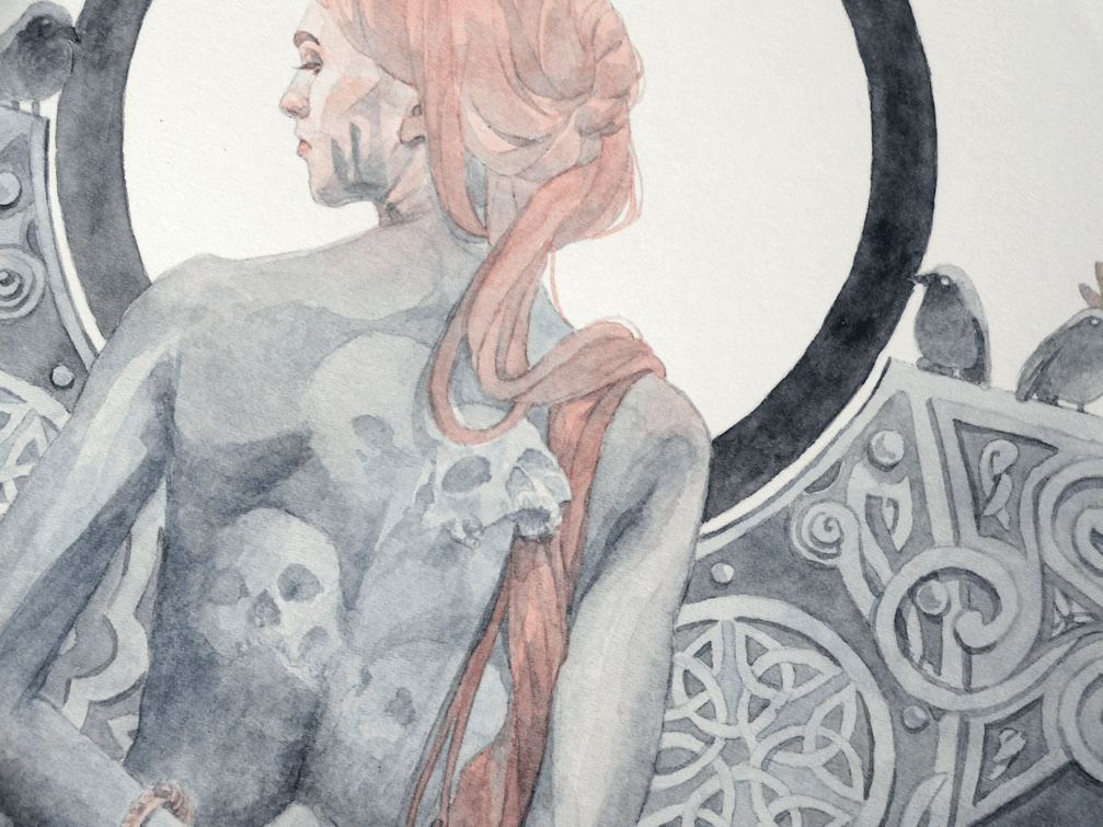
I knew what I wanted for the concept of this painting, but was forced to work around the other design elements; such as the Celtic knots & negative spaces, which would work well for the composition of a bookmark design. The goal was to create a piece designed specifically for the dimensions and purpose of the product, rather than have one of my paintings slapped onto a bookmark template. I haven’t had many opportunities to work with graphic design, so I’ve been experimenting with creating pieces specifically for certain formats and hopefully other materials too.
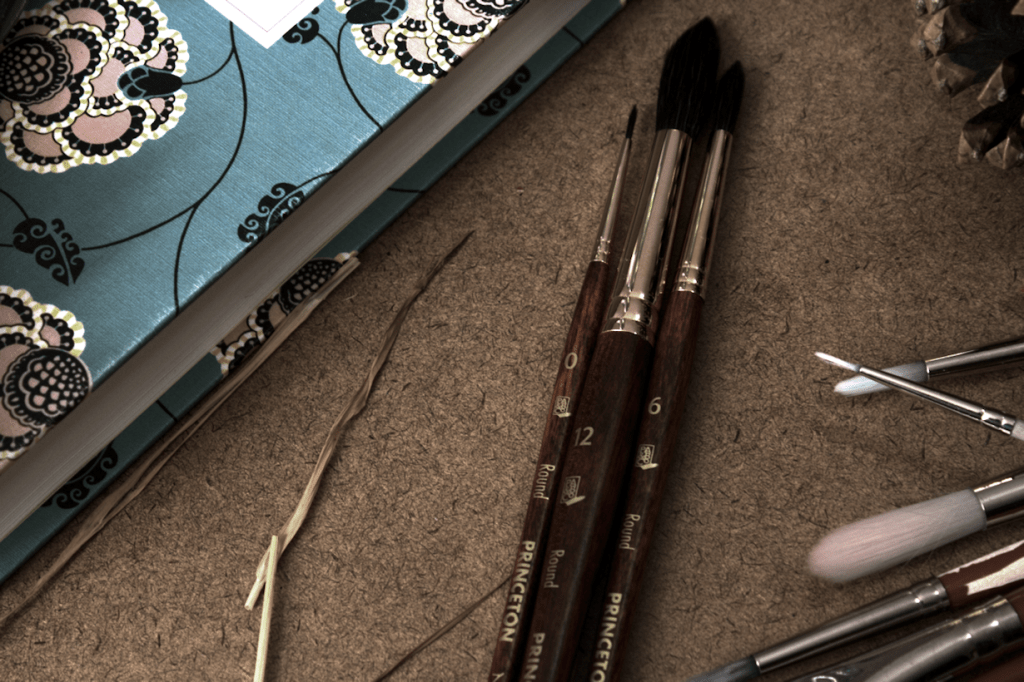
I’ve been meaning to get some new watercolour brushes, as the ones I’ve been using (although having served well for years) are fraying and/or have rogue hairs going in one direction. There are definitely a wide range of brushes out there (which was a tad overwhelming), but after watching some reviews by other artists on Youtube I settled for trying out the Princeton Neptune range. I went for the Round Synthetic Squirrel in 0, 6, & 12 (as they are the sizes I use the most) of the 4750 Series. I’m loving them so far, as the handles in particular feel more comfortable than my standard ones from Deserres or Curry’s.
Preliminary Drawings
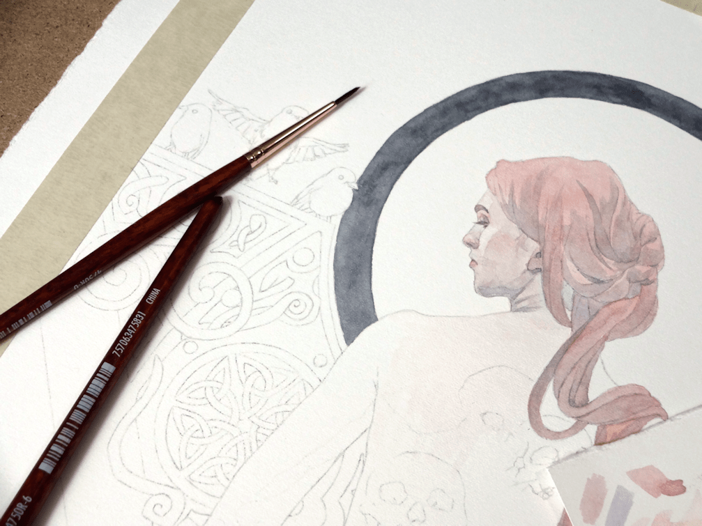
I started out with my drawing on tracing paper, eventually transferring the finished product with a graphite backing and tracing all the lines and details. I was sharing this thought on Instagram as well but, does anyone else hate ‘transfer’ days as much as I do?! Recently I’ve been laying some scrap paper as masking (as you see on the right side), just so I have less graphite residue to erase off of my watercolour paper when I’m done transferring.
The finished drawing ready for transfer.
There’s no better feeling than finally getting to put pigment to paper.
You always feel ambitious with the thought of filling a piece with knotwork, until the realization sets in of having to trace said knotwork for a second time accurately. I cheated a bit with this piece as you’ll notice with my preliminary drawing as I drew in only one side; the other side was cheekily transferred by doing a mirror/flip transfer of the paper. I also decided to incorporate some cute little Robins as well; going on themes of death and souls (Robins said to visit people in grief and mourning) for this painting.
I’ve made the switch to hot-press paper. Having conversations with other artists and looking at their process, it was time to switch over and give this paper a try. I think I’ll always prefer cold-press; the texture and depth of colours you can achieve is much more satisfactory, but alas the scanning results in my opinion are rarely so for displaying work online (especially for more illustrative pieces).
Stock piling and clutter in both art and life is not something I’m keen on. Something I’ve had to reconsider during this pandemic. Luckily I had enough supplies until shops opened up again, but what I didn’t have on hand was hot-press paper. A month back, the only shop that had any in stock here in Toronto was Deserres. 4-5 ‘misroutes’ with Canpar, emails & phone-calls back and forth with both companies, and I finally had my paper arrive in a bent cardboard box. …I don’t know if I was more surprised at having received my shipment at all, or that the paper had somehow survived with minimal damage. Yay to Canadian postal service.
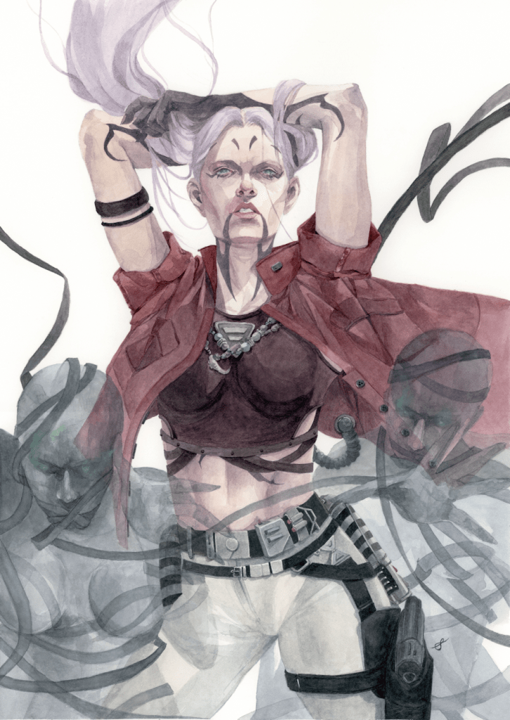
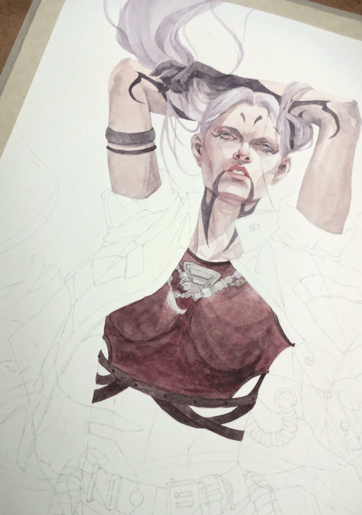
Ventress, watercolours & acrylics on 11×15″ paper, 2020
I chose to test out Fabriano’s Artistico Hot-Press Watercolour Paper, and after success with this one I’m eager to try out Arches‘ (pricier) paper as well. I had little to no warp; although I’m suspicious of my 3M masking tape playing a part as well. I don’t put down a lot of heavy wet washes either, so I can’t say what the result would be for those of you who like to do so.
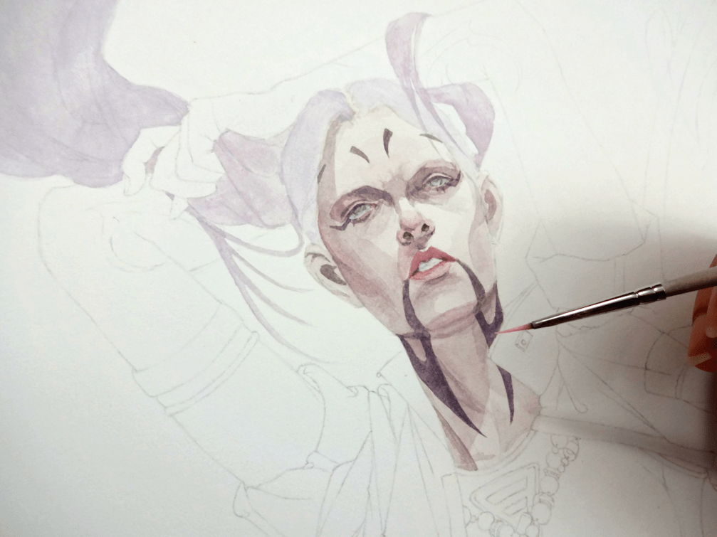
Achieving some ‘glowy’ eyes with acrylic paints.
I wanted to soften Asajj’s look by giving her hair again (drawing on the flashbacks of her lavender hair as a child), as well as changing her usual Sith attire to more of a civilian one. Taking liberties from the original design, I played around with additional Sith corruption marks and tried to include references to her Dathomirian heritage ─ beaded necklaces and elements of witchcraft & necromancy. This was a fun little side project to work on, although personally it’s always nerve-raking to mess around with original visions of any series.
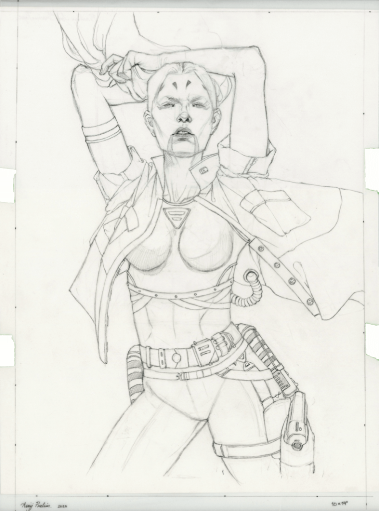
Process.
3rd time’s a charm; various attempts of re-imagining Ventress.
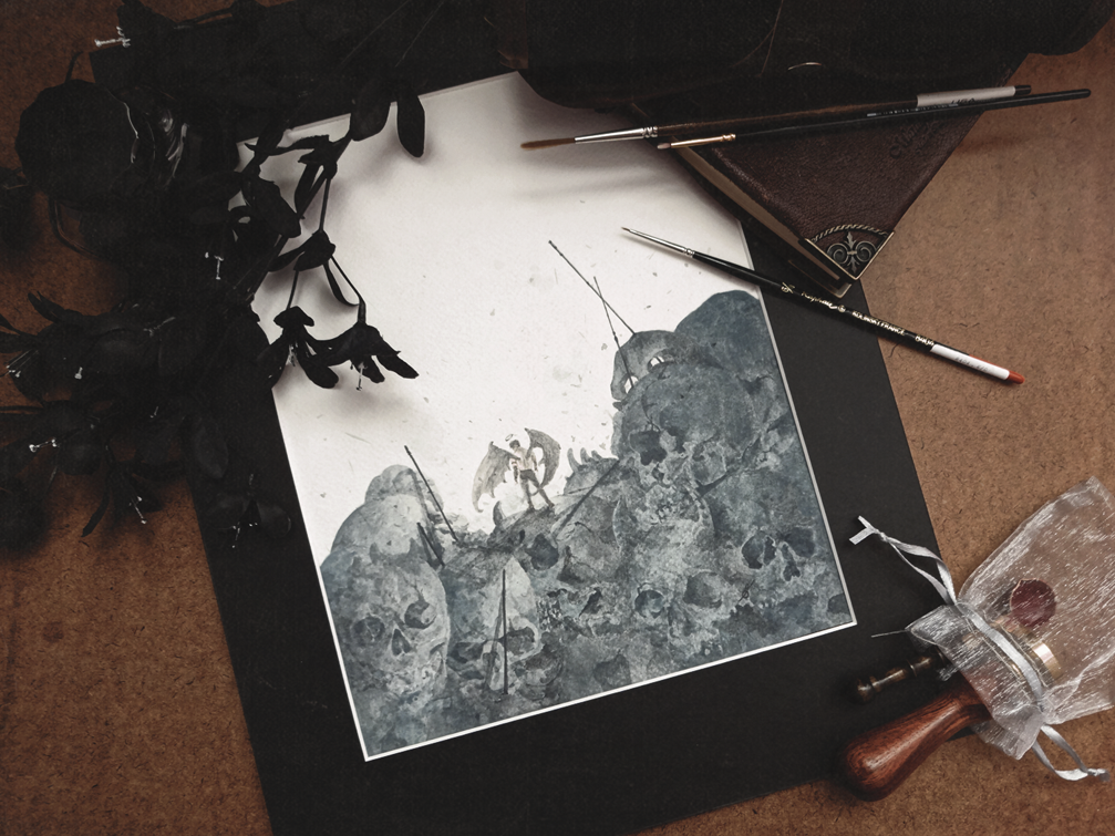
Something that was meant to be a fairly quick painting/study. I did enjoy it…although I might take a break from looking at this many skull references for a bit. This will be the last post for this year; so I’ll be wishing you all the best for 2020, and I can’t thank you all enough for supporting my work.