


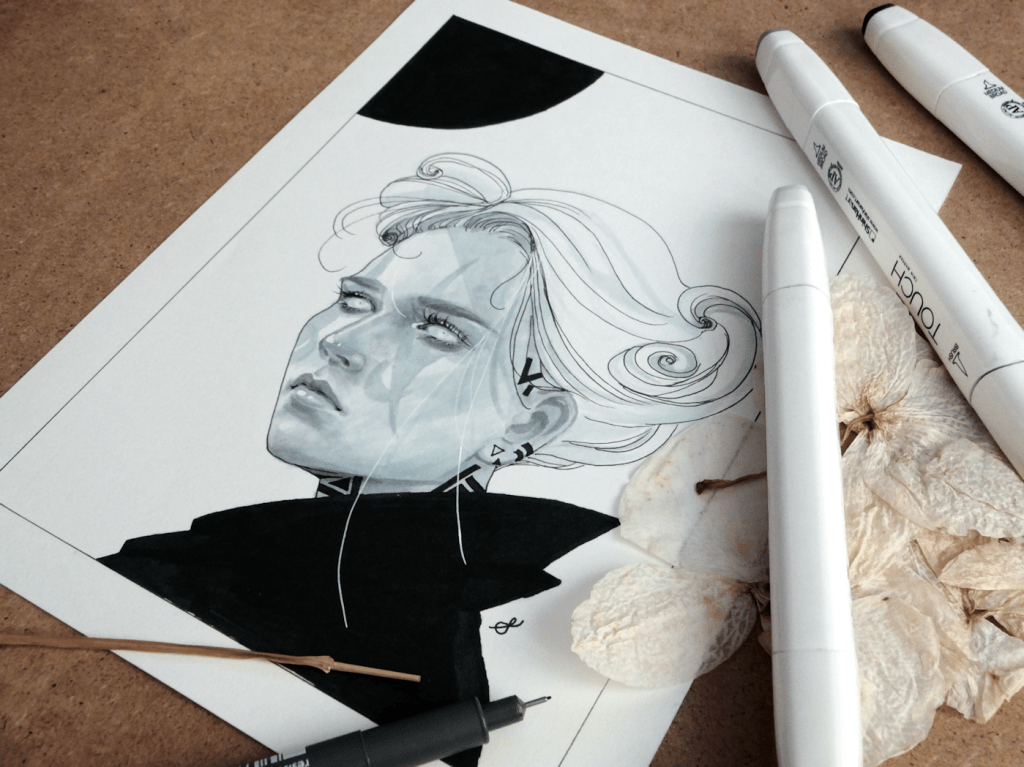
Although my head’s buzzing with ideas at the moment, this month has been rather slower than I would have liked. I had been struggling with the usual artist block, which returning meant too many ideas all at once. In hopes of improving whilst simultaneously creating new artwork, I’ve decided to do some mini drawings.
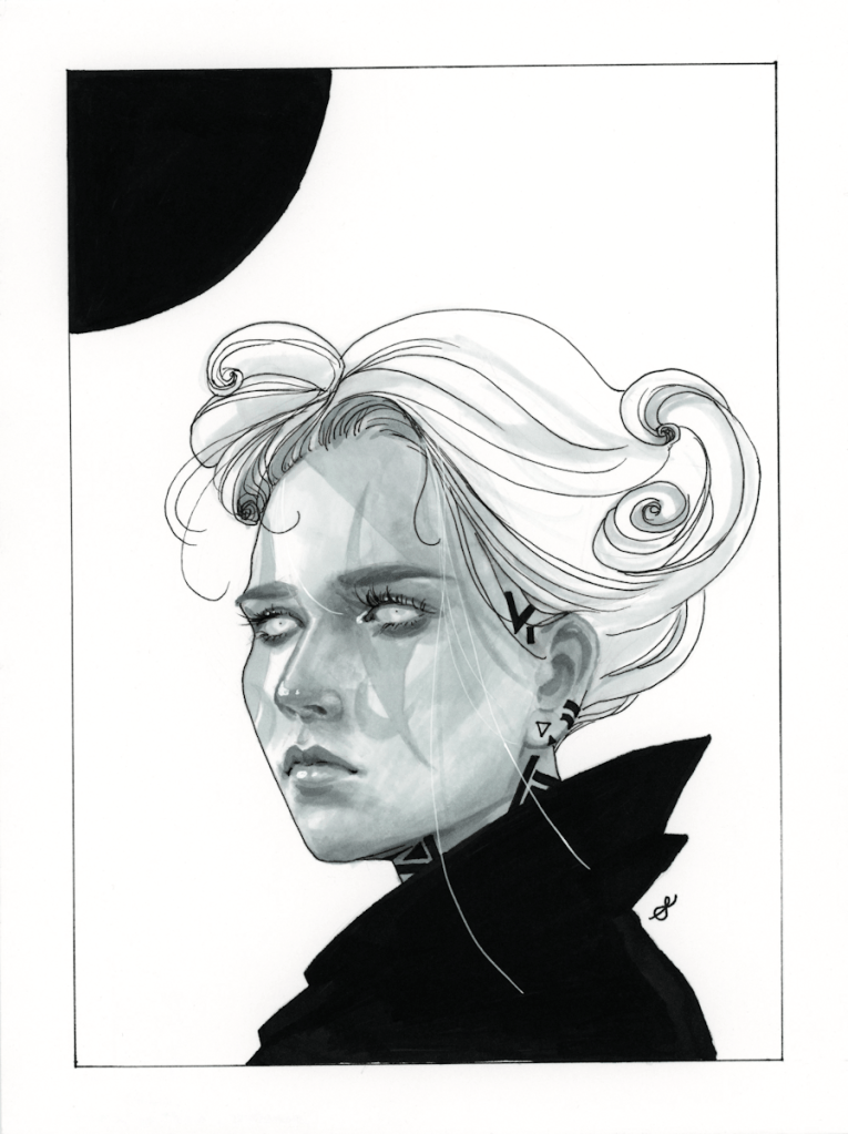

First finished painting of 2020. I usually get impatient to finish a piece as it nears the end, because at that point my head’s already full of ideas I want to get on paper for the next project.


_Shaima")


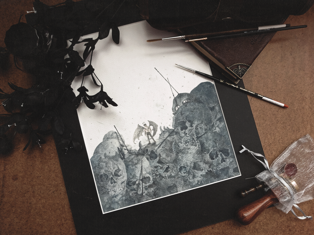
Something that was meant to be a fairly quick painting/study. I did enjoy it…although I might take a break from looking at this many skull references for a bit. This will be the last post for this year; so I’ll be wishing you all the best for 2020, and I can’t thank you all enough for supporting my work.

WIP.
This slideshow requires JavaScript.

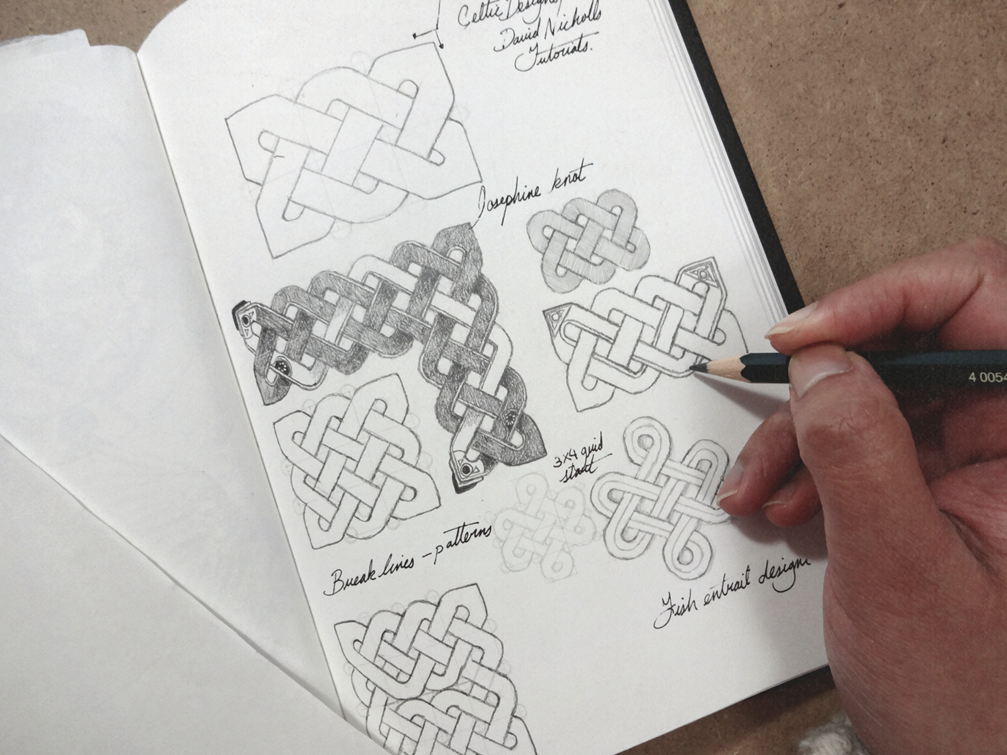
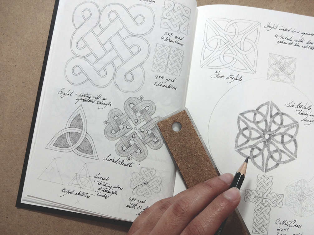
These couple of weeks, I’ve added to the long list of artistic challenges for myself by exploring design once again. I used to include a lot of in my work in my high school days, from fabric to generally…..everywhere. Feeling that I’ve lost touch with it, I decided to take on learning Celtic knots and similarly Viking designs; which I may be able to incorporate into future work. As you may know I’m very interested in Scandinavian history and Norse designs, so I thought that if I’m going to do studies I might as well make it for something I’m very interested in exploring.
There are various resources to look at, from books, videos, to good old Google. The Book of Kells is of course recommended by most tutorials I’ve come across, as well as just looking at various Viking artifacts for inspiration. For reference purposes (for myself in my sketchbook) I followed an incredibly helpful playlist from a charming gentleman on Youtube, whom I’ll link below if you’re keen on learning various knots.
RESOURCES:
There are a myriad of references you can consult on the web, so I wont bore you with google searches which I’m sure in this day and age everyone already knows about. Here are a few things I’ve been looking at.
Celtic Design by David Nicholls via Youtube


This drawing is probably the most fun I’ve had on an artwork this year. The initial research and reference stage had me a bit confused at first, as I hadn’t really thought about Odin’s eye until I looked at some old drawings and paintings online. I noticed a constant switch of direction of his missing right eye; my guess is mirroring had resulted in artists switching to the left side of his face. All in all a fun little project. (A side note, I had no idea how big ravens were. 😶)


WIP.
_Shaima")


_Shaima")
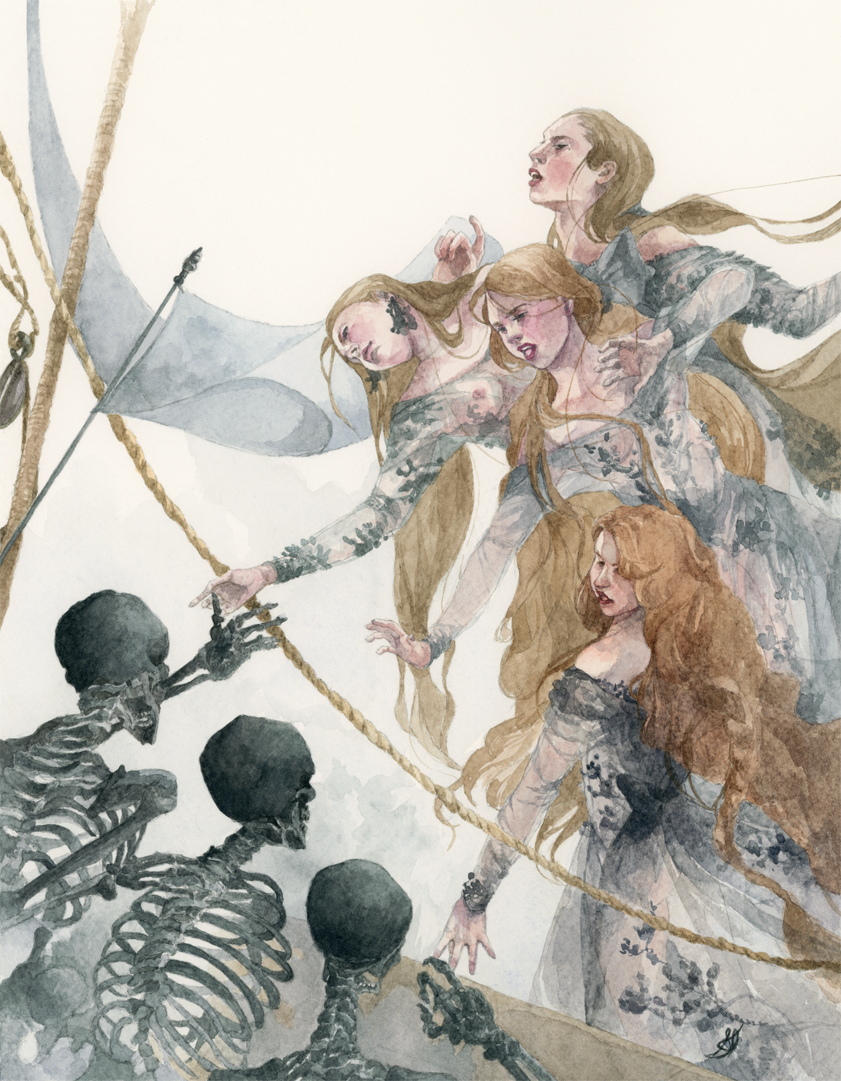
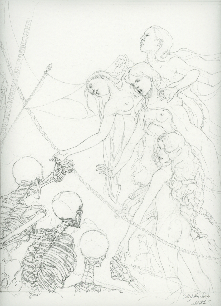
The tape finally came off this one, as I added some final touches this week. Probably one of my more enjoyable pieces that I’ve done so far; I worked at a more casual pace while working on some other things.


I also attempted to take more progress shots this time around, as more people seem to enjoy these on Twitter and Tumblr. The initial drawing was done with graphite on paper, and then transferred onto the watercolour paper from a scanned print.


WIP with watercolours.


Yesterday was Family Fan Day in Toronto, and I was lucky enough to meet some of the stars from various shows like Murdoch Mysteries, Caught, and Anne. The cast were so incredibly nice, to the extent of indulging me in signing my work. I’m curious to know how many of you were also able to drop by at the Sony Centre yesterday?

