BACK TO GRAPHITE
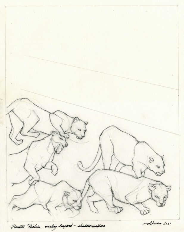
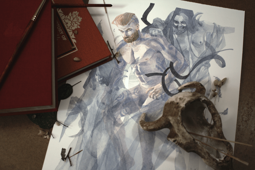
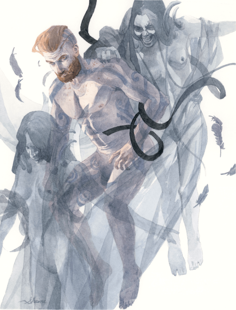
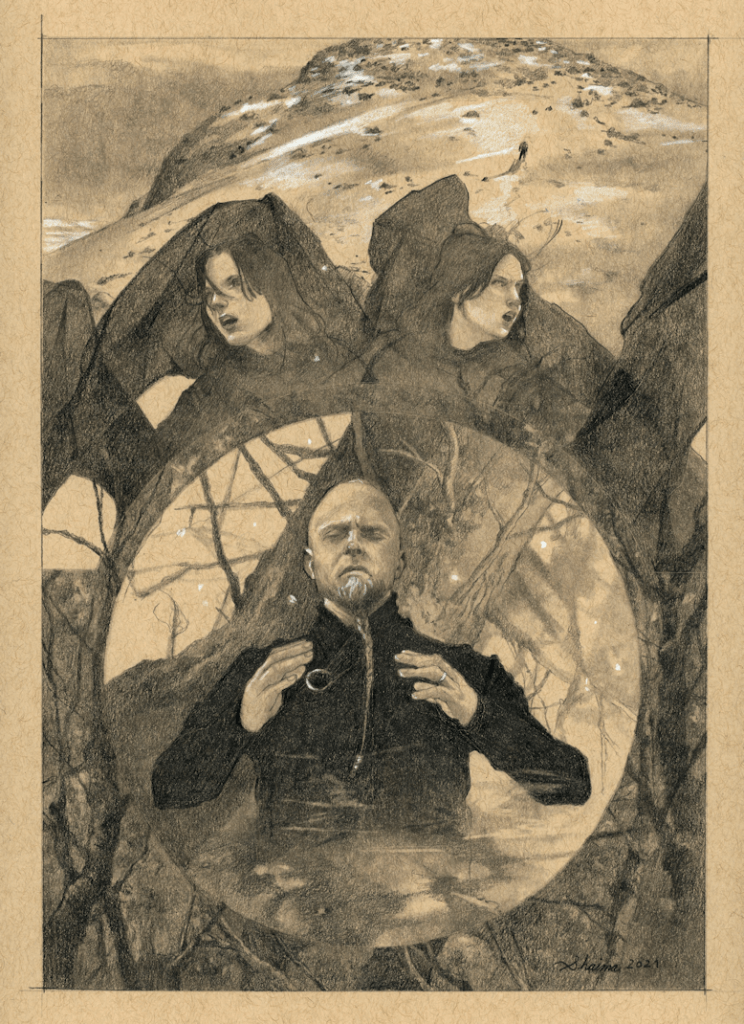
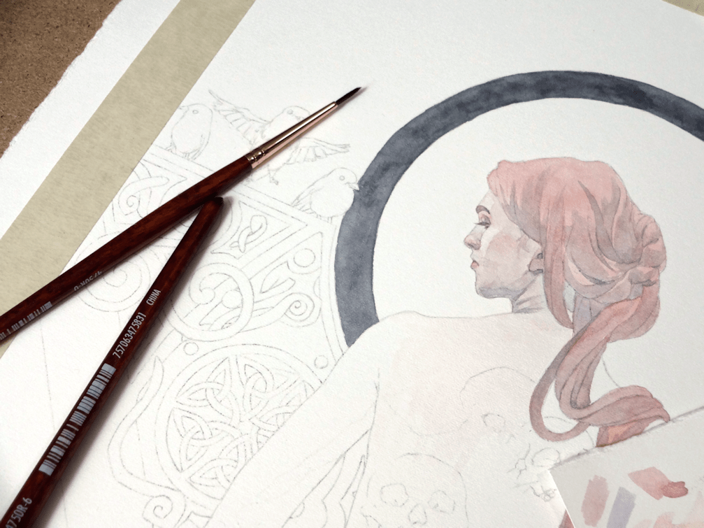
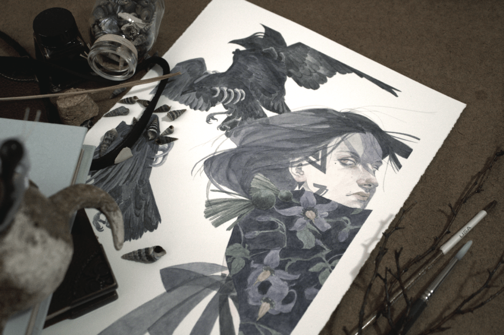
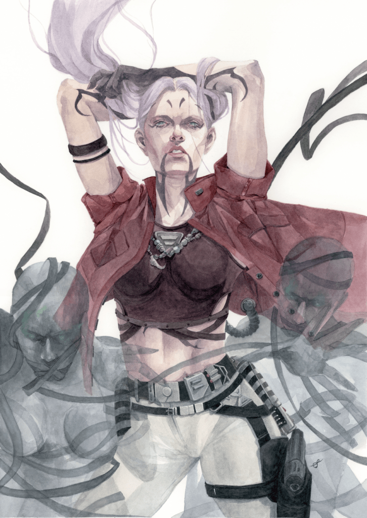
I’ve taken a little break from watercolours again. This one being a more fun personal project, taking a character from author Nalini Singh‘s work and imagining it into a more illustrative piece.
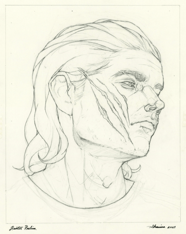
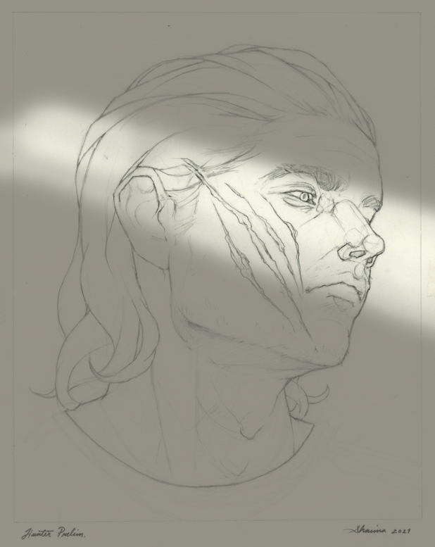
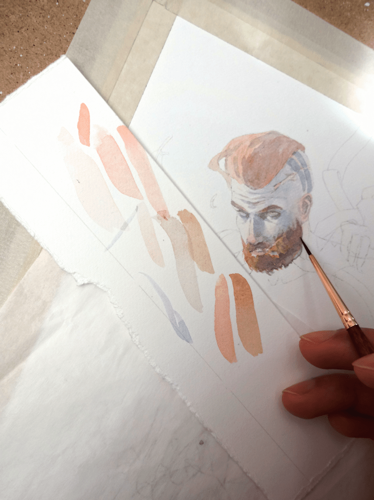
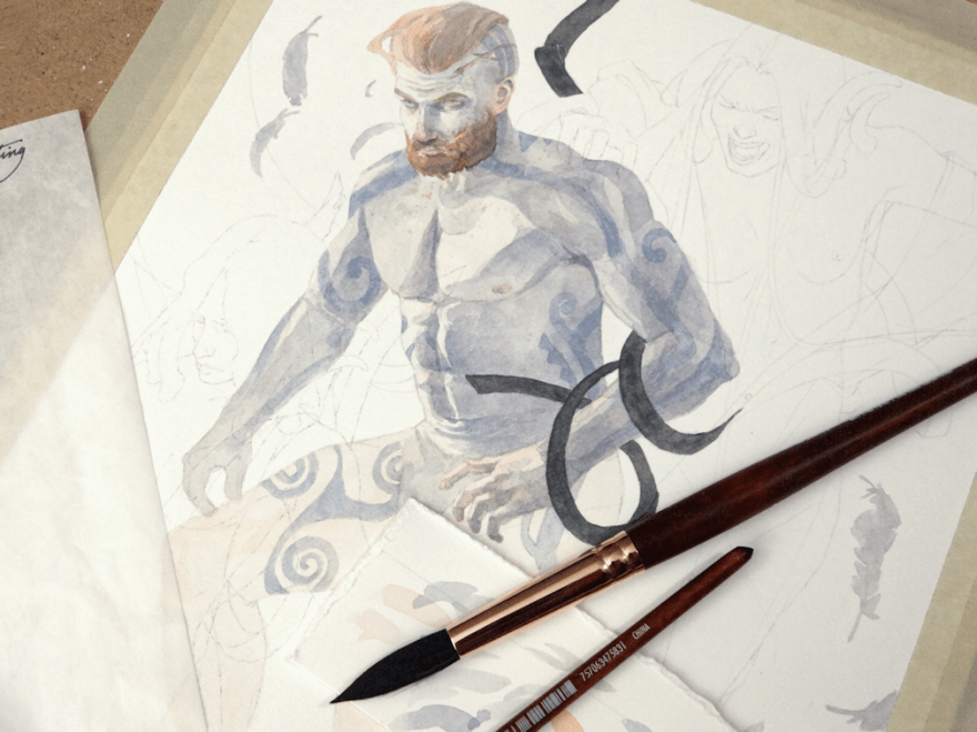
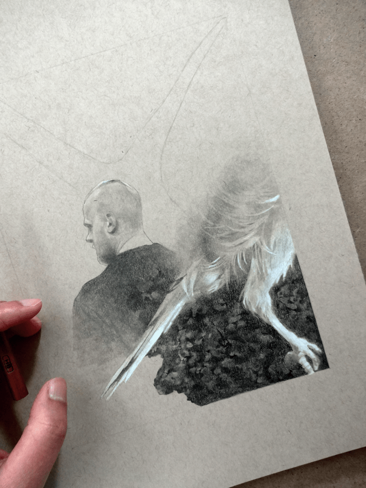
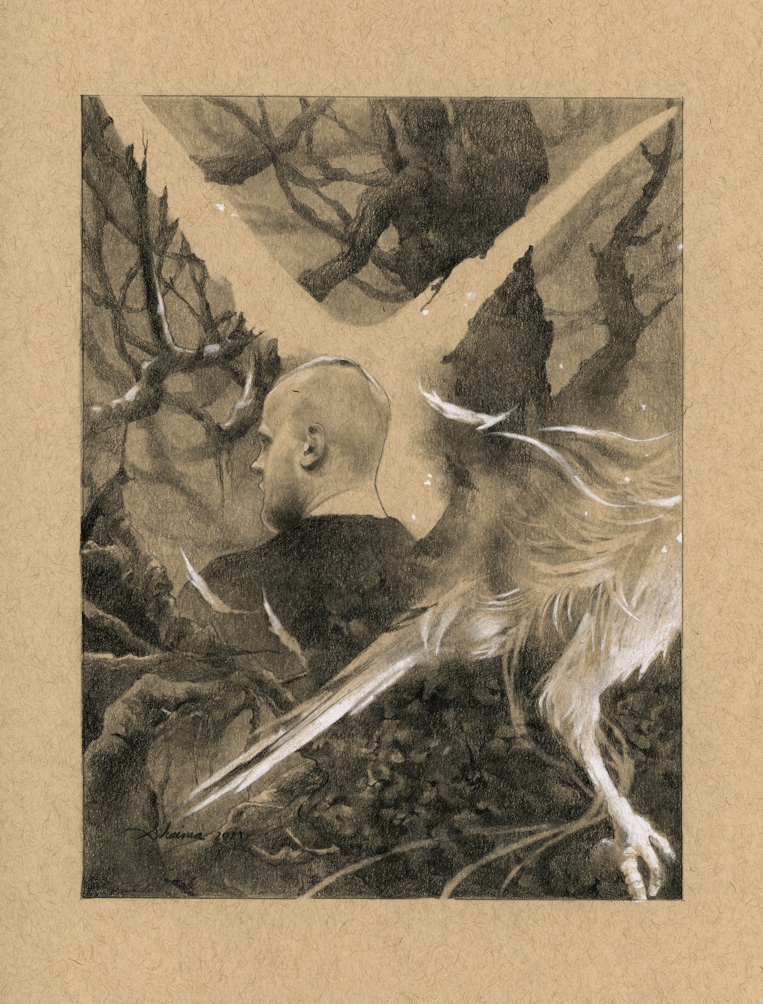
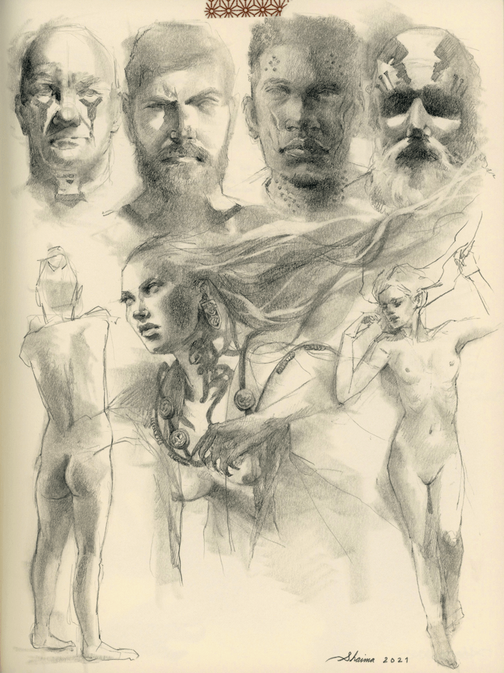
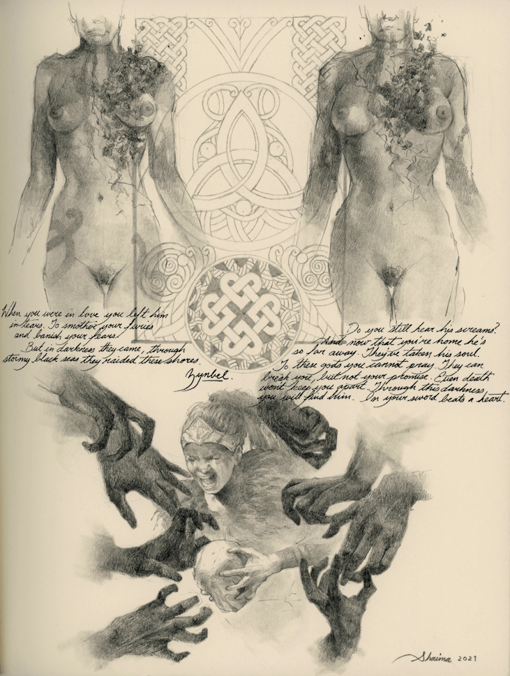
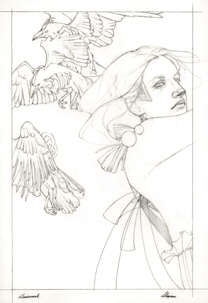
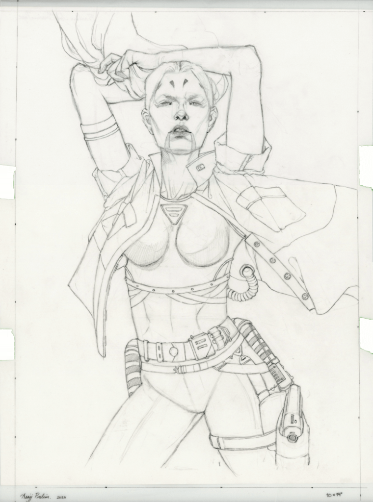
Starting off using the same technique from my last painting (Banshee’s Wail), and layering the preliminary drawings so they are ready for the transfer stage. This time around I wanted to play with more dramatic lighting, as I slowly get more comfortable with it. I decided to do some simple black and white lighting samples on Paintshop Pro. It’s not a really an in-depth study; more of an assurance, so that I don’t desecrate the drawing when I work graphite powder onto the paper. Speaking of paper, I’m using Strathmore’s Bristol 100lb. (270 g/m2) in Smooth Surface. I’ve used both the vellum and smooth surface sheets from Strathmore for many years now, and I usually shift between the two if I want more texture or not. I tend to shy away from more textured paper however, because I like to scan my pieces for digital use.
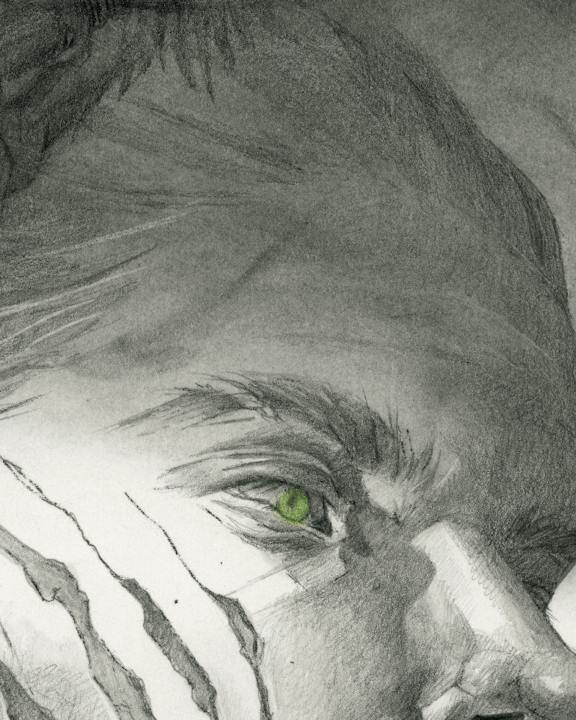
I use graphite powder for mainly large surfaces I want to cover. I don’t have any experience with any store-bought brands, so I tend to just use the saved ‘residue/remnants’ of when I sharpen my graphite (using the blade method). Using a tissue, I work it in to the paper ─ for this particular piece, adding in various forms with my Blending Stumps. I ended up feeling that the piece was a bit on the grey-scale of things; in which my usual work consists of some pure black elements for contrast, so I thought it might be fun to add some colour instead. Sticking to the paranormal and fantasy aspect of the author’s work, I chose to just focus on the eye with various shades of green colour pencils. Overall, a much needed casual and experimental project; although I never want to see leopards or spots again.
Hope you all have a fun Halloween!
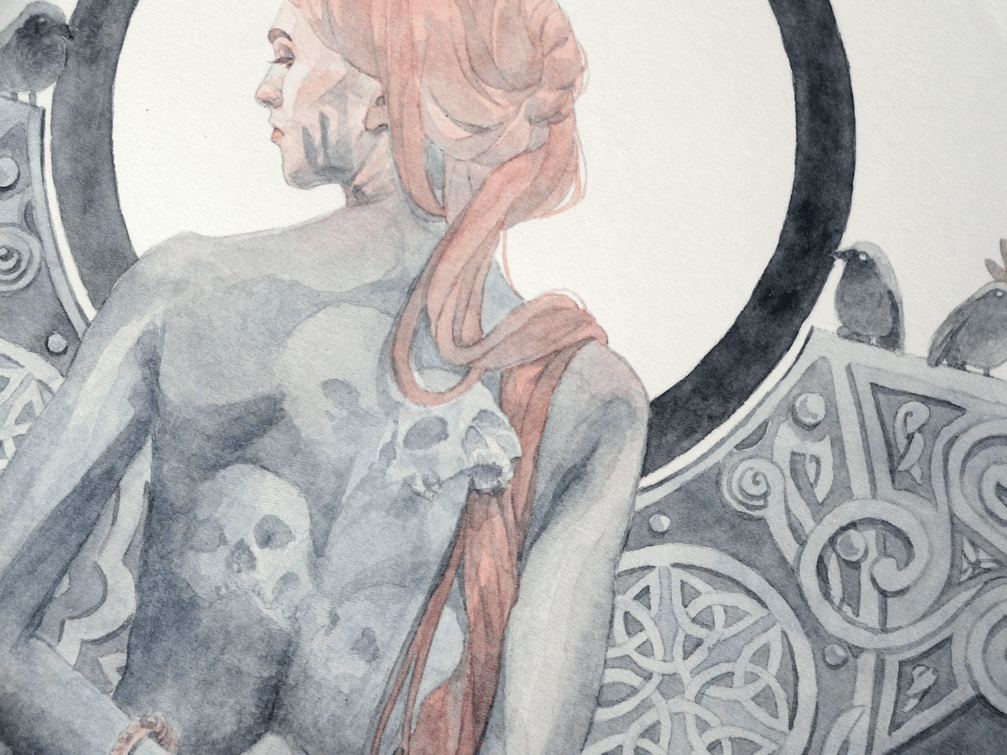
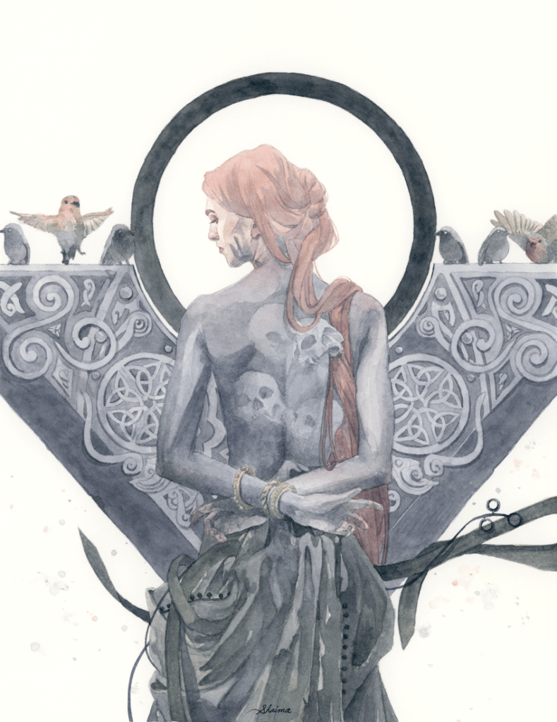
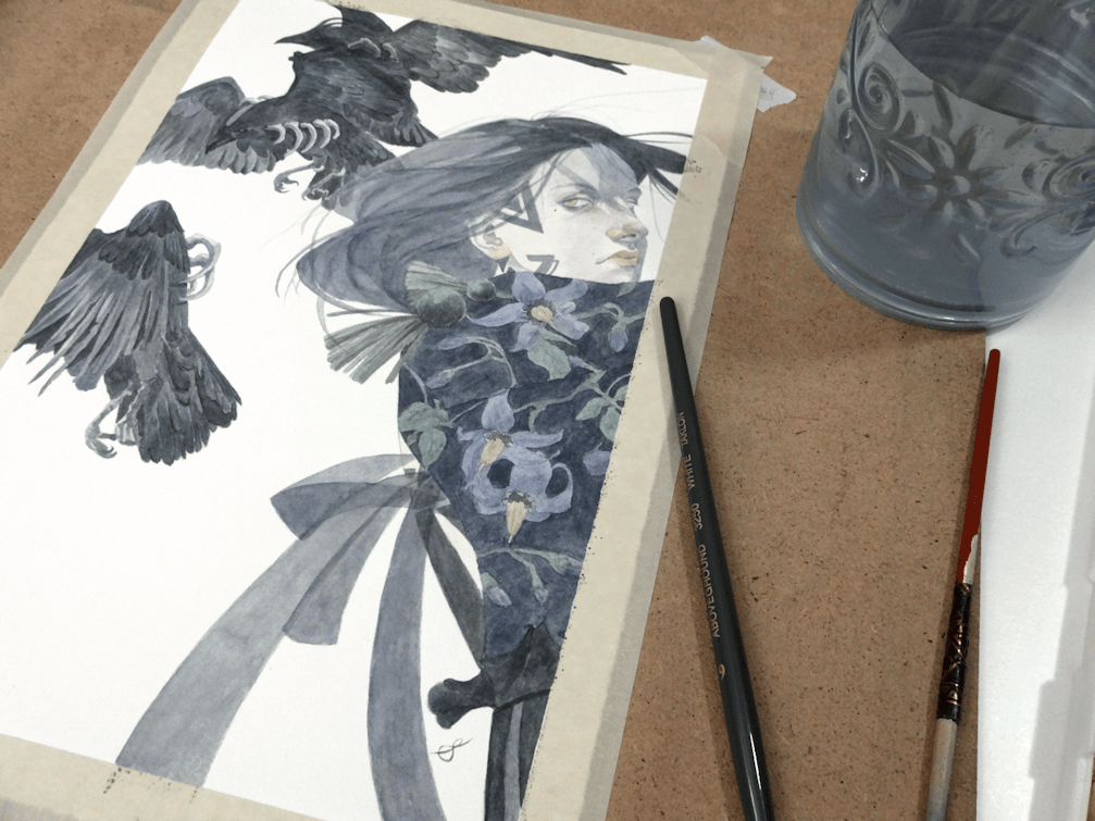
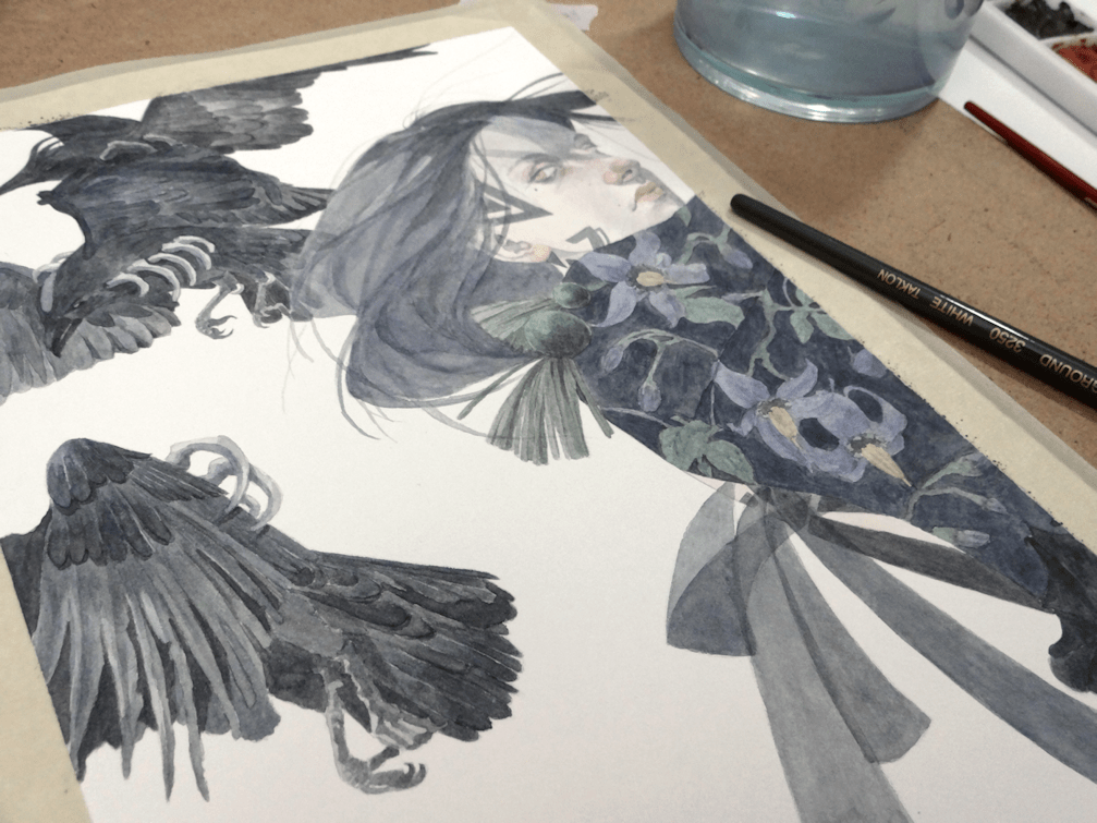
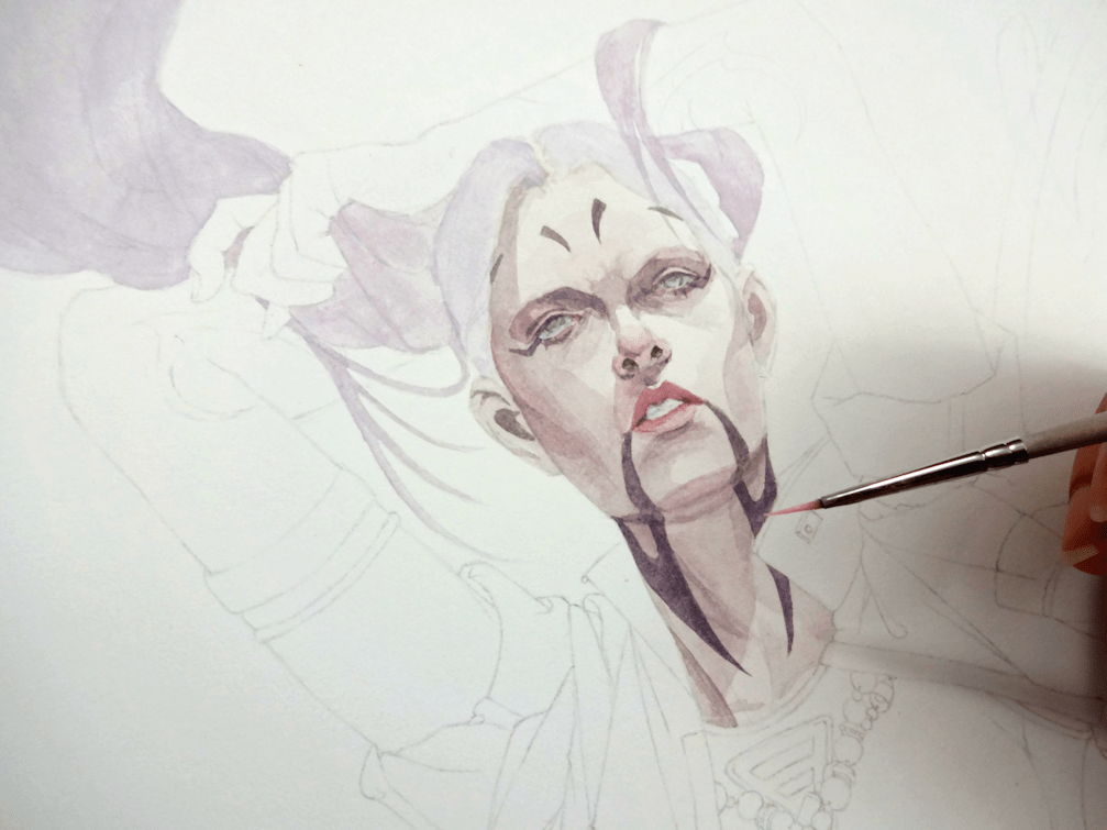
A CLOSER LOOK