Hellgate | Graphite Drawing

Image Courtesy of SPIRIDON | Tributes: HR Giger (interior)

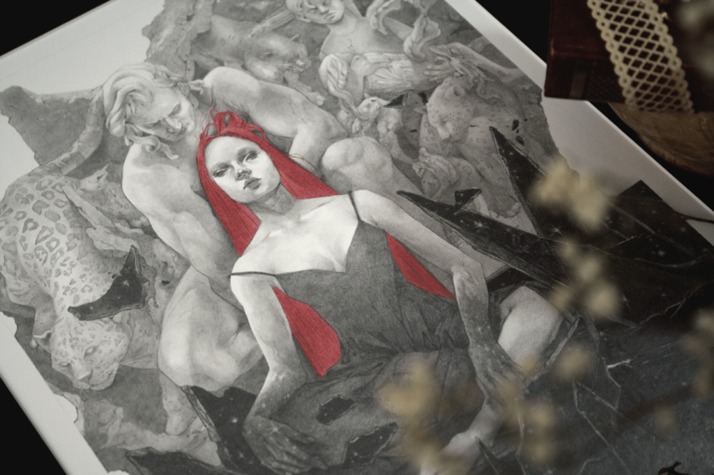
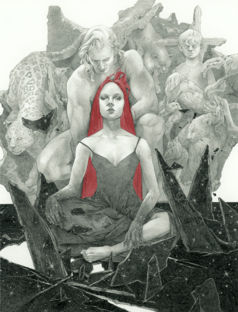
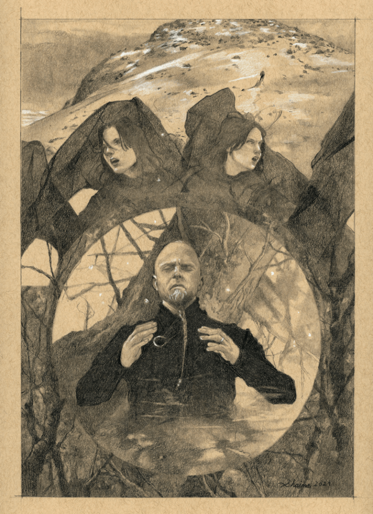
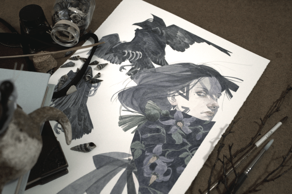
With the year coming to an end, as well as the Tributes: HR Giger Kickstarter campaign, I thought I’d share my drawing that will be included in the art book. It’s one of my favourite pieces to date, and I’ve been waiting to share the full version with you all.
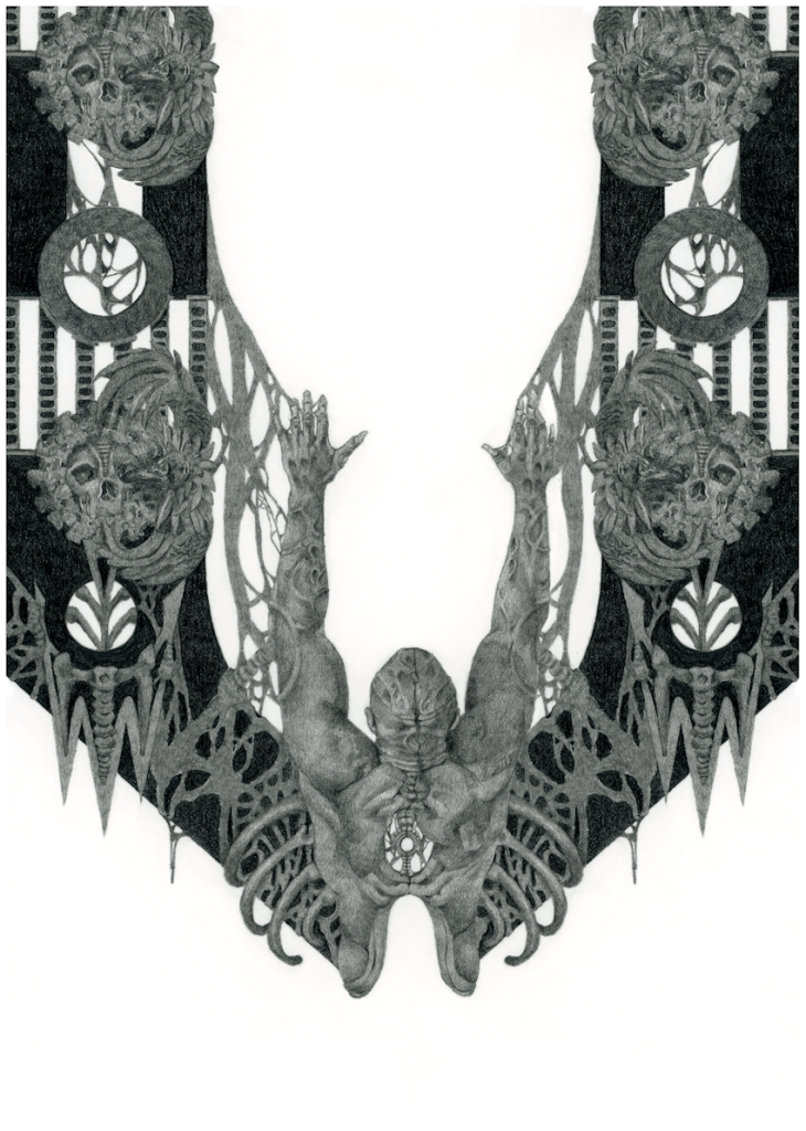
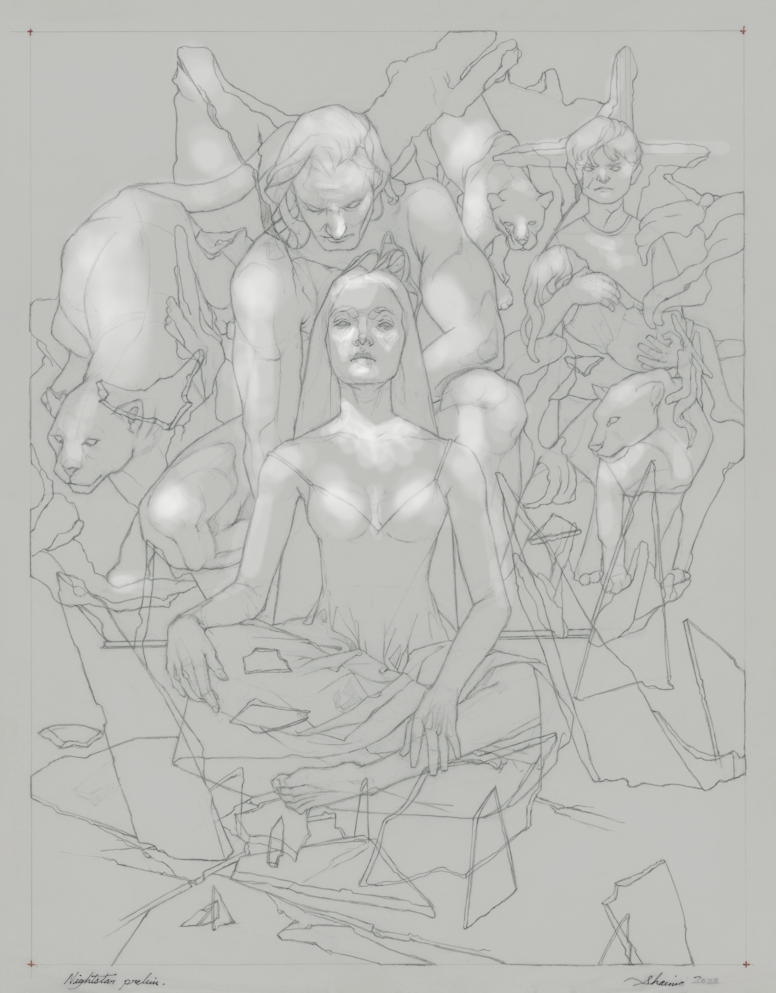
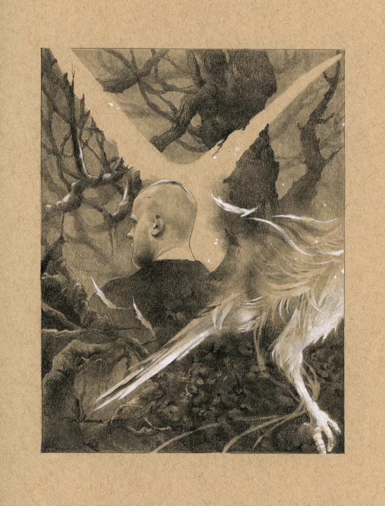
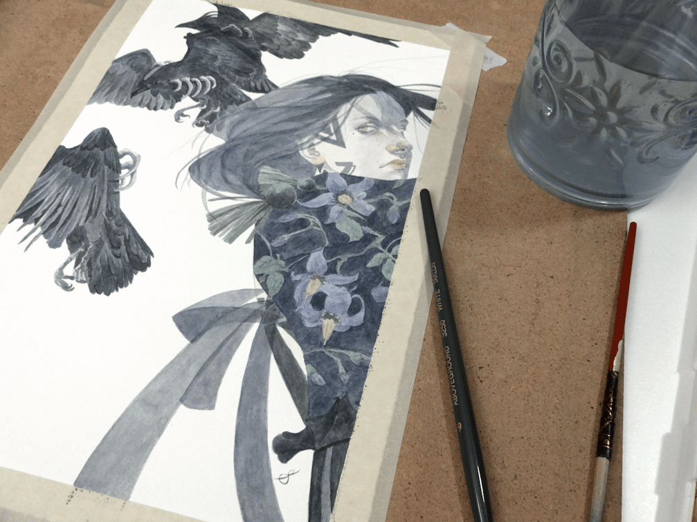
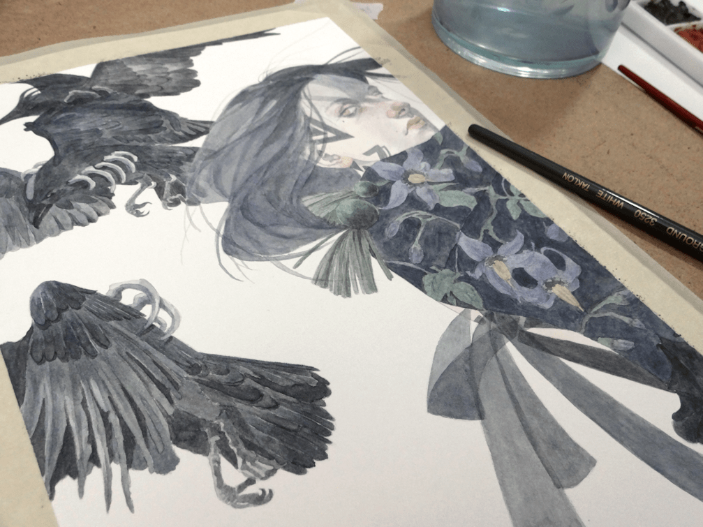
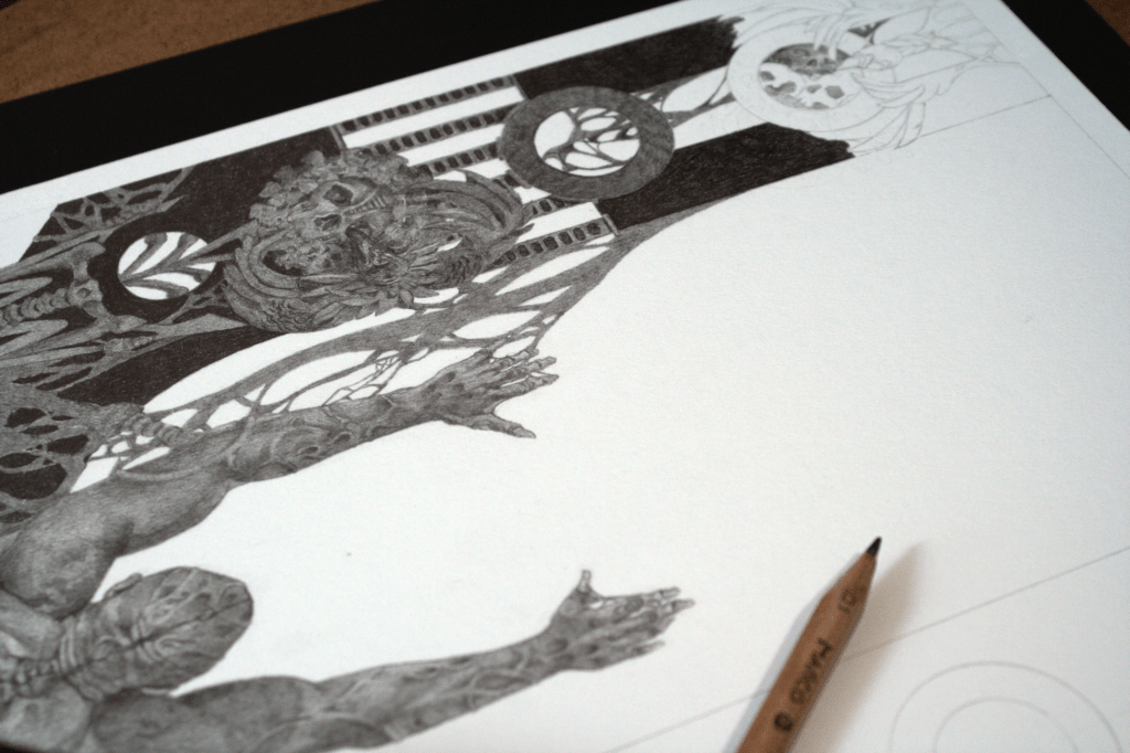
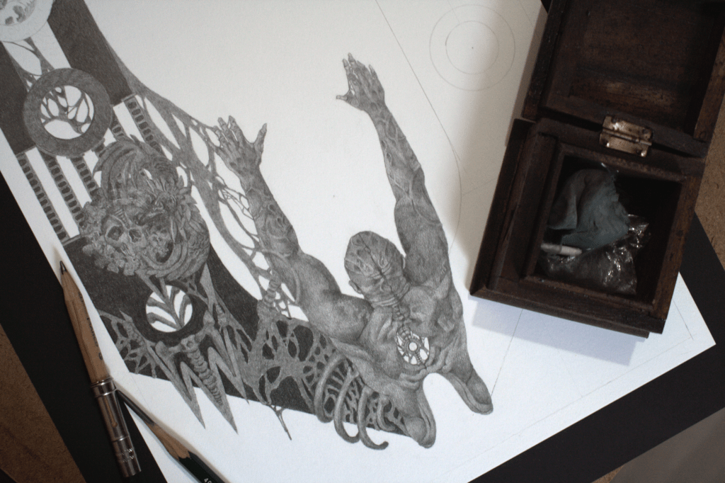
Hellgate, graphite on paper & paintshop pro, 21.5×30.5cm, 2023.

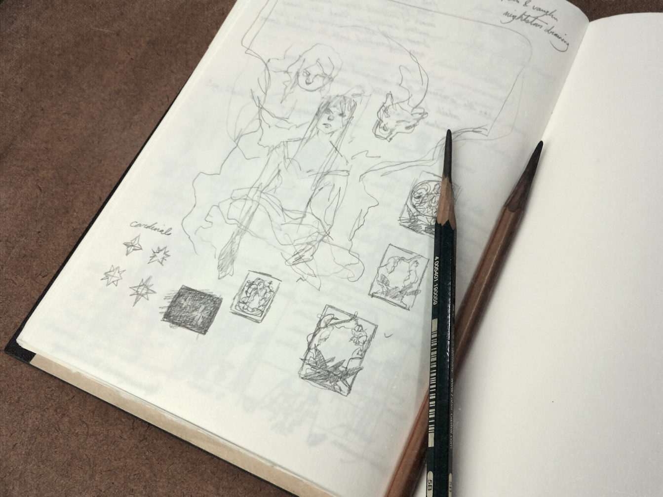
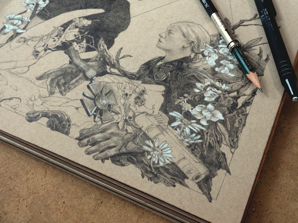
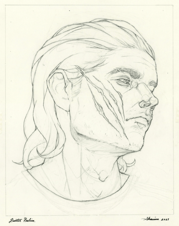
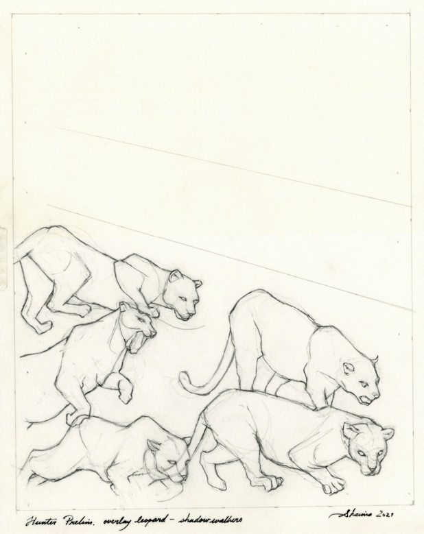
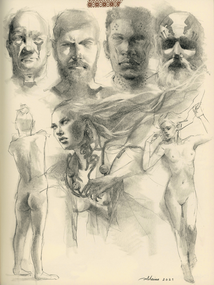
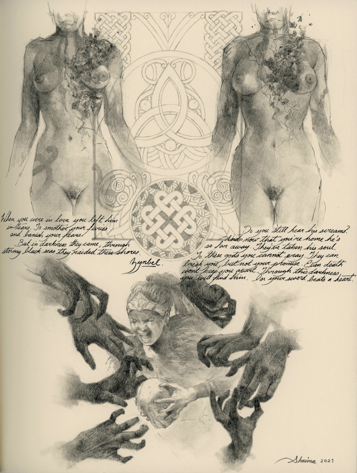
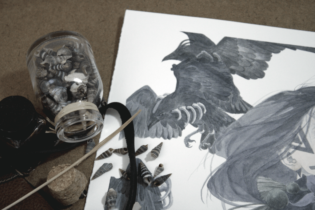
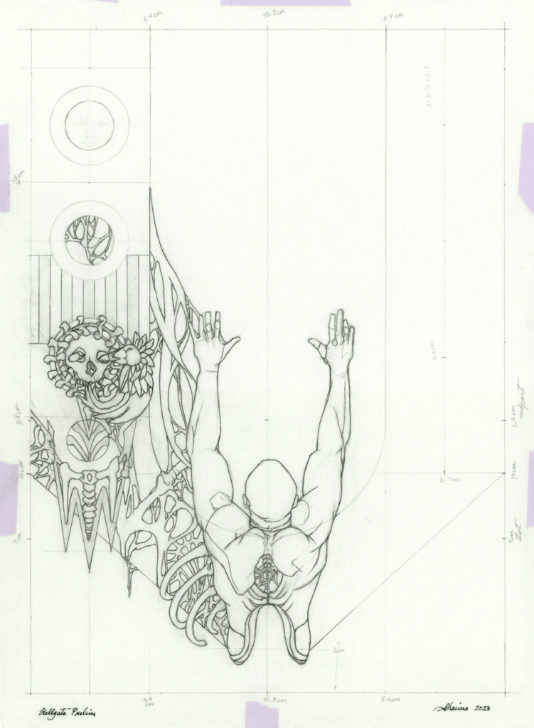
When tasked to create a piece that would pay homage to a very unique body of work that is Giger’s, I was left clueless on where to start for days. It wasn’t going to be anything Alien-esque, but I did want to revisit some of his paintings like Bombs II (1983) or Katarakt (2004) ─ and one my favourites, the Bar installation from the HR Giger Museum. Below are a look at some rough thumbnail sketches that were used to draft an idea of how I wanted the composition to look; the shapes & negative space. Soon I had the beginnings of what looked like a gate, and the idea to introduce some Norse-Pagan themes that would coincide with my body of work as well. The ‘Blood-Eagle’ ritual came to mind when incorporating the male figure in the center, and from there shaping the figure with some ‘Giger’ elements that would work for this project; flesh & bones, as well as other ‘adornments’ if you will.
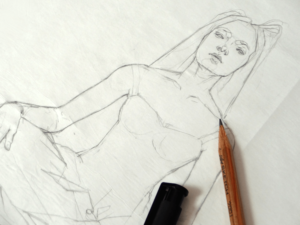
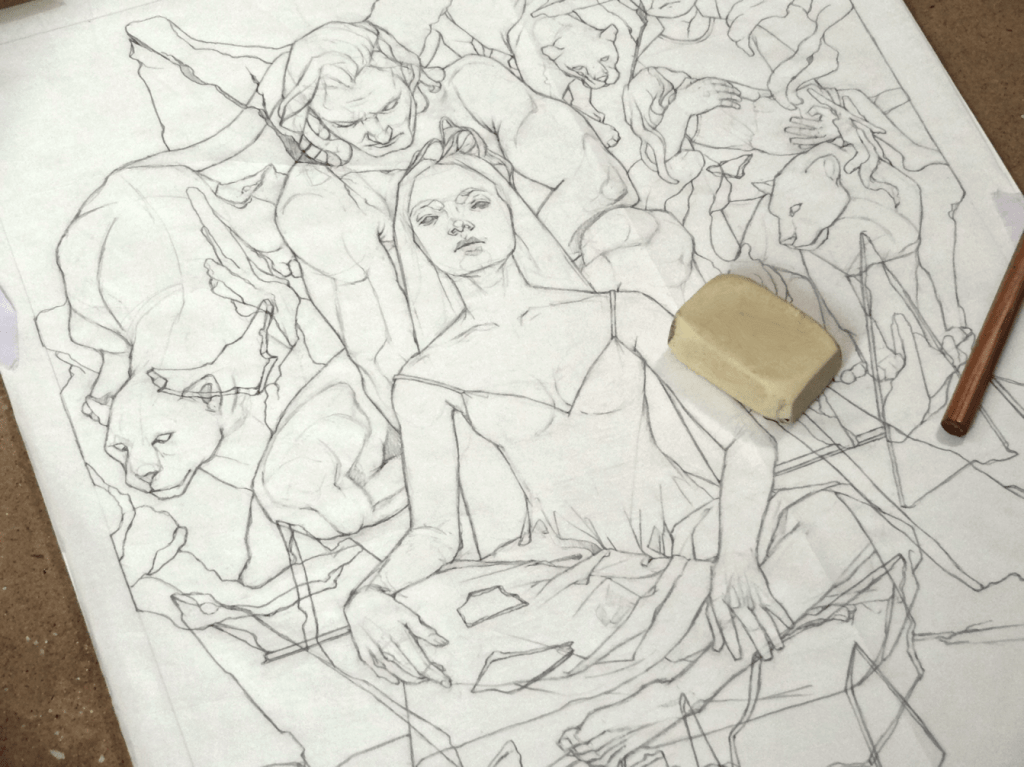
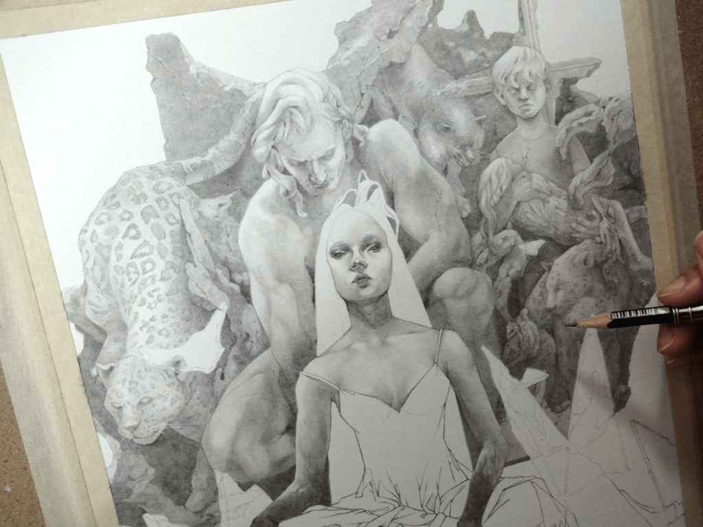
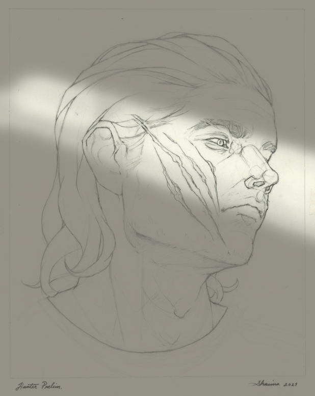
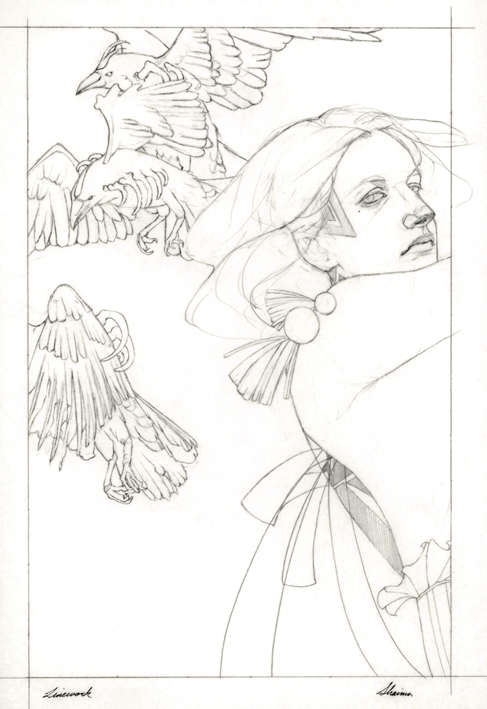
Hellgate, sketchbook thumbnails ─ eliminating ones that either looked too busy or not interesting.

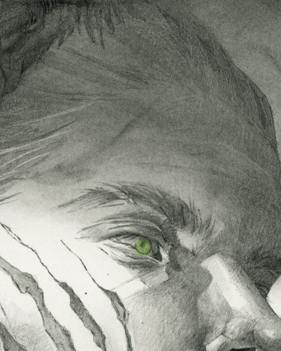
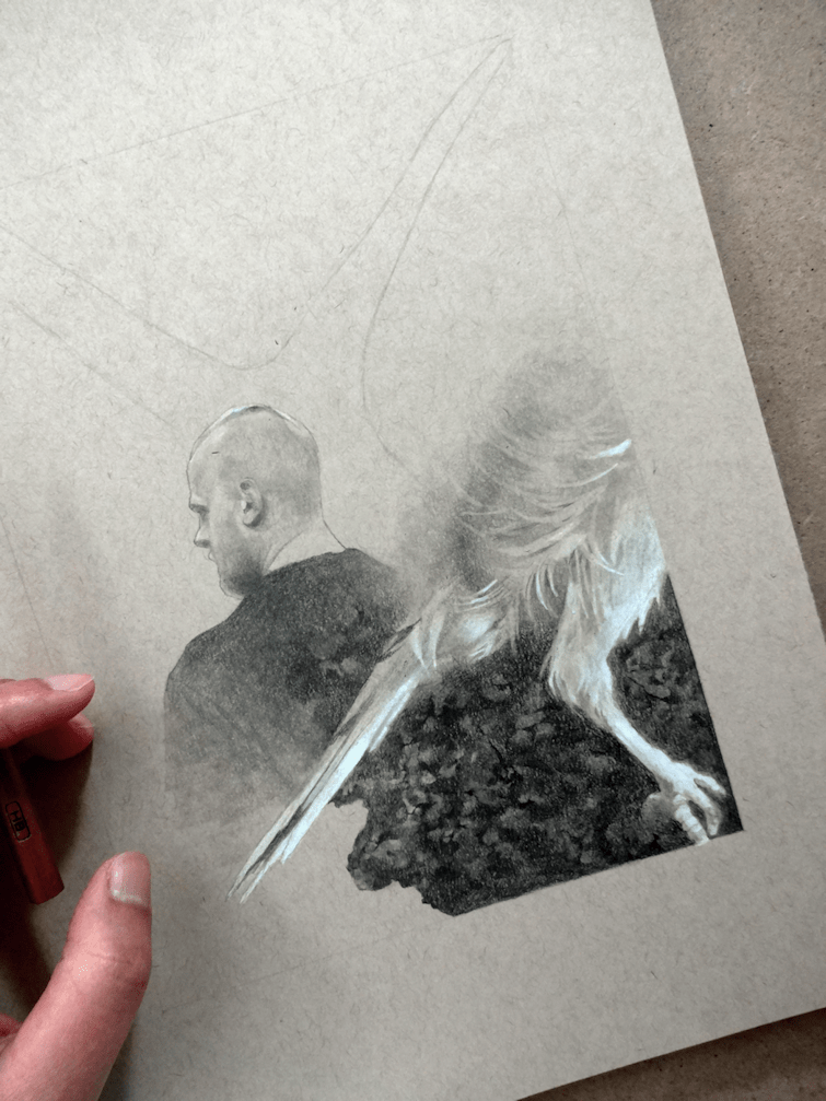
Like always, I start with my line-work drawing on tracing paper before transferring the base drawing onto my paper (usually Strathmore’s Bristol in Smooth or Vellum surfaces). For graphite I rotated between 2H/3H pencil all the way up to a 7B, using my blending stumps in between layers. This time I wanted to experiment with some digital edits ─ nothing too complicated, but seeing how mirroring for the side panels would work with my photo editing software. Although successful, I don’t see myself using this technique again unless I absolutely need to. Editing anything digital without a tablet is a nightmare (but that’s a me problem, that has yet to be amended), but more importantly I just didn’t enjoy not completing the drawing to full; taking on the challenge of learning how to mirror a complex design the traditional route. It’s something that’ll unfortunately be on the back on my mind whenever I look at this piece, in what was an otherwise fun & exciting project.

Once again, thank you to everyone who supported us with the Kickstarter campaign. The Tributes: HR Giger art book is scheduled for release for backers December 2026. You can keep up to date through Éditions Caurette & all of Spiridon’s art book news & releases. Happy New Year, and see you all in 2026!

Glittery & Gold | CODEX Obscurus

I had the immense pleasure of opening my copy of CODEX: Obscurus this week. This was an artist collaboration of ‘witchy’ and occult themed artwork produced by SPIRIDON. The book itself is quite hefty, and I’m especially loving the texture on the cover and back  ̶  not to mention it’s glittery and gold. Each artist has a page dedicated to their work, so you get the enjoyment of seeing the work in proper scale (no small/quarter images). On top of that you have the talents of Viktor Pushkarev with all his lettering, graphic, and calligraphy work. I’m now on the hunt for a vintage frame for his lino-cut print. If you’d like to see some more of his intricate-designs, his contribution to Alex Konstad’s Artbook, Obliskura is a good place to start  ̶  link here (you’re welcome…it’s mind-blowing).

If you missed out on the original Kickstarter campaign, I believe there are a few copies of just the artbook itself out there for purchase from Liber Distri.

NightStar | Graphite Drawing

NightStar, graphite & colour pencil, 10×13″ (11×14″ paper), 2022.

PRELIM

Starting with some brief thumbnails in the sketchbook. Going through Nalini Singh’s second installment in the Psy-Changeling series for some inspiration. Admittedly these tiny drawings look like a bunch of chicken-scratch, but the ideas are there I promise.

(below)

Starting the preliminary drawing on a sheet of vellum/drafting paper.


Taking the finished line drawing and creating a simple lighting/value study on Paintshop Pro.

Drawing in Progress

Line drawing transferred onto a sheet of Strathmore Bristol paper, followed by light applications of graphite; slowly building up to the darker values.


Reacher | June 2022

For this drawing I wanted to incorporate little things here and there from the show. I’ll avoid listing them all out, so as to not put out spoilers for those who have yet to watch the series or read the books. A side note ─ drawing skulls, bones, and such don’t bother me. I’ve got so say however, that I’ve never been more troubled by nature than while studying Snapdragon seed pods.

Killing Floor, graphite & white colour-pencil on paper.

Hunter | Graphite Drawing

Hunter, graphite & colour-pencils on paper, 8×10″, 2021

BACK TO GRAPHITE

I’ve taken a little break from watercolours again. This one being a more fun personal project, taking a character from author Nalini Singh‘s work and imagining it into a more illustrative piece.

Starting off using the same technique from my last painting (Banshee’s Wail), and layering the preliminary drawings so they are ready for the transfer stage. This time around I wanted to play with more dramatic lighting, as I slowly get more comfortable with it. I decided to do some simple black and white lighting samples on Paintshop Pro. It’s not a really an in-depth study; more of an assurance, so that I don’t desecrate the drawing when I work graphite powder onto the paper. Speaking of paper, I’m using Strathmore’s Bristol 100lb. (270 g/m2) in Smooth Surface. I’ve used both the vellum and smooth surface sheets from Strathmore for many years now, and I usually shift between the two if I want more texture or not. I tend to shy away from more textured paper however, because I like to scan my pieces for digital use.

I use graphite powder for mainly large surfaces I want to cover. I don’t have any experience with any store-bought brands, so I tend to just use the saved ‘residue/remnants’ of when I sharpen my graphite (using the blade method). Using a tissue, I work it in to the paper ─ for this particular piece, adding in various forms with my Blending Stumps. I ended up feeling that the piece was a bit on the grey-scale of things; in which my usual work consists of some pure black elements for contrast, so I thought it might be fun to add some colour instead. Sticking to the paranormal and fantasy aspect of the author’s work, I chose to just focus on the eye with various shades of green colour pencils. Overall, a much needed casual and experimental project; although I never want to see leopards or spots again.

Hope you all have a fun Halloween!

A CLOSER LOOK


August Drawings, 2021 | Pagan Folk

As I went to post my latest Wardruna inspired drawing, I realized I missed posting the last two pieces I had done. So here’s me backtracking to a couple of older sketchbook drawings. I’ve gone back to using my Strathmore Tan Drawing Sketchbook, and I would say after using it for this long it’s the only sketchbook I’ve gone back to over and over again (sadly some of my regular sketchbooks are collecting dust). Many artists, myself included, love the amount of depth you can easily create on toned paper. You already have a working middle ground, so pushing the shadows and highlights comes easier and results in better depth in the overall drawing.

WARDRUNA ‘Lyfjaberg’, graphite and white colour-pencil on paper.

The Appeal of Pagan Folk

I’m using the term ‘pagan folk’, but sometimes placing specific genres on a musician or band can be a bit vague. ‘Faroese singer-songwriter’ comes up for a singer like Eivør Pálsdóttir or ‘alternative Nordic pop’ for Aurora or Kalandra. The band Heilung describes their own music as “amplified history”. Where as a band like Faun from Germany, identifiable with their medieval themes, gets labelled pagan folk as well. All to say, lots of genres being thrown out there to the point that I don’t know how to package any of these musicians into one specific label.

The desire to be closer to nature, live more rural, and escape from the general madness of our concrete jungles is no longer reserved to a small population. It’s also something being translated more and more into different art forms including music. Inspiration can be found in many forms different from your practice; photography, film, etc, but mine has overwhelming been through music and literature. I can easily get lost in the rhythms and voice of a singer like Einar and feel transported.


“I think many people who don’t go to church or other religious ceremonies,
I think they miss that solemn, holy place.

One of the goals with Wardruna concert is to actually create that space.
To create that serious space, moment, where you can just get lost into the music.

It’s about communication, back and forth.
About acknowledging things that are bigger than yourself. Remembering nature,
that we are part of it, etc.”

-Einar Selvik with Iron Realm Productions at Midgardsblot 2016.
WARDRUNA ‘Kvitravn’, graphite & white colour pencil on paper.

The drawings for Kvitravn; the one above and the one with the white raven featuring Lindy-Fay Hella, are both inspired by Wardruna‘s latest album and the visuals from their respective music videos which you can find on Youtube.


Sketchbook, May 2021

Revisiting Norse and Celtic knotwork; they’re differences and similarities are always so interesting. On that note, trying to to make life-drawing a little more interesting this week by incorporating themes from Hellblade: Senua’s Sacrifice.
graphite on paper | Strathmore 400 Series Sketchbook

Dusk | Watercolour Painting

Dusk, watercolours on paper, 6.5×10″, 2021.

a closer look.

As usual I started with a drawing on tracing paper, although you’ll notice I didn’t add the flowers. Sometimes with more simpler design details, I’ll go in directly to the watercolour paper. The drawing isn’t really meant to be ‘finished’, just the line-work (the simpler the better) so I can do a graphite-transfer onto the paper. I’ve also stopped printing my line-art/drawing, as I used to for transferring drawings. Personally, I haven’t been finding the need to waste more paper; a sharp pencil over the tracing paper drawing works fine. I’ll usually scan the drawing before I get started on tracing with graphite, so as to preserve all the lines I originally had for reference.

It’s often too hard for me to capture the transferred drawing on my watercolour paper. I’ve usually erased quite a bit of the graphite so it’s barely visible when I lay down paint.

washes and paint | work in progress.